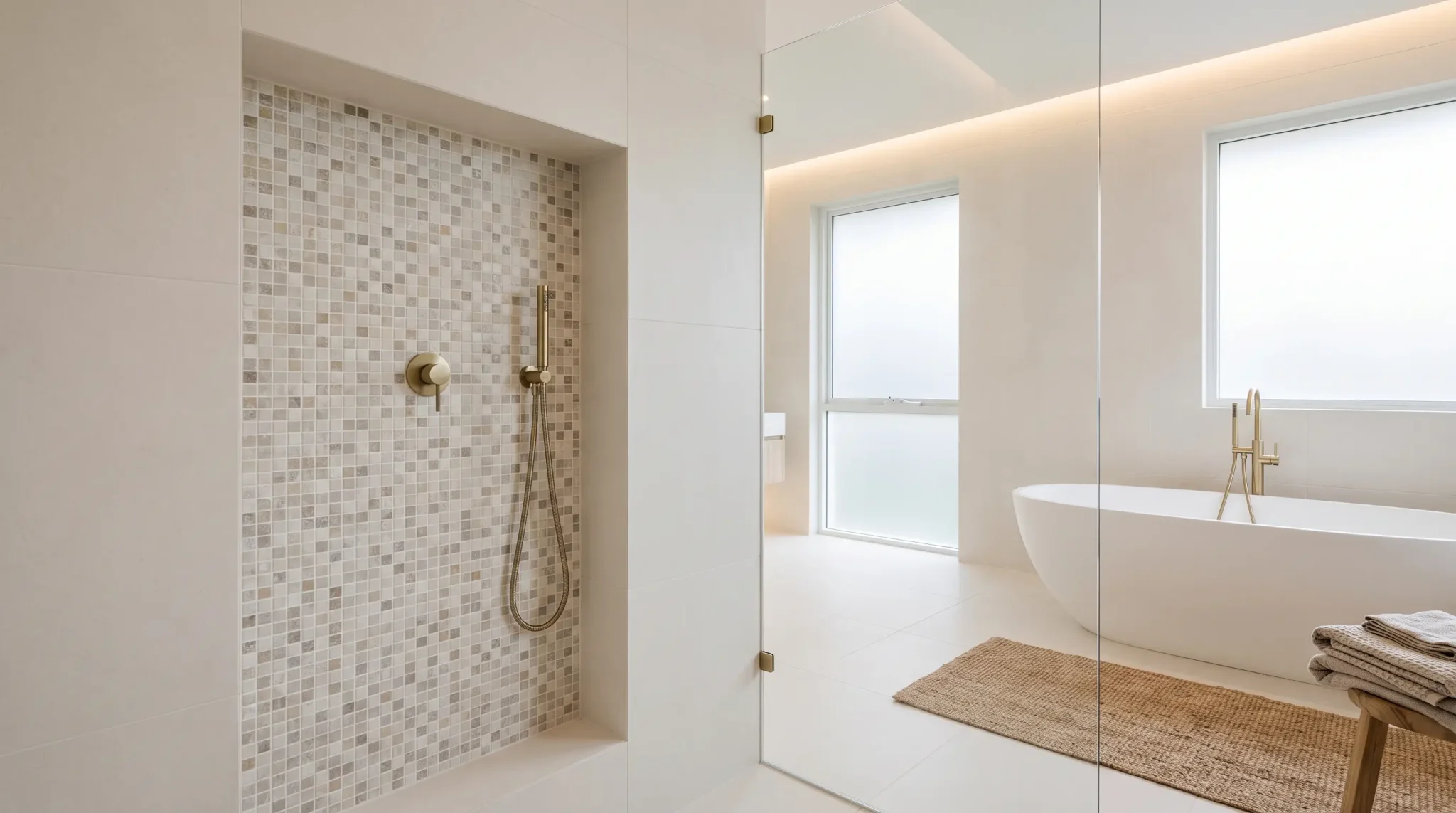
My bedroom used to be that classic white box everyone starts with, safe but forgettable.
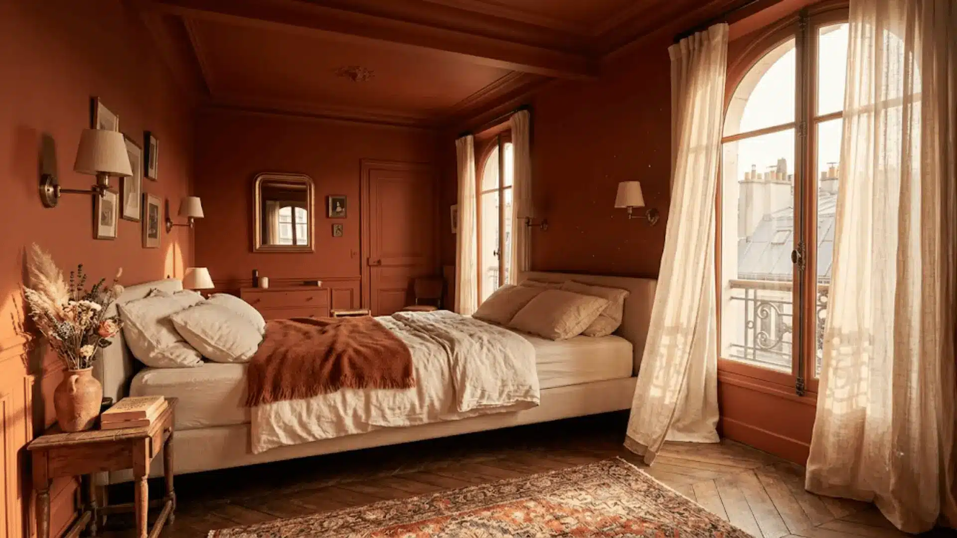
Then I watched Emily in Paris and got a little obsessed with those bedrooms where the walls, ceiling, and trim all wear one rich, saturated color.
That single choice made every room feel intentional and a little dreamy.
Turns out there is a name for it, color drenching, and it has quickly become the bedroom trend everyone wants right now.
This blog covers what color drenching means, why it works so well in bedrooms, how to recreate it, the most inviting shades, common mistakes, and whether it is here to stay.
What is Color Drenching?
Color drenching means painting the walls, ceiling, trim, doors, and even the moldings in one single shade, so nothing competes for attention.
It goes a step further than regular monochromatic decorating, where furniture and accents still bring in different tones.
Designers love this technique because it creates visual continuity and softens those awkward transitions where the wall meets the ceiling meets the trim.
Everything just flows. Bedrooms happen to be the perfect canvas for this.
A drenched room feels like a cocoon, calm and enveloping, and depending on the shade you pick, it can make a small room feel intimate or a large one feel cozier instantly.
How ‘Emily in Paris’ Brought Color Drenching Into the Spotlight?
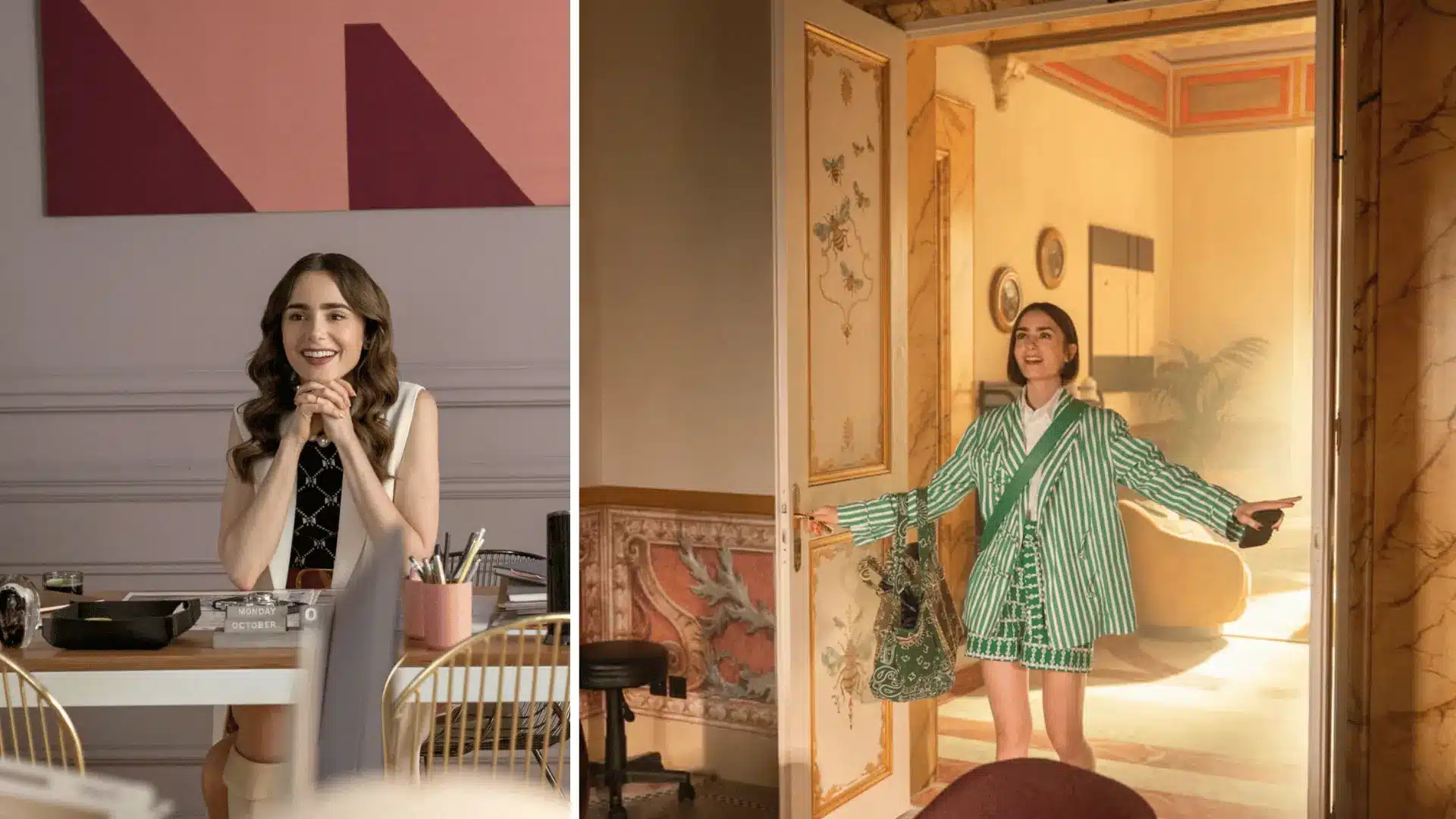
Those Parisian apartments in the show made saturated walls and rich, moody bedrooms look like boutique hotel suites.
But this look is far from new.
European homes have used it for generations, think traditional libraries, historic estates, and designer portfolios spanning decades of work I have studied while researching paint trends.
What the show really did was package a timeless technique into something instantly shareable.
To recreate it, pick one muted color, layer in rich textures, mix vintage pieces with contemporary furniture, and keep accessories minimal so the color itself stays the star.
Why Color Drenching Works So Well in Bedrooms?
Bedrooms are where color drenching truly earns its reputation. Every benefit of this technique shows up most clearly in the one room meant purely for rest.
1. Creates a Calming Retreat
When every surface wears the same shade, your eyes stop jumping from wall to ceiling to trim. That visual quiet translates into an actual sense of calm the moment you walk in.
I have tested this in my own bedroom, and the difference between a drenched room and a standard two-tone setup is noticeable within seconds. It genuinely feels like stepping into a retreat rather than just another room in the house.
2. Makes Small Feel Larger
Sharp contrast between walls and trim tends to chop a room into visual segments, which can make small spaces feel cramped. Color drenching removes those hard lines completely.
With no defined edges pulling your attention, the eye reads the room as one continuous space instead of separate parts, making even a compact bedroom feel noticeably more open and airy.
3. Gives the Room a Luxury Designer Appearance
Designers have relied on this approach for decades because it instantly signals intention. A single, well-chosen color applied everywhere reads as curated rather than accidental.
It removes the piecemeal look of mismatched trim and wall colors, giving the space a polished, high-end finish without needing expensive furniture or elaborate decor to back it up.
4. Softens Architectural Distractions
Awkward angles, low ceilings, or oddly placed moldings tend to stand out when trim is painted in contrasting white.
Drenching the entire space in one shade blurs those imperfections into the background. Instead of drawing the eye to structural quirks, the color wraps around them, letting the room feel intentional rather than flawed.
5. Makes Decorating Easier with One Cohesive Palette
Choosing furniture, bedding, and decor becomes far simpler when your base is a single unified color. There is no need to coordinate multiple wall tones with accent pieces since the backdrop is already settled.
It takes the guesswork out of decorating and gives you a clear, calm foundation to build everything else around.
What Surfaces Should You Color Drench?
Not every surface needs identical treatment, though the more you cover, the more immersive the room feels.
Here is a quick breakdown of what to paint and why each choice matters.
| Surface | Should You Paint It? | Why |
|---|---|---|
| Walls | Yes | Foundation of the look |
| Ceiling | Yes | Removes the visual stopping point |
| Trim | Yes | Eliminates jarring contrast |
| Doors | Yes | Lets doors blend into walls |
| Baseboards | Yes | Avoids a distracting floor line |
| Crown molding | Yes | Highlights detail through shadow, not contrast |
| Built-ins | Usually | Blends storage into the backdrop |
| Window frames | Optional | Some prefer contrast to frame the view |
| Radiators | Optional | Makes bulky fixtures disappear |
| Furniture | Sometimes | Adds depth without flattening the room |
Painting the ceiling is where color drenching really commits to the look. For more direction on shades that work well overhead, this roundup of ceiling color ideas is worth a look.
Step-by-Step: How to Color Drench a Bedroom?
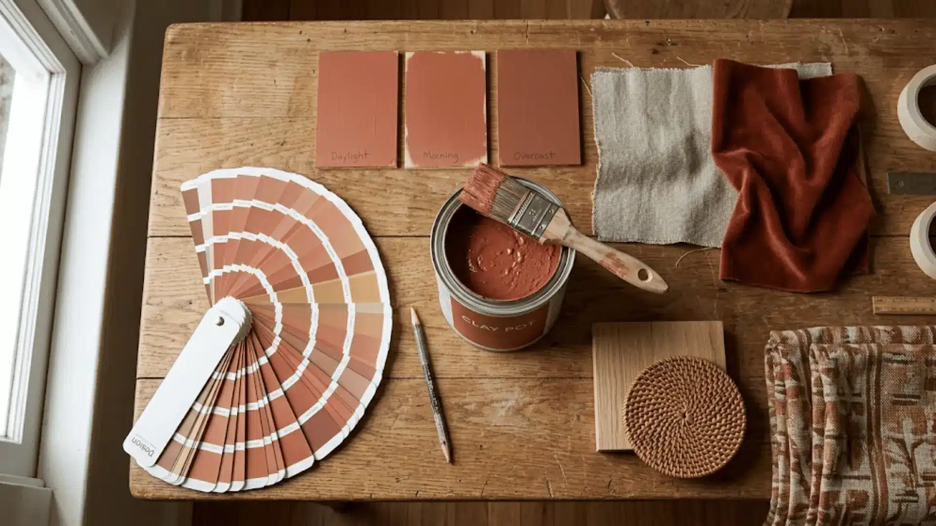
Once you are ready to commit, the process itself is simpler than it looks. Here is exactly how to go about it.
Step 1: Decide the Mood You Want
Before picking a single swatch, figure out how you want the room to feel. Are you after something cozy, airy, moody, urbane, or romantic? This decision shapes every choice that follows, from color temperature to finish.
I always start here because a color that photographs beautifully but does not match the mood you actually want ends up feeling wrong within weeks.
Step 2: Choose the Right Paint Color
Pick one shade that supports the mood from step one. If you are after something warm and cozy, a shade like Benjamin Moore’s Kendall Charcoal works beautifully when drenched.
For something airy and calm, Sherwin-Williams’ Alabaster is a popular pick that photographs well in natural light.
Avoid choosing based on trends solely. The right color should feel like something you want to wake up to daily, not just something that looks good in photos.
Step 3: Test Paint Throughout the Day
Paint colors shift dramatically depending on light, so testing is non-negotiable. Watch how the swatch reads in the morning, afternoon, evening, and under artificial lighting after dark.
- Morning light tends to look cooler and softer
- Afternoon sun brings out true undertones
- Evening light warms everything slightly
- Artificial lighting can shift a color entirely, sometimes revealing unwanted undertones
Step 4: Select the Right Paint Finishes
Sheen matters just as much as color. Go for matte on the ceiling, eggshell on the walls, and satin on the trim.
Behr’s Premium Plus Interior Paint line offers all three finishes within the same product, making it easy to source everything at once.
Step 5: Continue the Palette into Furniture and Textiles
Do not stop at the walls. Carry the same tone into bedding, curtains, or an accent chair so the color feels woven through the whole room rather than confined to the paint.
This is what makes drenched rooms feel finished instead of half done.
Step 6: Add Texture Instead of Extra Colors
Once the color is set, resist the urge to introduce more hues. Instead, bring in texture through linen, velvet, wood, or woven baskets.
Texture keeps a single-color room from feeling flat while staying true to the drenched effect.
The Best Colors for a Color-Drenched Bedroom
Instead of picking a color just because it looks pretty on a swatch, it helps to think in terms of mood first.
Here is how fifteen popular shades line up against room size, lighting, style, materials, and finish.
| Color | Complementary Materials | Suggested Finish |
|---|---|---|
| Warm White | Light wood, linen, rattan | Eggshell walls, matte ceiling |
| Cream | Linen, brass, light wood | Eggshell walls, matte ceiling |
| Soft Beige | Wool, wood, woven textures | Eggshell walls, satin trim |
| Taupe | Leather, linen, wood | Eggshell walls, satin trim |
| Greige | Metal, glass, light wood | Eggshell walls, satin trim |
| Sage Green | Rattan, linen, unfinished wood | Matte walls, satin trim |
| Olive Green | Brass, velvet, wood | Matte walls, satin trim |
| Dusty Blue | Linen, cotton, light wood | Eggshell walls, satin trim |
| Slate Blue | Velvet, brushed metal, wood | Matte walls, satin trim |
| Deep Navy | Brass, velvet, dark wood | Matte walls, satin trim |
| Chocolate Brown | Leather, wood, wool | Matte walls, satin trim |
| Terracotta | Clay, rattan, linen | Matte walls, satin trim |
| Burgundy | Velvet, brass, dark wood | Matte walls, satin trim |
| Charcoal Gray | Metal, glass, dark wood | Matte walls, satin trim |
| Soft Black | Brass, velvet, marble | Matte walls, satin trim |
If you are torn between two popular warm neutrals, these two of the most requested warm whites breaks down which one suits a bedroom best.
How Different Bedroom Styles Use Color Drenching?
Color drenching does not look the same across every design style; it bends to fit the mood each aesthetic is going for.
I have personally tried this technique only in Scandinavian and Dark Academia setups, so those two sections come from direct experience while the rest are based on research and design references.
1. Modern Minimalist
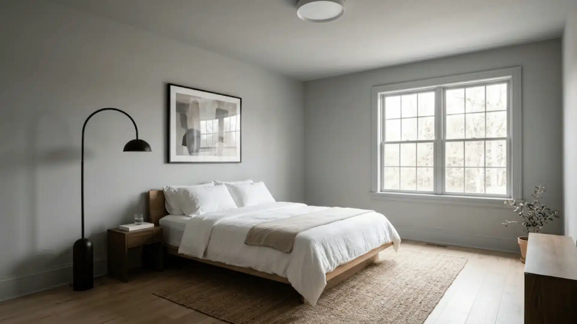
Here, drenching works best in soft neutrals or muted grays that keep the room feeling calm and uncluttered. The goal is a clean, monochrome backdrop that lets a few carefully chosen pieces stand out.
Nothing competes for attention, which is exactly the point. Sharp lines and minimal decor pair naturally with this approach, keeping the whole space feeling deliberate rather than sparse.
2. Scandinavian

In my own bedroom, I went with a warm white drenched across walls, ceiling, and trim, paired with light wood and linen textures.
The effect was softer than I expected, almost glowing in natural light. Scandinavian spaces lean on this gentle, airy quality, using pale, warm tones rather than stark white to keep things cozy without feeling cold.
3. Japandi
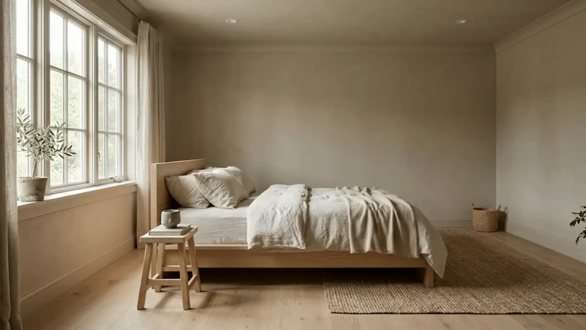
This style blends Japanese minimalism with Scandinavian warmth, and drenching suits it beautifully through earthy, muted tones like soft clay or warm greige. The result feels grounded and quiet.
Natural materials such as unfinished wood and stone do the heavy lifting here, while the drenched color acts as a calm, unobtrusive backdrop rather than a focal point.
4. English Country
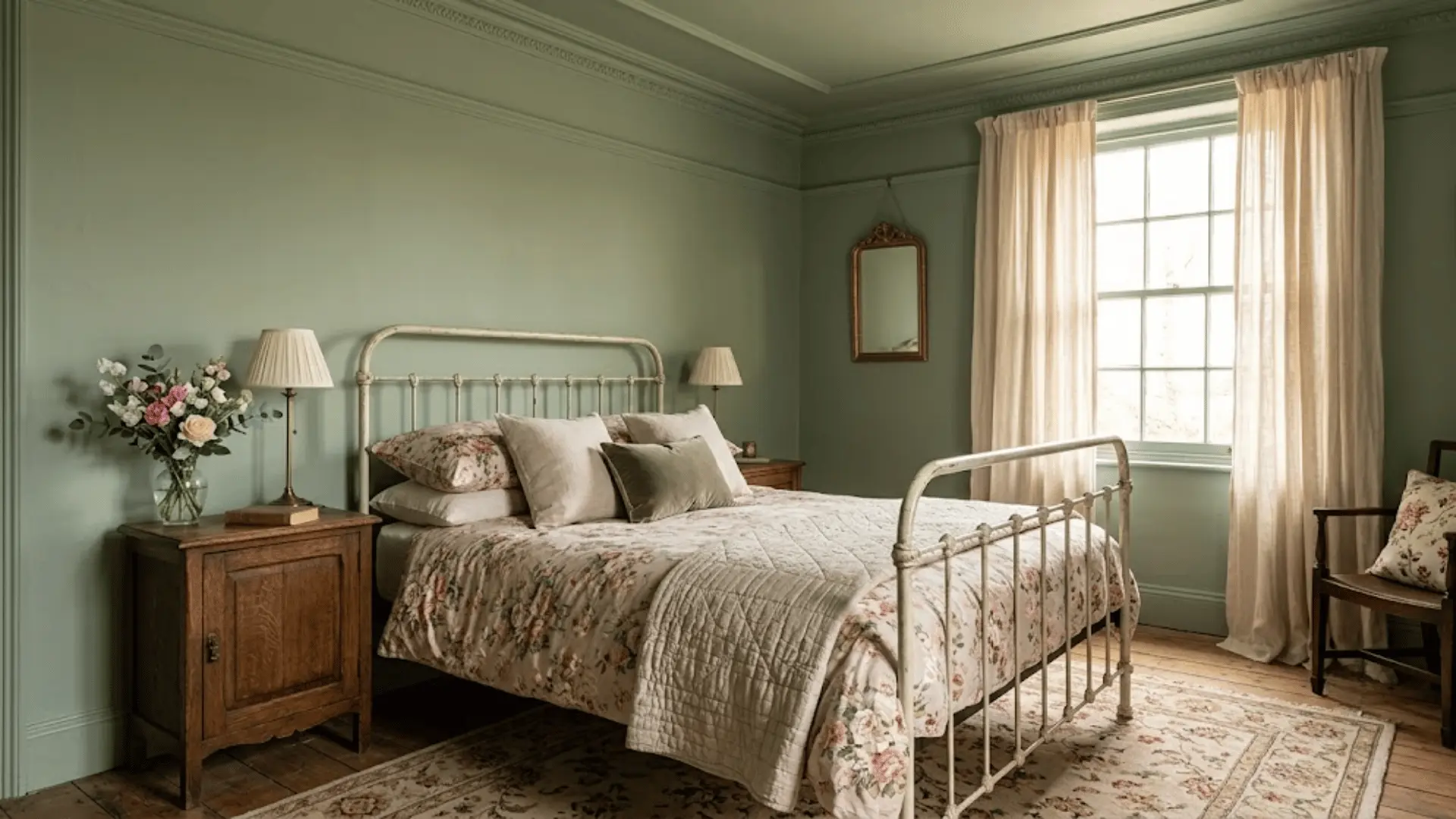
Soft sage greens and dusty blues drenched throughout suit this style’s relaxed, floral-heavy sensibility.
The single-color approach softens busy patterns from bedding or curtains, letting them stand out against a calm backdrop instead of competing with contrasting trim.
5. Dark Academia
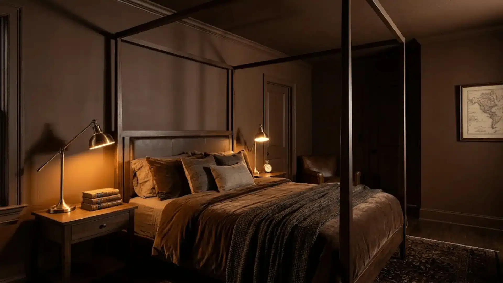
I tested a deep chocolate brown drench in a small guest bedroom styled this way, paired with dark wood furniture, leather, and brass details.
The effect felt intimate and scholarly, almost like stepping into an old library. This style leans on rich, layered tones that make the room feel enveloping rather than closed in.
Decorating a Color-Drenched Bedroom
Once the walls are drenched, decorating the rest of the room takes a slightly different approach than usual. Instead of picking pieces that stand out, the goal is to build layers that support the color rather than compete with it.
Here is how to think through each element.
-
Bedding and Curtains: Stick to tonal shades or soft neutrals that echo the wall color. Matching curtains to the walls lets windows disappear into the room entirely.
-
Rugs: A rug in a complementary neutral or subtle pattern grounds the space. Avoid anything too busy, since the room should feel calm and unified.
-
Upholstered Beds: A bed frame in the same tonal family, whether velvet, linen, or boucle, blends into the room. It adds texture right where the eye lands first.
-
Nightstands: Wood or matte-finish nightstands in warm or dark tones work best. They add contrast through material rather than color.
-
Artwork and Mirrors: Choose art with muted tones or frames that echo the wall color. A mirror in brass, wood, or matte black adds a reflective break while bouncing light around the room.
-
Lamps: Soft, warm lighting through table or floor lamps enhances coziness. This matters most in the evening when color can feel heavy.
-
Decorative Accents: Keep trays, candles, and small objects limited to two or three tones. Pull them from the same family as the walls.
-
Plants: Greenery adds a natural, living contrast against a single-color backdrop. It breaks up the room without needing another color or pattern.
Taken together, these choices help a color-drenched bedroom feel finished rather than flat. The trick is restraint, letting texture and material do the work that multiple colors usually would.
The Closing Note
Color drenching is less about chasing a trend and more about giving a bedroom real personality.
I tried it myself in a soft Scandinavian white and later in a moody Dark Academia brown, and each version completely changed how the room felt to be in.
Looking for cozy, moody, or soft and airy, this technique makes it easy to get there without overthinking every decor choice.
If committing to a full room feels like a lot, start with one wall and see how it feels first.
Have you tried color drenching in your bedroom? Drop a comment and share how it turned out.
Frequently Asked Questions (FAQs)
Does Color Drenching Make a Room Look Bigger?
It can, depending on the shade chosen. Lighter tones drenched throughout remove visual breaks and often make small rooms feel more open.
Can You Color Drench with Neutral Colors?
Absolutely, neutrals like warm white, cream, or greige work beautifully. They create the same seamless effect while keeping the room feeling soft and airy.
Is Color Drenching Still in Style?
Yes, and it shows no signs of fading soon. Its roots go back decades, which suggests it is more of a lasting technique than a passing trend.
Is Color Drenching Expensive?
Not necessarily, since it often uses just one paint color across multiple surfaces. Costs mainly depend on the size of the room and paint quality chosen.
Can Renters Try Color Drenching?
Yes, through removable options like peel-and-stick wallpaper or renter-friendly paint agreements. Curtains, bedding, and accent walls can also mimic the look without permanent changes.