Pale Oak Benjamin Moore has quietly become one of the most-reached-for neutrals in residential interiors, and for good reason. It sits in that rare zone where warmth doesn’t tip into heaviness and softness doesn’t read as bland.
But pale oak OC-20 is also a color that surprises people, sometimes in ways they didn’t plan for. I’ve seen it transform north-facing bedrooms into calm retreats and turn south-facing living rooms unexpectedly pink.
What makes the difference isn’t the color itself; it’s understanding how it behaves. This review breaks down undertones, lighting, room fit, styling, and comparisons so you walk in knowing exactly what you’re working with.
Getting to Know Pale Oak OC-20
Pale Oak OC-20 lives in warm greige territory, not a true beige, not a true gray, but a soft balance of both with a distinct warmth leaning. Before getting into how it behaves, here’s what the spec sheet actually says.
| Detail | Information |
|---|---|
| Color Name | Pale Oak/ Athena 858 |
| Brand | Benjamin Moore |
| Color Code | OC-20 |
| Hex Code | #DED8CD (approximate) |
| LRV | 69.11 |
| Color Family | Warm Greige / Neutral |
| Tone | Light, soft, muted warm |
| Undertones | Pink-beige, subtle gray |
| Available Finishes | Flat, Eggshell, Satin, Semi-Gloss, High Gloss |
| Best For | Living rooms, bedrooms, open-plan spaces, whole-home use |
An LRV of 69.11 places it solidly in the light range without crossing into stark or washed-out territory. On the warmth–coolness scale, it leans warm, but the gray undertone keeps it from reading as a traditional beige.
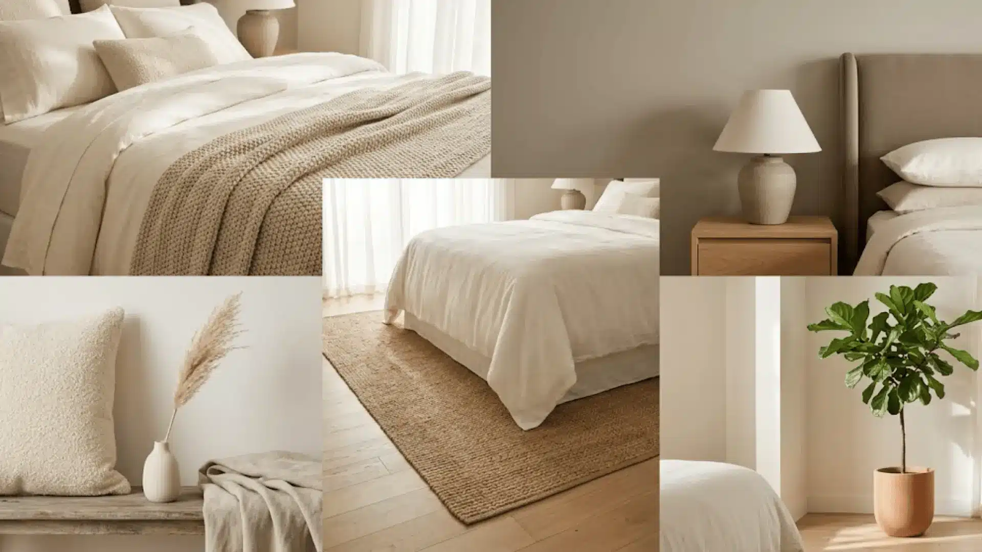
First impression on the wall: soft, quiet, and gently warm. It doesn’t announce itself, which is exactly why designers keep coming back to it. Understanding the undertones is where the real decision gets made.
The Undertones in Pale Oak: What Matters More Than Swatches
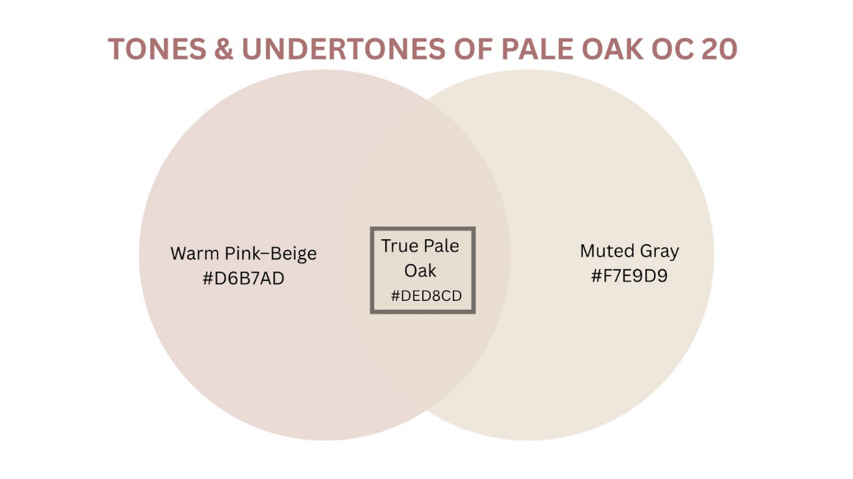
The swatch at the store will tell you Pale Oak is a light warm neutral. What it won’t tell you is how those undertones shift depending on what’s around them, and that gap is where most paint regrets happen.
- Primary undertone: Soft pink-beige warmth, present but not bold, it reads as skin-tone adjacent warmth rather than anything overtly rosy
- Secondary undertone: Muted gray that grounds the pink and keeps Pale Oak from going full traditional beige
- When pink dominates: South-facing rooms, warm incandescent bulbs, and amber LED lighting all pull the pink forward noticeably
- When it reads neutral: North light, heavily shaded interiors, and cooler white lighting suppress the pink and bring out the gray-greige balance
- What triggers unwanted pink: Yellow-toned wood floors, honey oak cabinets, orange-red tile, any warm-toned surface nearby amplifies the pink undertone significantly
The pink is not a flaw. But it is a variable. Know your room’s light direction and existing finish tones before committing, and the undertone becomes an asset rather than a surprise.
How Light Changes Pale Oak Throughout the Day
Light is what actually determines the final color on your wall; direction and source both shape how Pale Oak reads from morning to evening.
1. North-Facing Rooms
Pale Oak reads cooler and more greige in north-facing spaces. The pink undertone softens considerably, and what remains is a calm, muted neutral. It’s elegant without being warm.
Works beautifully in bedrooms and reading rooms where a restful, less stimulating tone is the goal. If you’ve been worried about it going too pink, a north-facing room will put that concern to rest.
2. South-Facing Rooms
This is where warmth peaks. Pale Oak glows creamy and softly pink through most of the day in south-facing rooms. It’s a beautiful effect if warmth is what you’re after, but it can feel heavier than expected if the room also has warm-toned flooring or furniture. Pair with cooler trim and neutral furnishings to keep the balance.
3. East-Facing Rooms
Morning light brings out soft, gentle warmth in Pale Oak. By mid-afternoon, it settles into a more balanced greige as direct light shifts away.
This is one of the most flattering orientations for this color; you get the warmth in the hours it feels most welcoming, without it staying all day.
4. West-Facing Rooms
Expect a noticeable beige-pink shift in the late afternoon and evening. As the sun drops, west light deepens the warmth considerably.
If your space gets heavy west light and you’re sensitive to warm tones, paint a large swatch and observe it specifically between 4–7 PM before deciding.
| On artificial lighting: Warm LEDs and incandescent bulbs bring out the pink undertone. Cool white LEDs (5000K+) neutralize it and bring out the gray. Bulb temperature is a real factor, not a minor one. Day-to-night shift: Pale Oak consistently reads softer and slightly creamier by evening regardless of room orientation. Plan your lighting choices accordingly. |
Best Rooms for Pale Oak Benjamin Moore
Room function, light direction, and existing finishes all determine whether Pale Oak lands as intended or misses the mark.
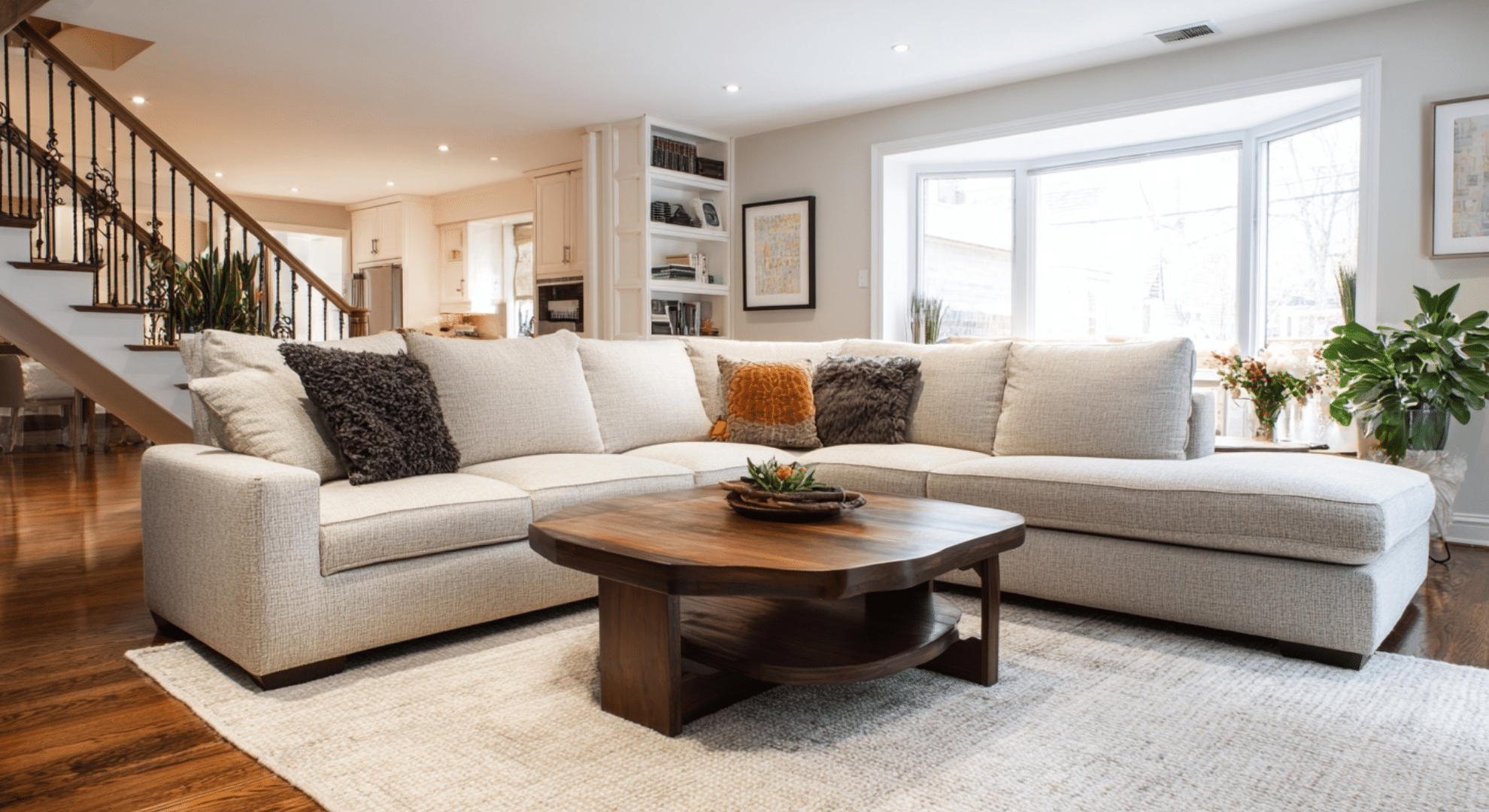
Living Rooms
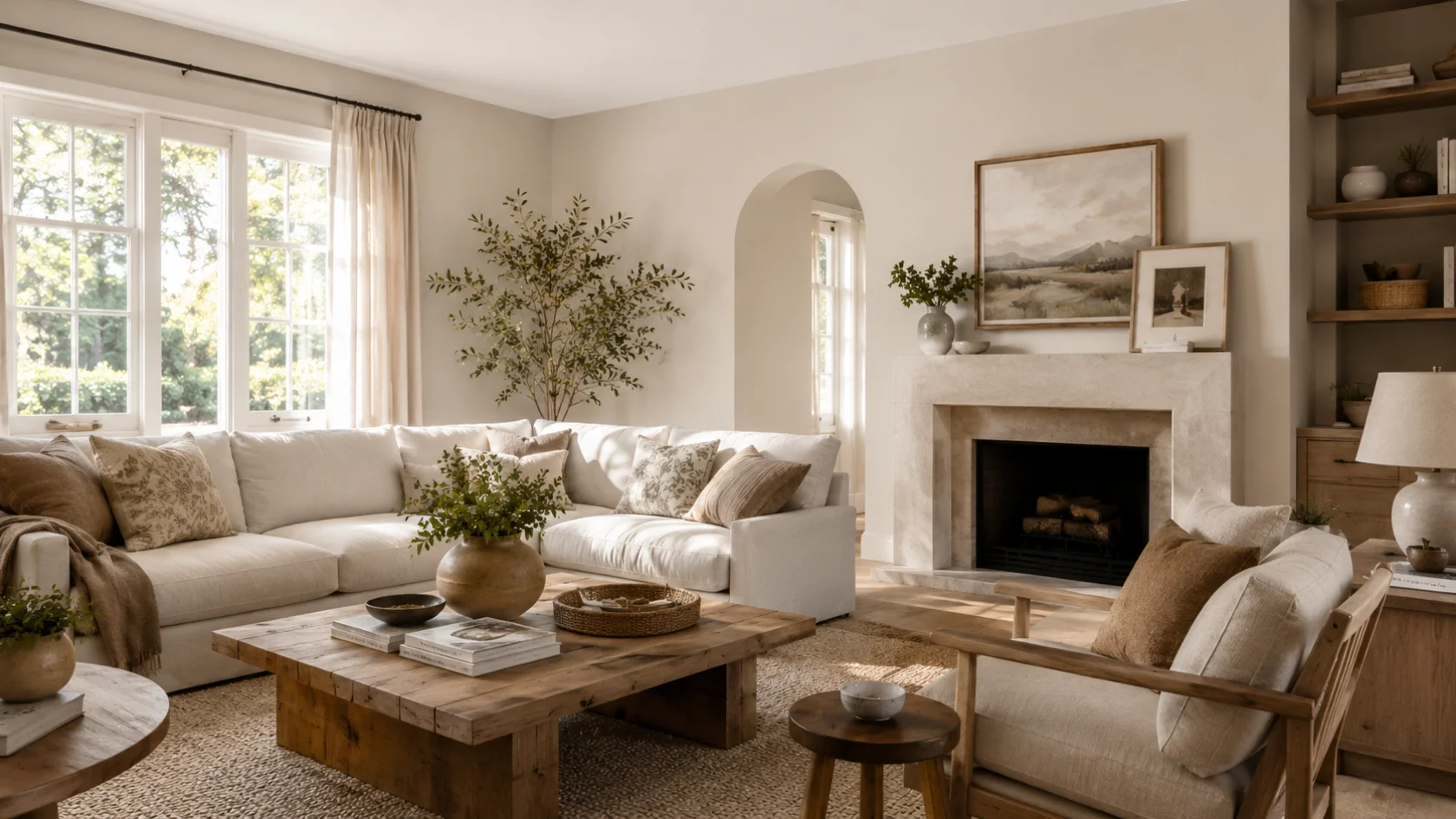
A warm, grounding neutral that doesn’t compete with furniture, art, or architectural detail. Pale Oak gives a living room a quiet presence; it reads as a backdrop that makes everything in front of it look considered.
Works best with natural light and mixed-tone furnishings. Avoid pairing with very cool gray sofas or blue-dominant textiles; the undertone contrast becomes the first thing you notice.
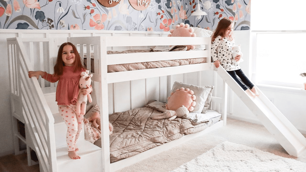
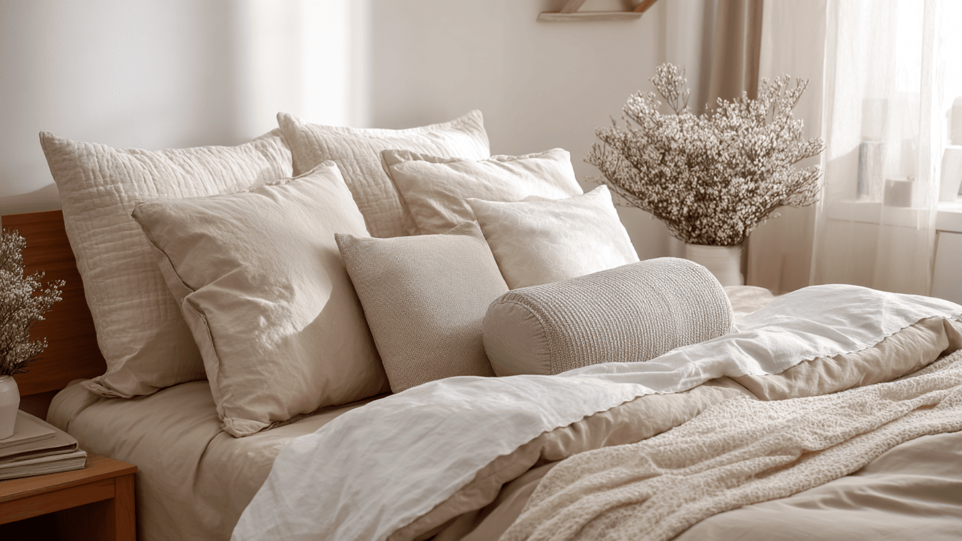
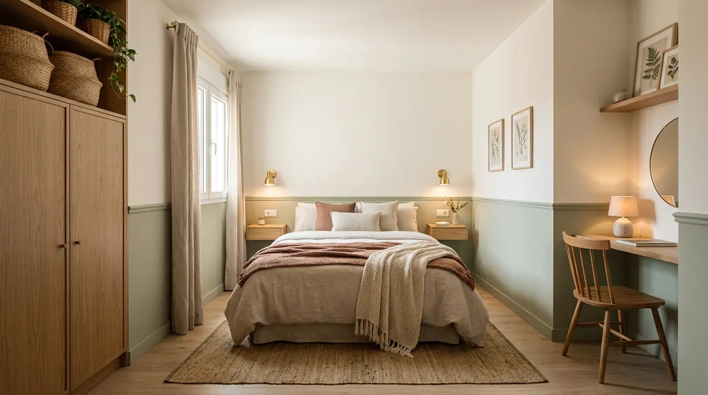
Bedrooms
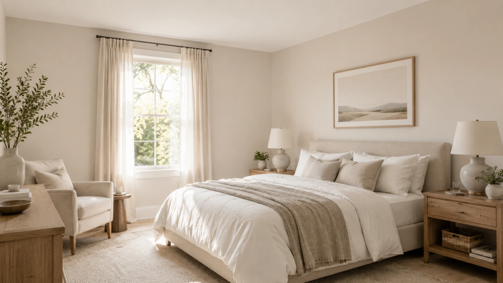
Pale Oak is close to ideal in bedrooms. The muted warmth avoids sterility without swinging into cozy-heavy territory. It creates a restful, soft atmosphere that holds up across seasons.
Particularly strong with light wood furniture, linen textiles, and warm white trim. One of the most consistent performers in this space.
Hallways and Transitional Spaces
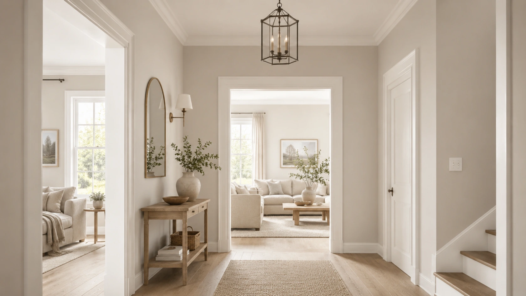
One of Pale Oak’s most underrated uses. As a connective color throughout a whole home, it maintains visual flow between rooms without reading as flat or washed out.
Consistent trim throughout, White Dove or Simply White, is important here. Trim inconsistency in hallways makes undertone shifts between rooms more obvious.
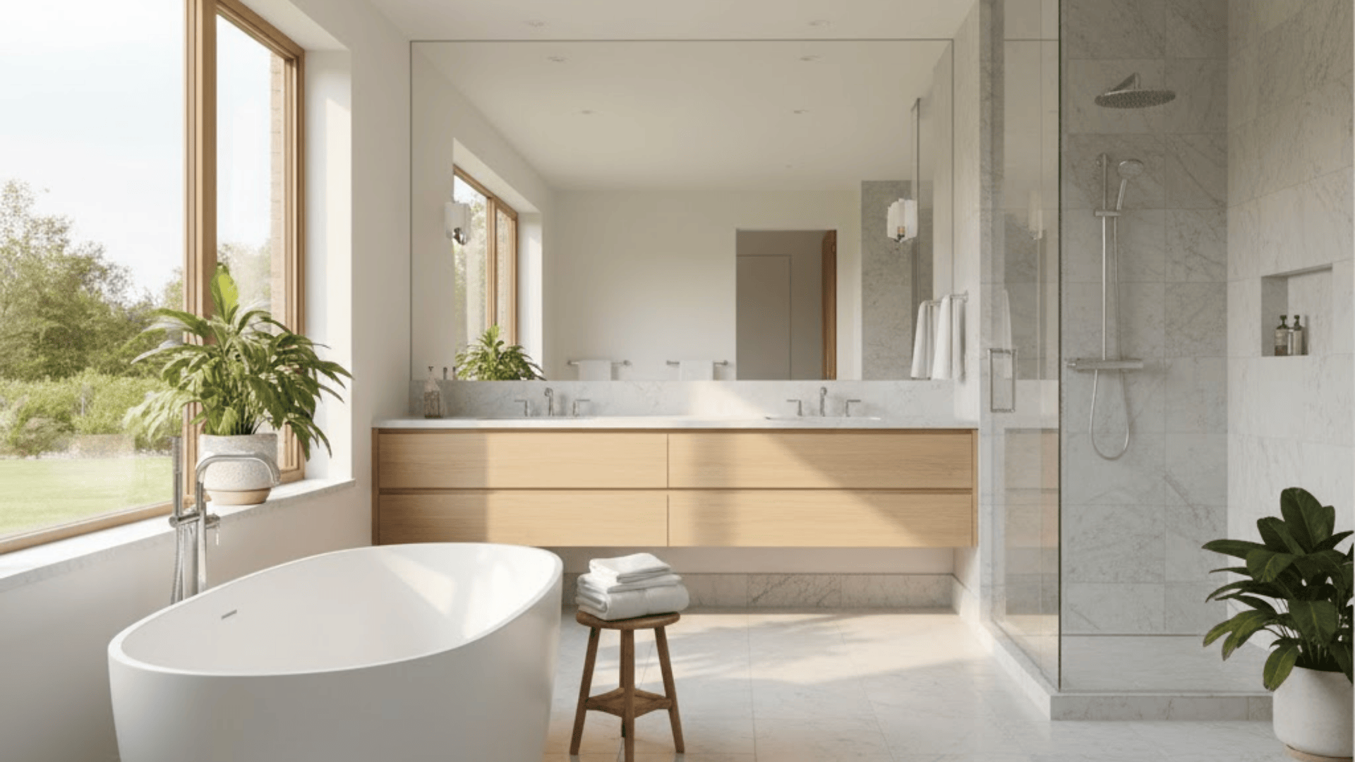
Bathrooms
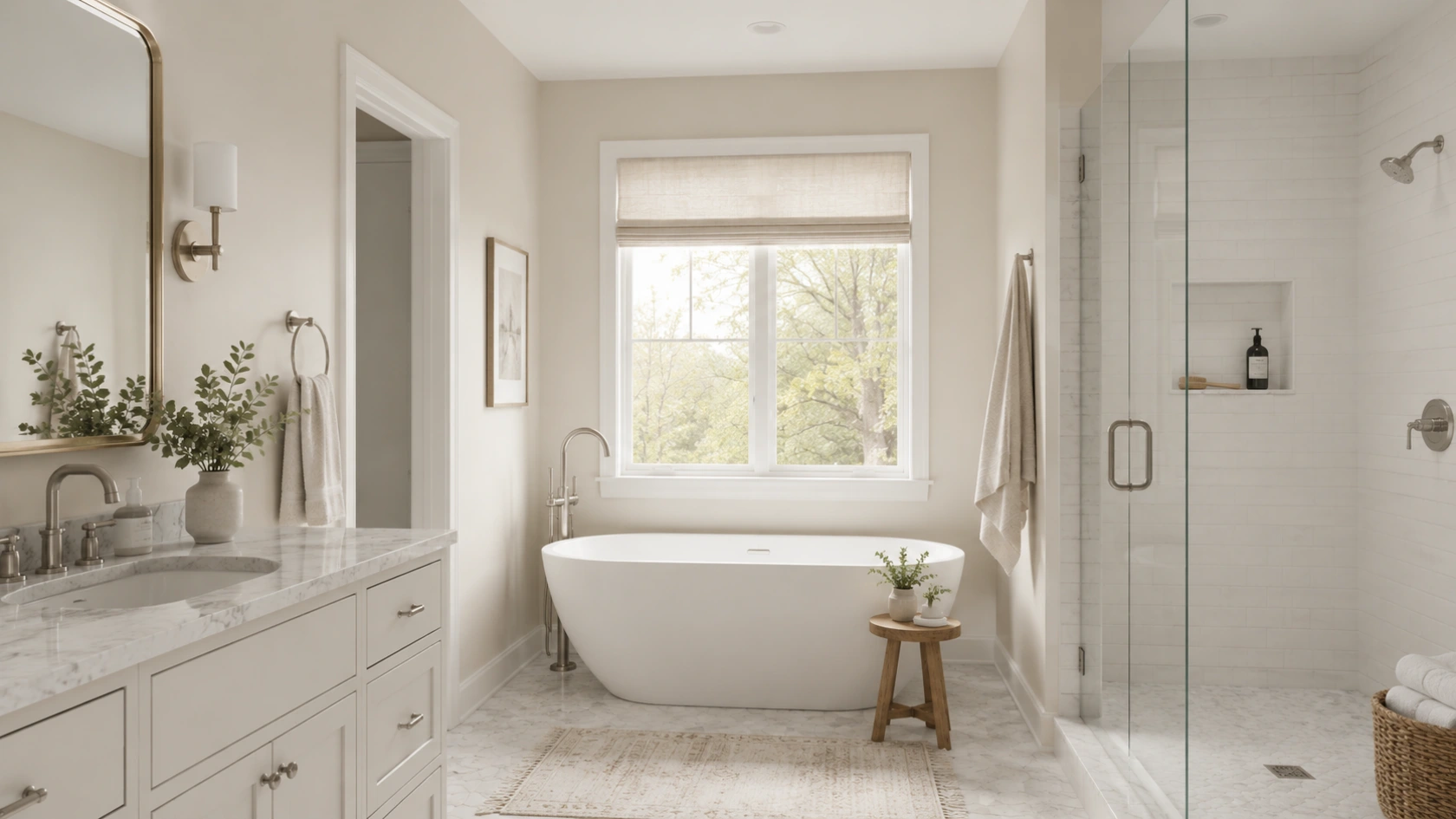
Works, but with conditions. Cool marble, white subway tile, or neutral stone, yes. Yellow-toned, terracotta, or warm beige tile, no. Bathrooms concentrate undertone reactions because the surfaces are close together and the rooms are small. The pink in Pale Oak reacts quickly and visibly to warm-toned surfaces in a confined space.
Where it doesn’t work:
- Rooms with dominant warm yellow lighting: amplify pink past the point of balance
- Spaces with red-toned or orange hardwood flooring: undertone conflict is significant and difficult to style around
- Basements or windowless rooms: without natural light, Pale Oak can read flat, slightly muddy, and lifeless
Styling Pale Oak: Floors, Trim, Metals & Furniture
Pale Oak is forgiving, but the finishes around it determine whether the overall look feels intentional or accidental.
- Light oak / white oak flooring: best pairing; keeps the warmth balanced and the space feeling airy
- Medium walnut: works well; adds depth and richness without activating the pink undertone
- Red-toned or honey oak wood: avoid; pulls out a pink undertone strongly and creates an unintended warmth conflict
- Trim: White Dove or Simply White: warm whites complement naturally; stark whites like Chantilly Lace create too much contrast and expose the undertone unfavorably
- Marble or cool quartz countertops: ideal; the gray balance in Pale Oak connects to cool stone without fighting it
- Warm-toned stone or butcher block: test carefully; can tip the room’s warmth further than expected
- Brass hardware: adds intentional warmth; works well in transitional, warm-modern, and classic interiors
- Chrome or brushed nickel: keeps the overall palette cooler; better for more contemporary or minimal interiors
- Furniture styles: transitional, Scandinavian, modern classic, and soft contemporary all work well; sharp cool-minimalist schemes with heavy gray or blue tones will fight the undertone
Good styling choices disappear into the room. The wrong ones make the undertone the loudest thing in the space.
Pale Oak Benjamin Moore vs. Similar Neutrals
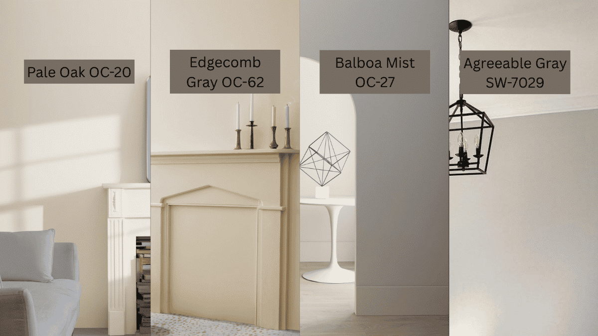
These colors are often compared because they occupy similar territory on the color spectrum, but they behave very differently under real-world conditions.
| Feature | Pale Oak OC-20 | Edgecomb Gray OC-62 | Balboa Mist OC-27 | Agreeable Gray SW-7029 |
|---|---|---|---|---|
| LRV | 69.11 | 63.43 | 73.28 | 60.05 |
| Undertone | Pink-beige, soft gray | Gray-greige, balanced | Light gray, airy | Warm greige, slight violet |
| Warmth Level | Warm | Moderate | Cool-neutral | Moderate-warm |
| Best For | Whole-home neutral | Rooms needing balance | Airy minimal spaces | Open-plan, transitional |
| Pink Risk | Moderate | Low | Low | Low |
| Brand | Benjamin Moore | Benjamin Moore | Benjamin Moore | Sherwin-Williams |
The differences look subtle on a chip. On a wall, under your specific light, with your specific floors and finishes, they are not.
Technical & Designer Notes
Product choice and finish affect how accurately Pale Oak reads on the wall; the same color, different line, different result.
- Best in Aura or Regal Select: truest color payoff, best depth and consistency across coats
- Eggshell for walls: slight sheen adds dimension and makes the color read richer; also easier to clean
- Satin for trim: holds up well and creates a subtle but clear separation from the wall finish
- Flat for ceilings: prevents light bounce that could shift the undertone perception on walls below
- Tinted primer recommended: especially important over dark walls, bare drywall, or heavy previous color
- 2 coats standard: on properly prepped and primed surfaces; a third coat is rarely needed with Aura
The right product line won’t change the color, but it will change how confidently and consistently it shows up on your wall.
Common Mistakes With Pale Oak: And How to Avoid Them
In my experience, most Pale Oak regrets trace back to the same avoidable decisions: almost always made before a single coat goes on the wall.
- Not testing in actual room light: a chip card is useless for this color; paint a 12×12 sample board and observe it at different times of day before deciding
- Pairing with yellow-toned floors: amplifies the pink undertone and makes the wall read as unintentionally warm
- Using stark white trim: creates a harsh contrast that draws attention to the undertone in an unflattering way
- Choosing cool-white LEDs to “fix” warmth: flattens the color rather than balancing it; address warm surfaces instead
- Using in basements or windowless rooms: reads muddy and flat without sufficient natural light; consider a lighter or cooler neutral in these spaces
- Trusting the paint chip: Pale Oak is one of those colors that shifts significantly between chip and wall; sampling is non-negotiable
Most of these mistakes share one root cause: skipping the sample step and trusting the chip. A $10 sample pot is cheap insurance on a whole-room decision.
Frequently Asked Questions
Can Pale Oak be used on exteriors?
It can work on exteriors, particularly on siding for craftsman or cottage-style homes. The warmth reads well in natural daylight. Always test on a large surface area first; exterior light varies significantly more than interior light, and the pink undertone can behave unexpectedly.
Does Pale Oak work with cool gray furniture?
It can, but with caution. Cool gray furniture will visibly contrast with the pink-beige undertone. A warm white trim acts as a bridge between the two tones. The more gray-dominant the furniture, the more the undertone becomes the focal point of the room.
How does Pale Oak hold up in high-traffic areas?
Color performance in high-traffic spaces depends on finish, not hue. In eggshell or satin, Pale Oak holds up well and cleans without streaking or dulling. Flat finish is not recommended for hallways, family rooms, or anywhere that sees regular contact with walls.
Is Pale Oak a good choice for rental or resale properties?
It is one of the stronger choices for resale, warm, broadly appealing, and non-polarizing to most buyers. It also photographs well in listing photos, which matters more than most sellers realize. Avoid it only if the property has heavy warm-wood finishes throughout that could create undertone conflict.
Does Pale Oak look different on walls versus cabinets?
Yes, noticeably. On cabinets, the higher sheen level makes the pink undertone read more prominently. It is a less common cabinet color for this reason. Test a full cabinet door panel before committing; it will look meaningfully different from the same color on a flat wall.
The Last Coat
Pale Oak Benjamin Moore OC-20 earns its reputation, but only when you understand what you’re actually working with. It is not a simple, grab-and-go neutral.
The pink-beige undertone is real, light direction matters, and the finishes around it either support it or work against it.
Everything in this review, from lighting behavior to pale oak coordinating colors to the comparison table, points toward the same conclusion: sample it first, test it in your actual room, and make decisions based on what you see on the wall rather than what’s on the chip.
I’ve watched this color work beautifully in the right conditions and fall flat in the wrong ones. The difference is always preparation. If you’ve used Pale Oak in your home, drop a comment with your room direction; it helps others make a more informed call.