Warm, sandy, and perfectly soft. In three words, that is Sherwin-Williams’ Sashay Sand SW 6051. However, choosing a wall colour is never that easy, is it? The swatch looks fantastic when you hold it up.
It reads entirely differently after you paint the wall. Your furniture collides, the light changes, and you start over. People are often pleasantly surprised by Sashay Sand.
It is one of those uncommon hues that improves throughout the day. We go over everything in this blog, including its specifications, undertones, and ideal rooms.
Sashay Sand SW 6051: Color Basics
Before looking at room ideas and color pairings, it helps to understand what this color actually is. Here is a quick breakdown of Sashay Sand SW 6051 by the numbers.
| Specification | Details |
|---|---|
| Color Name | Sashay Sand |
| Color Code | SW 6051 |
| HEX Code | #CFB4A8 |
| RGB Values | R: 207, G: 180, B: 168 |
| LRV (Light Reflectance Value) | 49 (Medium range) |
| Hue Angle | 18 to 19 degrees |
| Color Temperature | Warm |
| Tone | Mid-tone |
| Chroma (Color Intensity) | 12.56 (Low, soft, and muted) |
| Color Family | Red (Sherwin-Williams classification) |
| Undertones | Soft pink and light gray |
| Best Used In | Living rooms, bedrooms, bathrooms, kitchens, exteriors |
Now that the numbers are clear, let us talk about what this color actually looks and feels like in a real space.
What Is Sashay Sand by Sherwin-Williams?
Sashay Sand SW 6051 is a warm, beige-pink paint color that sits in Sherwin-Williams’ Red color family.
It was named the April 2024 Color of the Month, reflecting how well it fits current design preferences. It works on both interior and exterior surfaces.
The color sits between a soft, sandy neutral and a quiet rose tone, warm without being loud and personal without being overpowering.
How Light Affects Sashay Sand?
Light changes how any paint color reads on a wall. Understanding Sashay Sand SW 6051’s LRV helps you know what to expect before the first coat goes on.
- LRV value: The LRV is 49, placing it in the medium range on a scale from 0 (pure black) to 100 (pure white).
- What medium LRV means for your room: It reflects about half the light that hits the surface, so it will not brighten a dark room dramatically, nor weigh down a bright one.
- In natural light: The pink undertone becomes more visible, and the color reads warmer throughout the day.
- In artificial light, The gray undertone becomes stronger, making Sashay Sand feel more neutral and subdued.
- In north-facing rooms: The color tends to feel slightly cooler and more muted. Pair it with white trim to keep it from feeling heavy.
- In south-facing rooms: Expect the warmth and pink notes to show more clearly from morning to evening.
Pro Tip: Interior designers generally consider LRV values between 40 and 60 as safe choices. They add depth without going too dark for most room types.
What Does Sashay Sand Look Like in Different Rooms?
Color behaves differently in every room. Here is how Sashay Sand SW 6051 looks and performs in the most common areas of a home.
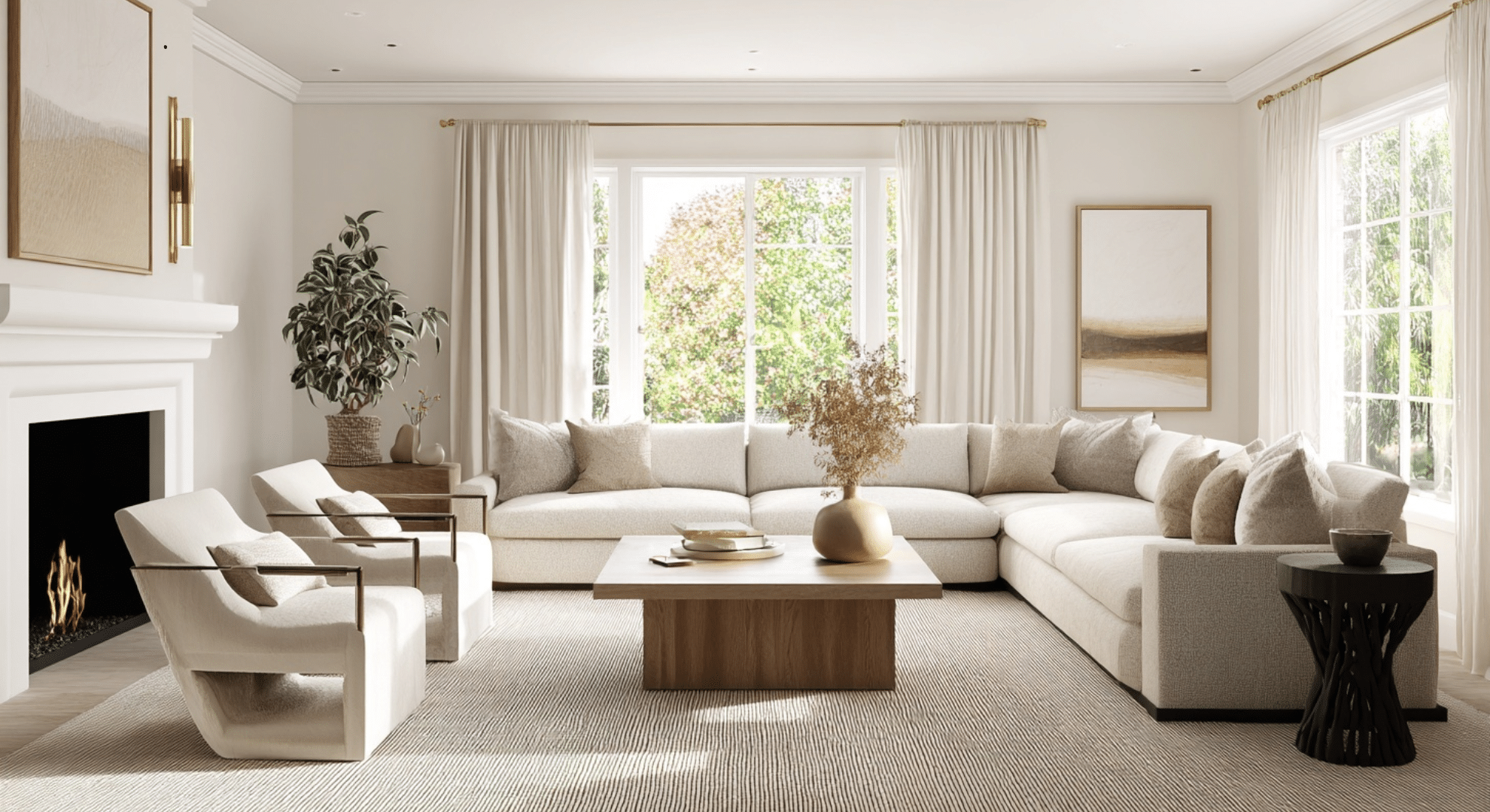
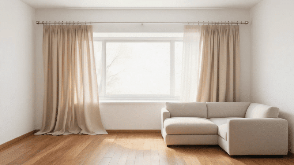
1. Living Room
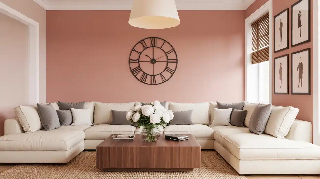
Sashay Sand creates a warm, welcoming feel in living spaces. It works well with plush neutral-toned furniture, textured throws, and warm metallic accents like brushed gold or bronze.
Pair it with soft white trim like Alabaster (SW 7008) to keep the space feeling fresh and light.
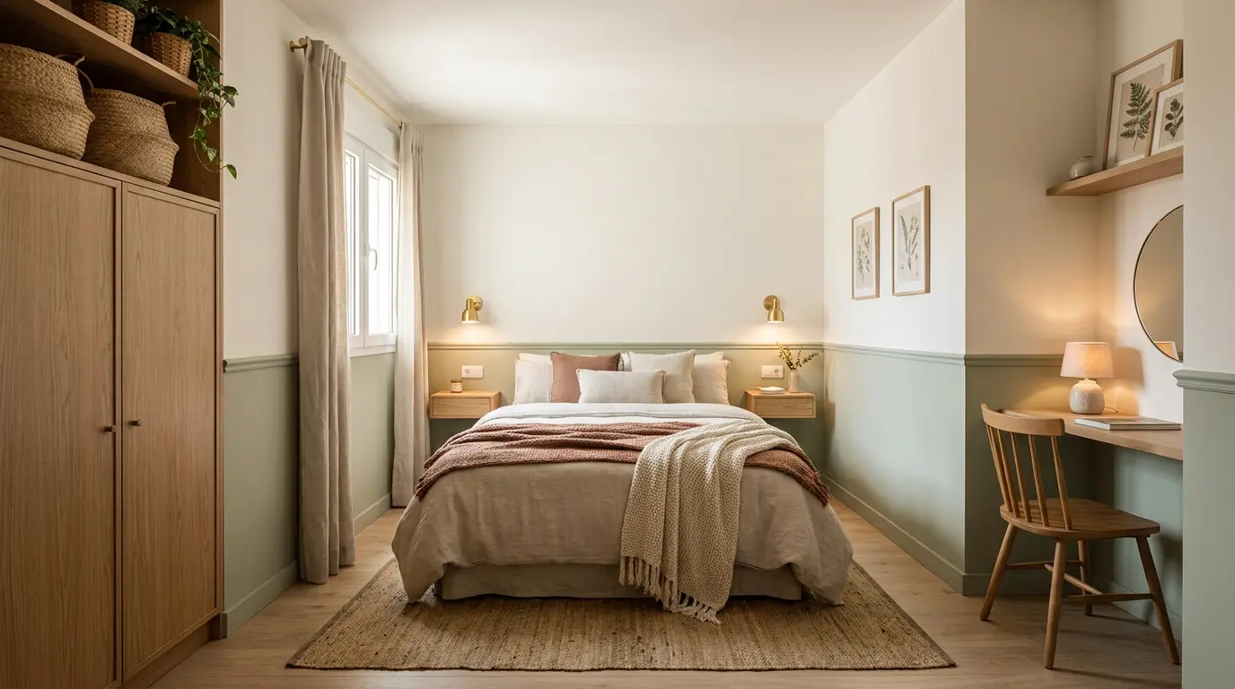
2. Bedroom
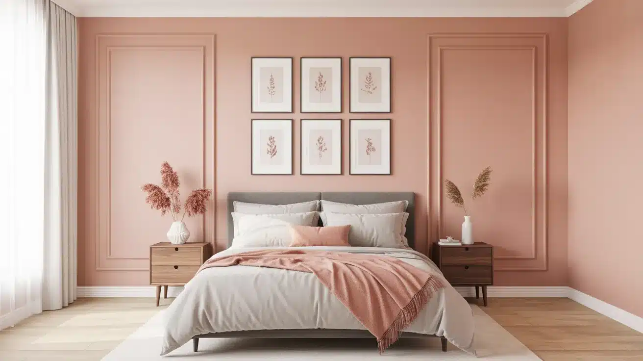
The soft pink undertone gives bedrooms a calm, restful quality that is hard to replicate with a flat neutral.
It pairs naturally with creamy white bedding and linen curtains, and works for both adult rooms and children’s rooms. Blush or terracotta accessories bring out the warmth in the color.
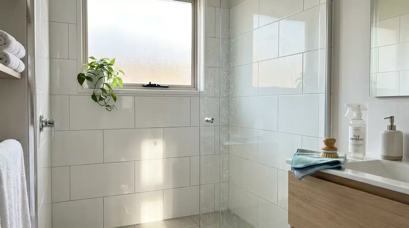
3. Bathroom
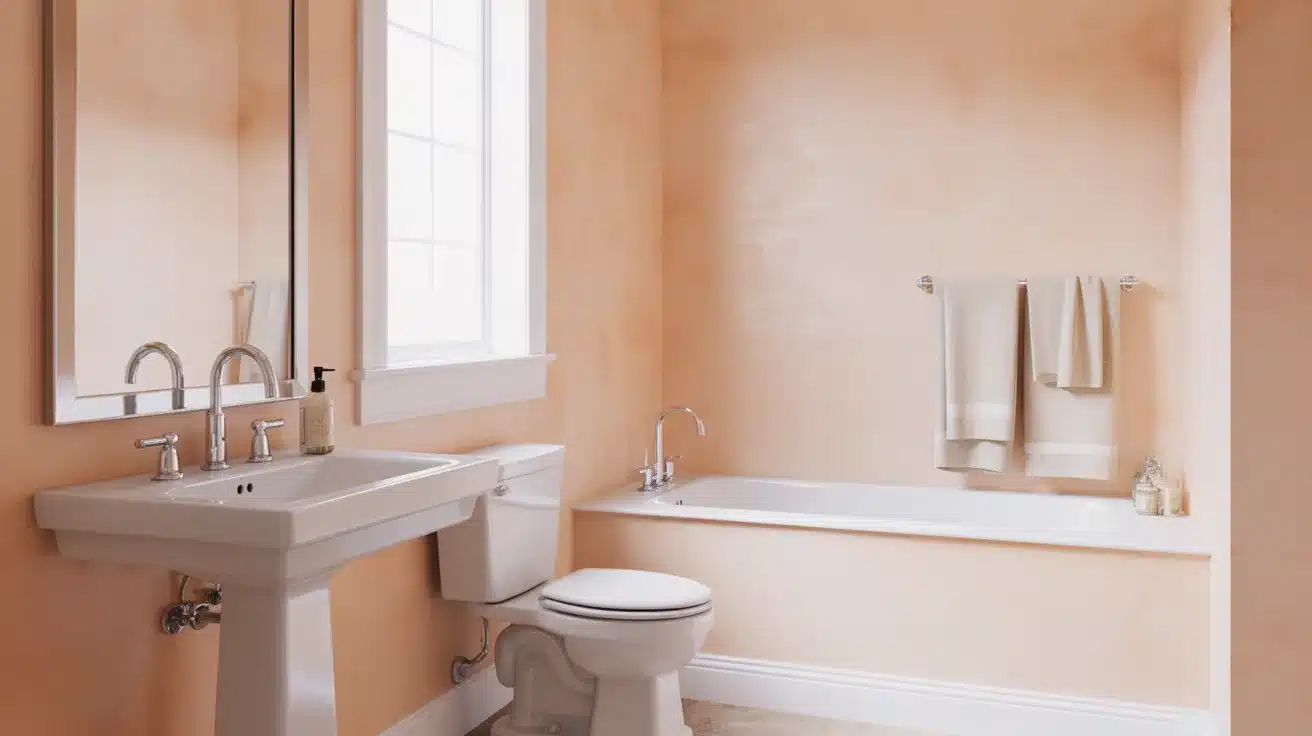
In a bathroom, Sashay Sand adds warmth without making the space feel closed in. It pairs well with crisp white tiles, soft gray stone accents, and black or brushed-nickel fixtures for a clean, grounded contrast.
4. Kitchen
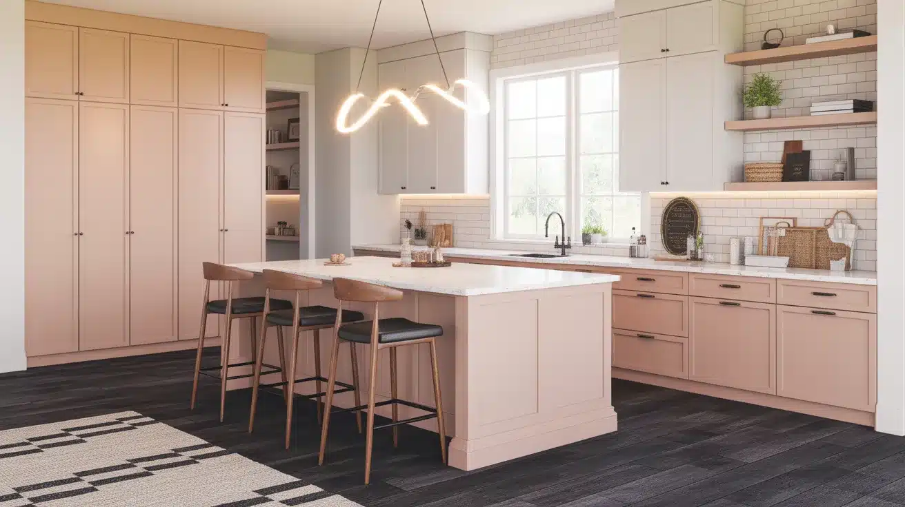
Sherwin-Williams itself recommends Sashay Sand for kitchens. It suits light wood cabinets, open shelving, and vintage-style hardware well.
Soft white upper cabinets with Sashay Sand on the lower walls or island create a warm, layered finish.
5. Exterior

Used on exterior walls, Sashay Sand gives a home a soft, sandy finish that feels natural against outdoor surroundings.
It works best with white or cream trim and natural wood accents, and suits cottage-style, farmhouse, or transitional architectural styles.
Best Colors That Go With Sashay Sand SW 6051
Picking the right colors to pair with Sashay Sand makes all the difference. Here are the pairings that work, grouped by the look you are after.
Coordinating Colors:
| Color Name | SW Code | Best Used For |
|---|---|---|
| Alabaster | SW 7008 | Trim, ceilings, cabinetry |
| Gorgeous White | SW 6049 | Ceilings, adjacent walls |
| Steamed Milk | SW 7554 | Accent walls, adjoining rooms |
| Accessible Beige | SW 7036 | Open-plan spaces |
| Cocoa Berry | SW 9078 | Accent wall, furniture |
| Naval | SW 6244 | Accent wall, cabinetry, front door |
| Iron Ore | SW 7069 | Trim, window frames |
| Evergreen Fog | SW 9130 | Accent wall, kitchen cabinets |
| Smoky Salmon | SW 6321 | Soft furnishings, decor accents |
| Urbane Bronze | SW 7048 | Furniture, accent pieces |
Colors to Avoid:
| Color Type | Why |
|---|---|
| Cool blue-based grays | Clash with the warm pink undertone |
| Bright saturated colors | Overpower the soft, muted quality |
| Cool-toned stark white | Makes Sashay Sand look yellow by contrast |
Sashay Sand for Different Interior Design Styles
One of the strongest qualities of Sashay Sand SW 6051 is its ability to blend seamlessly with various design styles. Here is a look at where it works best.
- Modern Farmhouse Pairs well with shiplap walls, white trim, natural wood beams, and simple black metal fixtures.
- Mid-Century Modern. The warm, vintage quality of Sashay Sand works beautifully with retro furniture shapes and rich wood tones.
- Transitional sits comfortably between traditional and contemporary, suits spaces that mix old and new elements.
- Scandinavian (Scandi) works as a warm neutral base alongside minimal furniture, light wood floors, and clean lines.
- Traditional / Classic Complements antique furniture, warm wood floors, brass fixtures, and layered soft furnishings.
- Modern Minimalist Acts as a soft, warm backdrop that keeps the space feeling calm without adding visual noise.
- Coastal / Cottage The sandy, beige-pink tone ties naturally into light, airy coastal palettes with white and natural textures.
Sashay Sand vs. Similar Sherwin-Williams Colors
Sashay Sand is not the only warm neutral in the Sherwin-Williams lineup. Here is how it stacks up against the colors that are most often compared to it.
1. Abalone Shell (SW 6050)
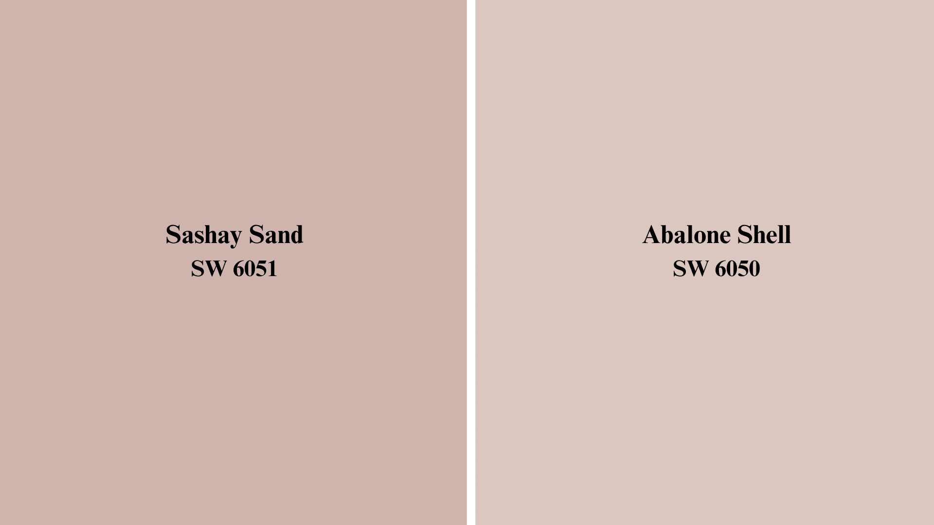
Abalone Shell sits right next to Sashay Sand on the color strip and has a higher LRV. It reads more gray and less pink, making it a cooler and more subdued option. Choose it if you want the warmth of Sashay Sand without the rosy shift.
2. Reddened Earth (SW 6053)
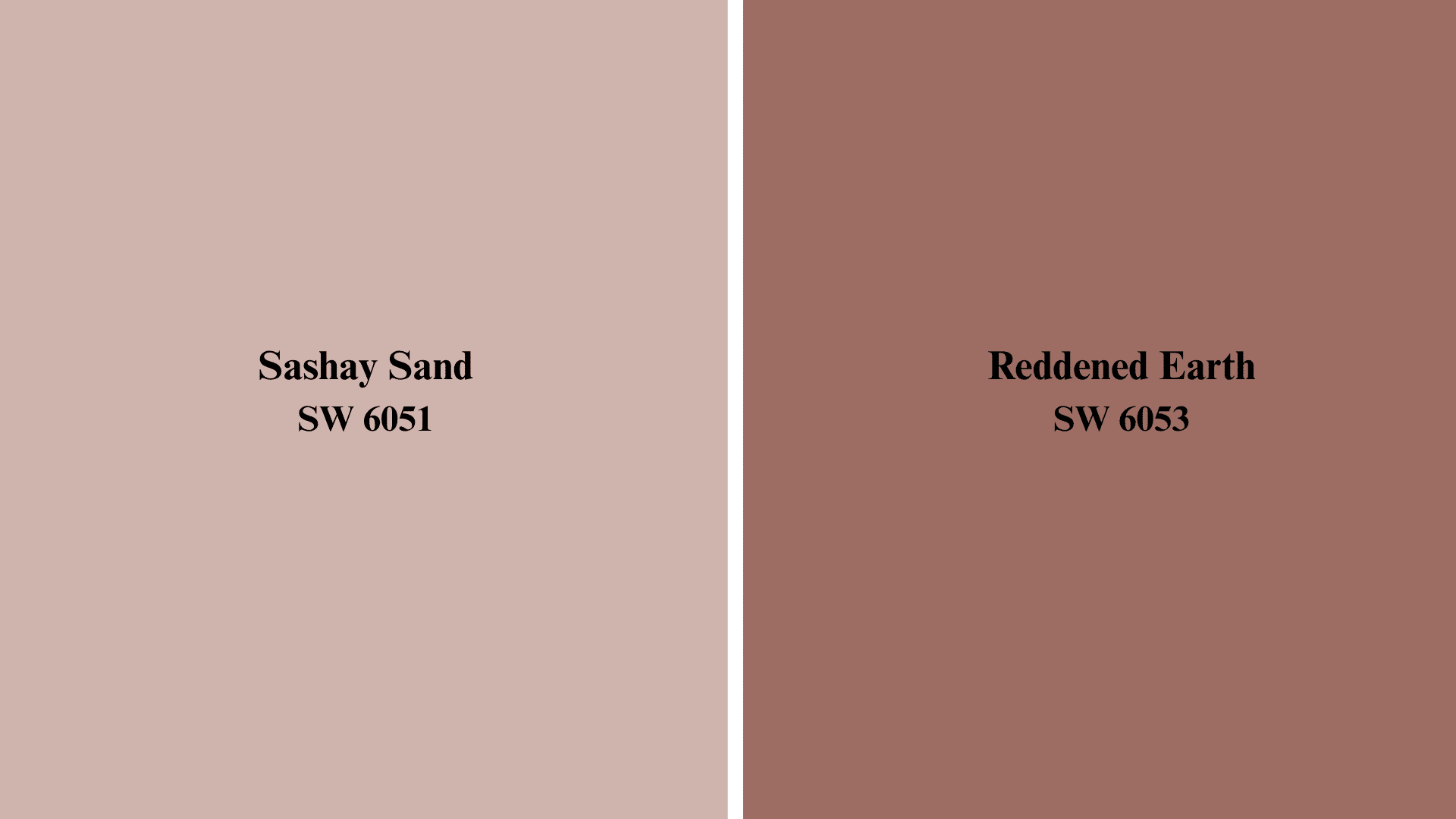
Reddened Earth carries a deeper, more terracotta tone with a lower LRV. It holds more visual weight than Sashay Sand and feels more grounded. It suits spaces where you want a stronger color presence without going fully dark.
3. Likeable Sand (SW 6058)
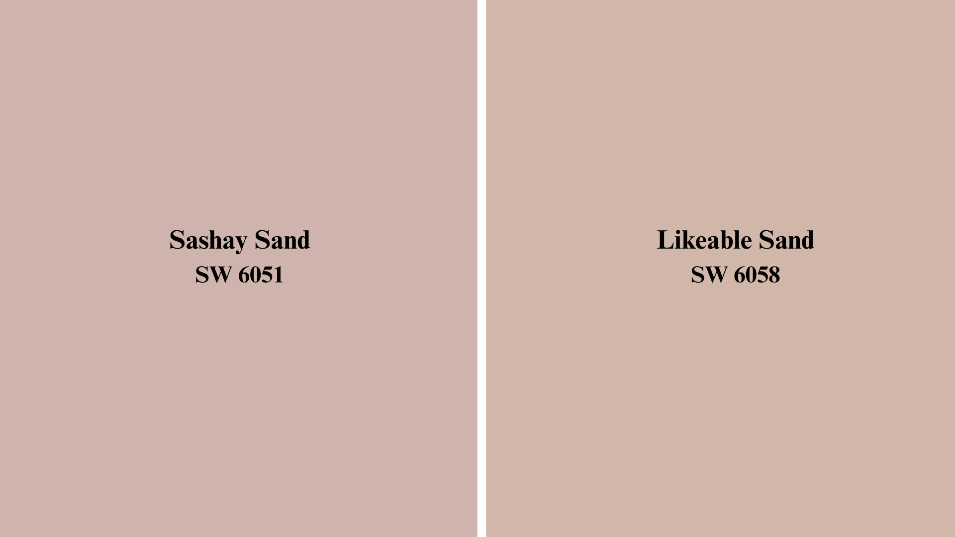
Likeable Sand is a more straightforward warm beige with less pink influence. It reads as approachable and neutral in nearly any room. If the pink notes in Sashay Sand feel too strong for your space, Likeable Sand is a more restrained pick.
4. Artistic Taupe (SW 6030)
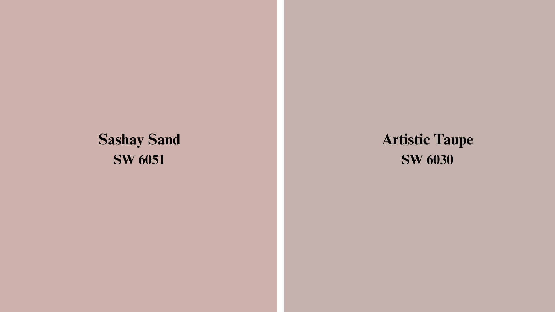
Artistic Taupe has a lower LRV and a calmer, more intimate feel. It works well in smaller spaces or rooms where you want a cozy, enclosed atmosphere. Sashay Sand is the better choice when you need more light reflection.
Tips for Sampling and Testing Sashay Sand at Home
A paint swatch in the store looks nothing like a painted wall at home. Here are the steps to test Sashay Sand SW 6051 the right way before you commit to a full room.
- Get a physical sample: Pick up a paint sample from a Sherwin-Williams store before buying a full can.
- Paint directly on the wall: Apply the sample on your actual wall, not on white paper held up against it.
- Use a large patch: Paint at least a 12×12-inch section so you can see how the color reads at scale.
- Check it at different times of day: Look at the patch in the morning, afternoon, and under your evening lights.
- Let it dry fully: Wet paint always reads darker than dry paint, so judge the color only after it has completely dried.
- Compare against existing materials: Hold it near your floors, furniture, and trim before making a final call.
- Note your light source: Warm incandescent bulbs bring out the pink undertone; cool LED bulbs push it toward a soft, neutral beige.
Is Sashay Sand Right for Your Space?
For the majority of rooms and homeowners, Sashay Sand SW 6051 is a great option. Because of its medium LRV of 49, it can function in a variety of lighting situations without becoming overly washed out or dark.
Spaces that require more than a simple neutral but not a full colour can benefit from the warm beige-pink tone. It works well in kitchens, bathrooms, living rooms, bedrooms, and even outside walls.
The one thing to keep an eye out for is the pink undertone of your current floors and furniture, which tends to be cool or grey. Try it first. Most of the time, it will perform better than you anticipated.
Final Thoughts
The colour Sashay Sand SW 6051 is not very striking. It doesn’t make an effort to command attention. However, it gives any space it’s in a sense of cosiness, complexity, and quiet personality.
It holds its own from the living room to the outside, from the kitchen to the bedroom. The LRV pairs with more colours than most people anticipate, sits squarely in the middle, and has undertones that change with the light.
Order a sample and hang it on your wall if you have been unsure. The colour is self-explanatory. Have you tried it at home? Tell us which