Sage is that soft, earthy green you see in dreamy minimalist spaces and those perfectly curated mood boards.
This beautifully muted shade blends green with whispers of gray and brown, taking its name from the silvery herb that graces kitchen windowsills everywhere.
Sage has become the darling of interior designers, brand creators, and fashion lovers alike, bringing a sense of calm serenity wherever it appears.
There’s something deeply appealing about how this understated hue shapes spaces and palettes, creating that effortlessly chic aesthetic we all crave.
It’s no wonder Sage keeps popping up in our feeds and our homes.
What Color is Sage?
Sage sits in that sweet spot between green and gray, offering a muted, calming presence that feels both natural and refined.
Unlike the brightness of mint or the richness of olive, sage carries those signature gray and brown undertones that give it a softer, more grounded quality.
In real life, you’ll notice sage can lean silvery and cool or take on warmer, earthier notes depending on the lighting.
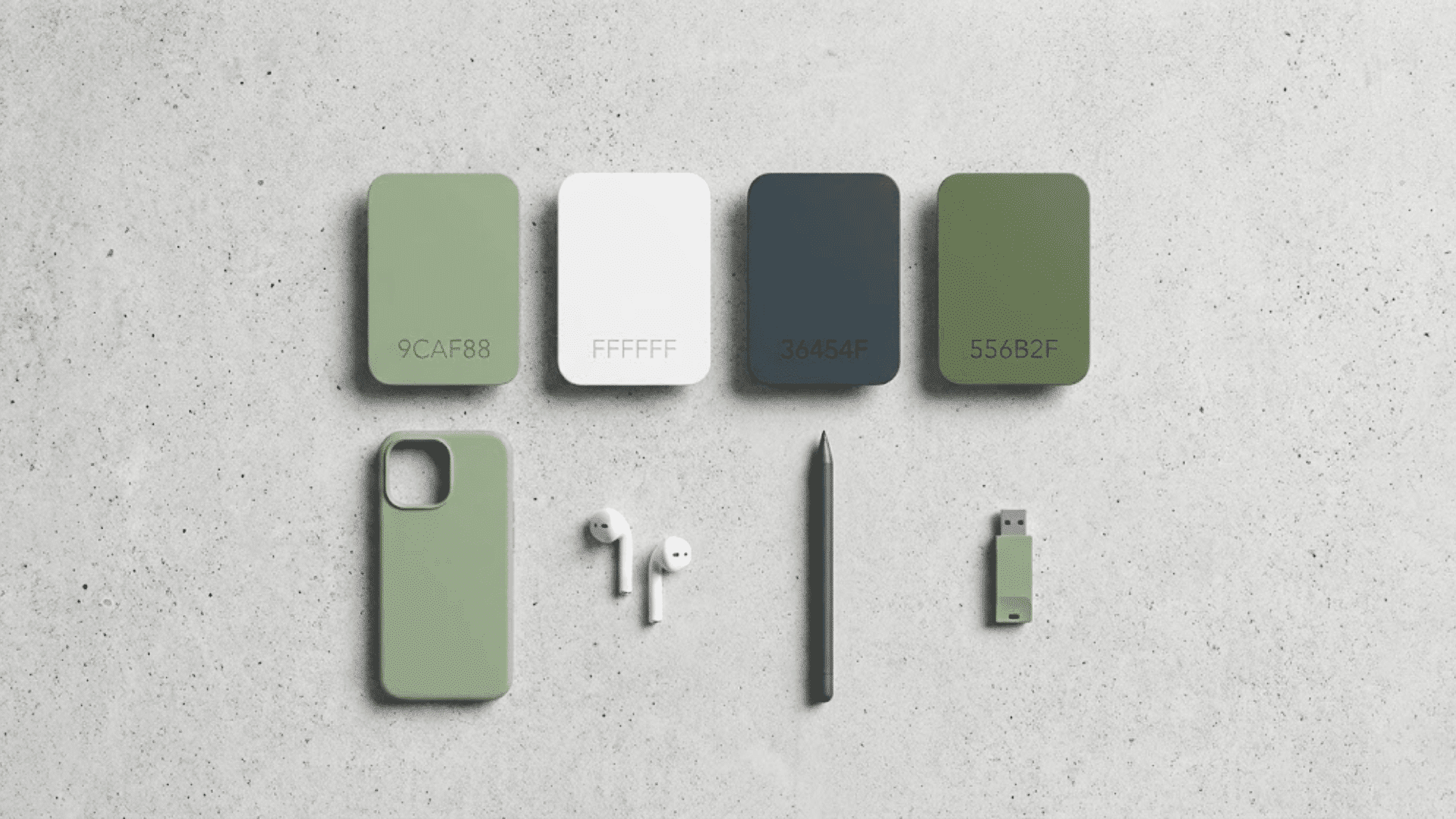
Common Sage Color Values:
- HEX: #9CAF88
- RGB: 156, 175, 136
- CMYK: 25, 0, 35, 15
- HSL: 89°, 20%, 61%
These values serve as a baseline, though sage naturally varies across different shades and applications.
Sage in Color Psychology
Sage carries a quiet power in color psychology, evoking feelings of calm, peace, and connection to nature.
This gentle hue symbolizes balance, growth, and harmony, making it a natural choice for wellness spaces and sustainability-focused brands.
When you see sage in mindful branding contexts, it instantly communicates authenticity and intentionality.
The color’s roots run deep through history, where the sage plant itself represented purity and wisdom across cultures for centuries.
Today, that same essence translates into modern design, offering a visual breath of fresh air that soothes the mind and grounds the spirit in our fast-paced world.
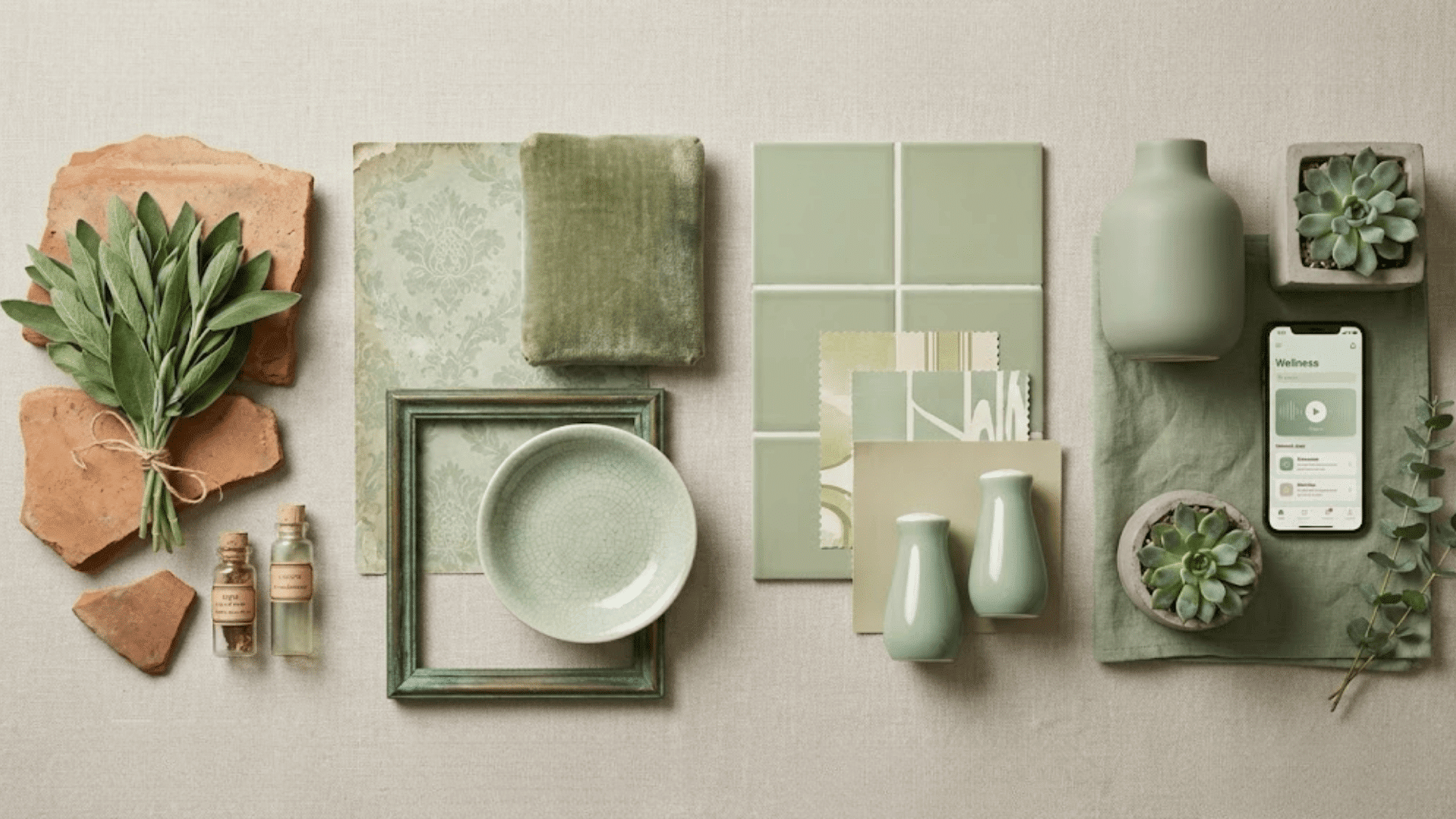
Sage Color Palettes
Sage’s versatility shines when paired with the right companions. From calm neutrals to bold contrasts, these curated palettes show how sage adapts beautifully across different moods and aesthetics.
1. Classic & Neutral Palettes
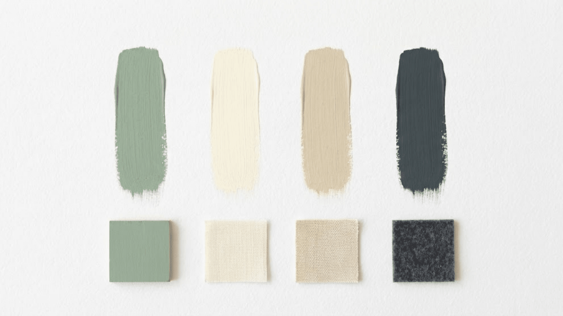
These enduring combinations create serene, refined spaces that never go out of style. Sage grounds neutral tones while adding just enough color to keep things interesting.
| Palette | Colors | Vibe | Best For |
|---|---|---|---|
| Sage + Cream | 9CAF88 + FFFDD0 | Soft, airy, and effortlessly polished | Bedrooms, minimal branding |
| Sage + Beige | 9CAF88 + F5F5DC | Warm, cozy, and naturally inviting | Living rooms, cafes |
| Sage + Charcoal | 9CAF88 + 36454F | Modern, grounded, with subtle contrast | Offices, contemporary spaces |
2. Earthy & Organic Palettes
Nature-inspired pairings that feel grounded and authentic. These combinations bring the outdoors in with warmth and texture.
| Palette | Colors | Vibe | Best For |
|---|---|---|---|
| Sage + Terracotta | 9CAF88 + E2725B | Warm, earthy, and richly layered | Boho interiors, artisan brands |
| Sage + Sand | 9CAF88 + C2B280 | Desert-inspired and beautifully muted | Spas, wellness spaces |
| Sage + Olive | 9CAF88 + 808000 | Botanical, lush, and deeply organic | Gardens, eco-brands |
3. Soft & Romantic Palettes
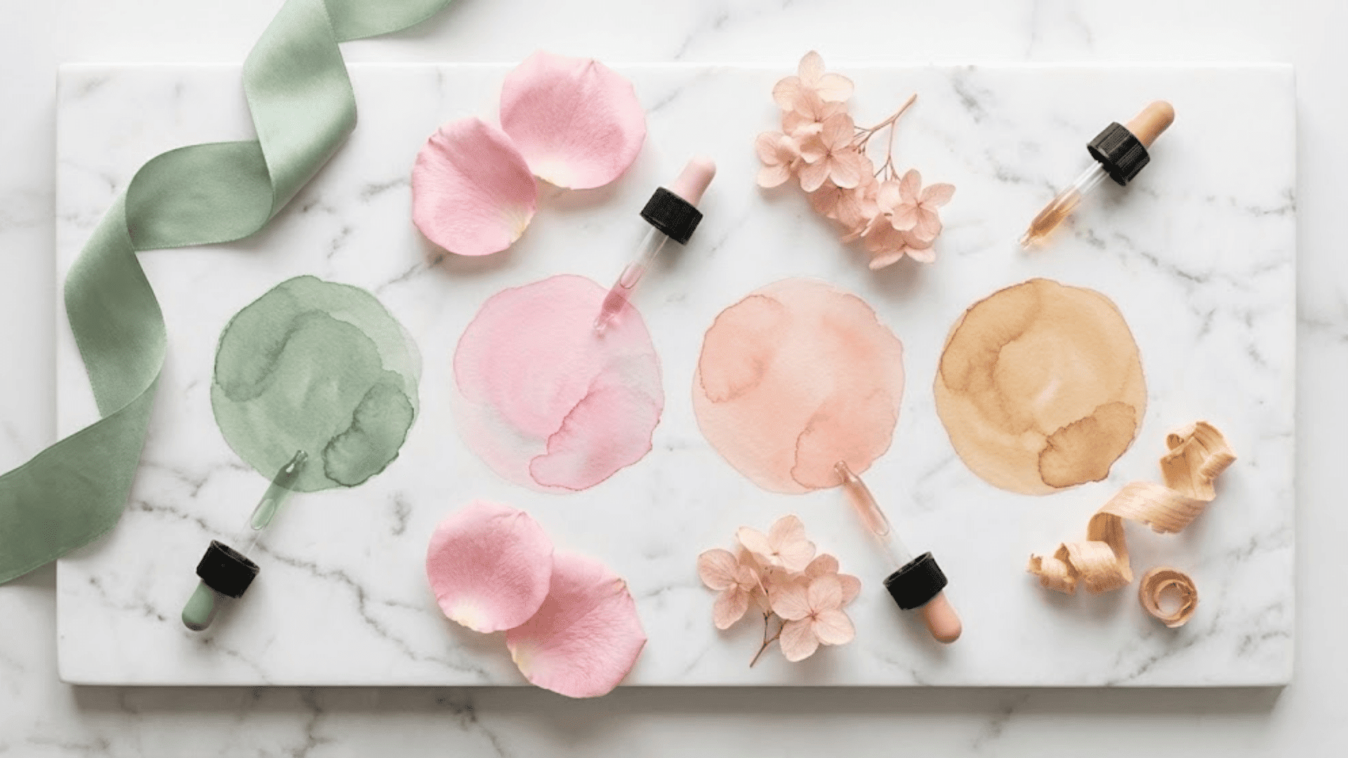
Gentle, dreamy combinations perfect for creating tender, inviting atmospheres. These pairings feel soft without being overly sweet.
| Palette | Colors | Vibe | Best For |
|---|---|---|---|
| Sage + Pastel Pink | 9CAF88 + FFD1DC | Whimsical, gentle, and incredibly soothing | Nurseries, feminine brands |
| Sage + Blush | 9CAF88 + FEC5BB | Romantic, warm, and softly feminine | Weddings, beauty packaging |
| Sage + Light Wood | 9CAF88 + D4A574 | Natural, cozy, and Scandinavian-inspired | Kitchens, minimalist homes |
4. Vibrant Accent Schemes
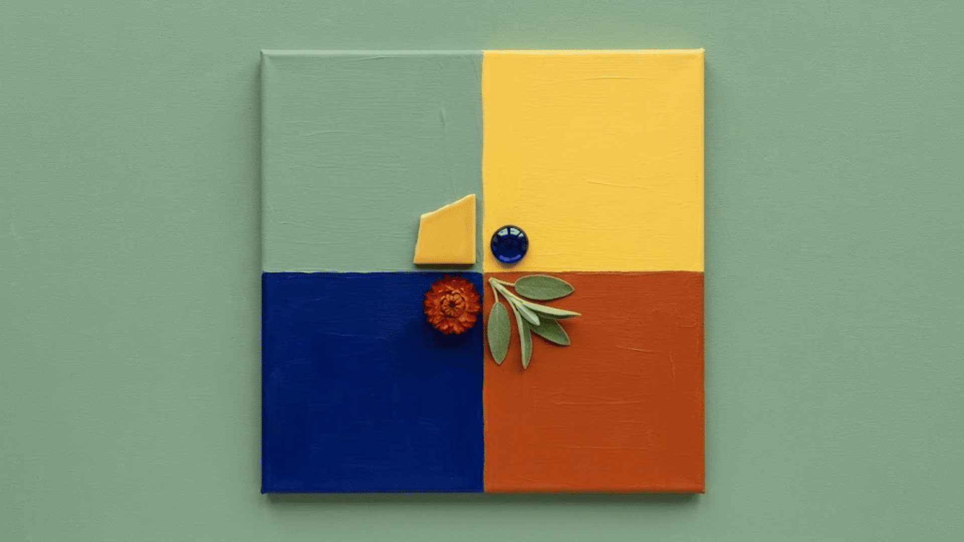
Bold pairings that let sage play the supporting role while brighter hues take center stage. These combinations add energy and personality.
| Palette | Colors | Vibe | Best For |
|---|---|---|---|
| Sage + Mustard | 9CAF88 + FFDB58 | Playful, retro, and surprisingly fresh | Creative studios, casual dining |
| Sage + Navy | 9CAF88 + 000080 | Classic, crisp, with coastal appeal | Marine themes, professional sites |
| Sage + Rust Orange | 9CAF88 + B7410E | Warm, autumnal, and richly saturated | Fall collections, vintage shops |
5. UI & Digital Palettes
Sage works beautifully in digital design as a muted background color or for subtle UI elements.
Its low saturation reduces eye strain while maintaining visual interest, making it ideal for wellness apps, sustainable brand websites, and minimalist interfaces.
Use sage for menu bars, card backgrounds, or icon accents paired with crisp white text and darker green or charcoal for buttons and calls to action.
How to Pair Sage with Other Colors?
Sage plays well with others thanks to its neutral base. For complementary contrast, pair it with soft mauves or dusty purples that sit opposite on the color wheel.
Analogous schemes work beautifully, too, combining sage with neighboring hues like olive, mint, or soft yellows for a naturally cohesive flow.
High-contrast looks pair sage with deep charcoal or crisp white for drama, while tonal approaches layer multiple muted greens and beiges for a whisper-soft effect.
The key is balancing saturation levels. Keep companions equally muted for harmony, or let one bold accent pop against the sage’s quiet backdrop.
Practical Uses of Sage in Design
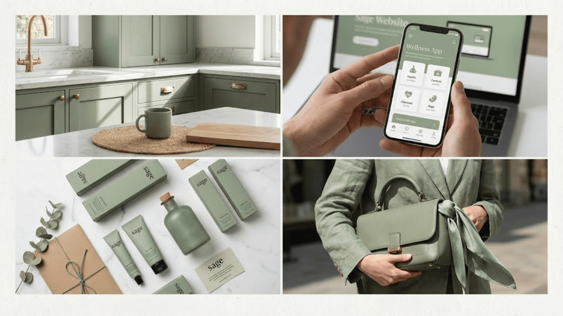
Sage translates beautifully across mediums, from the walls of your home to the pixels on your screen. Here’s how designers are putting this versatile hue to work in real-world applications.
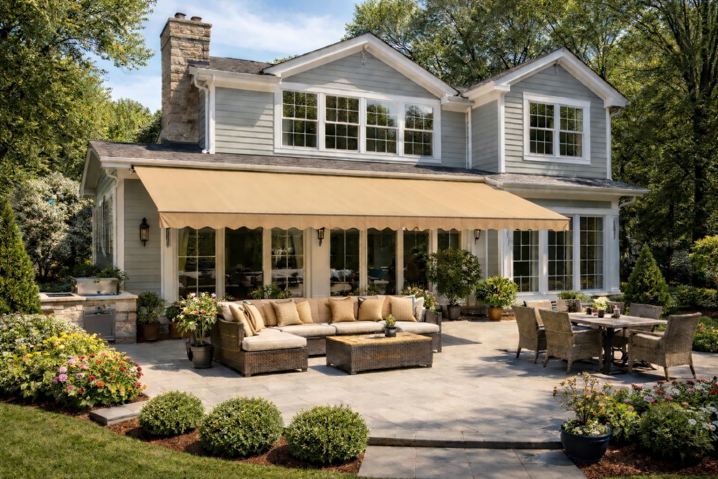
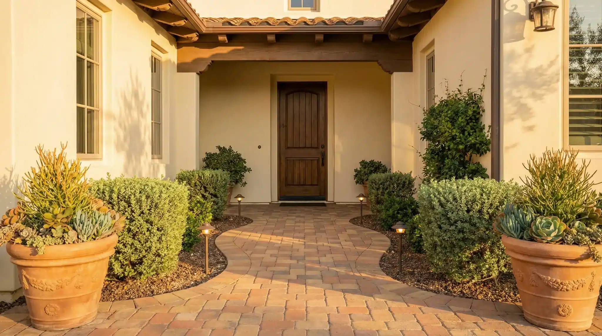
1. Interior Design
Sage brings instant serenity to interior spaces, working gorgeously on accent walls, kitchen cabinets, or upholstered furniture.
The color pairs effortlessly with natural wood tones, from light oak to walnut, while brass and matte black metals add just the right amount of contrast.
Layer in linen textiles, jute rugs, and ceramic accents to build texture. For a bolder statement, try sage on cabinetry with marble countertops, or keep it subtle with sage throw pillows against neutral upholstery.
2. Graphic & UI/UX Design
In digital spaces, sage serves as a calming background that won’t compete with content. Use it for card backgrounds, subtle gradients, or muted icon fills in wellness and lifestyle apps.
For accessibility, pair Sage with dark charcoal text for sufficient contrast ratios. Avoid sage-on-white text combinations as they often fail WCAG standards.
The color works particularly well in hero sections, providing breathing room while maintaining visual interest without overwhelming users or detracting from calls to action.
3. Branding & Packaging
Sage communicates authenticity, mindfulness, and environmental consciousness, making it a go-to for brands in wellness, organic beauty, sustainable fashion, and artisan food sectors.
The color feels premium without being pretentious, approachable without being casual. On packaging, sage conveys natural ingredients and ethical practices, resonating deeply with conscious consumers.
Brands using sage often attract audiences who value quality, sustainability, and intentional living. Pair it with kraft paper textures or minimalist typography for maximum impact.
4. Fashion & Lifestyle
Sage has found its moment in fashion, appearing in everything from flowing maxi dresses to structured blazers and cozy knitwear. The color flatters a wide range of skin tones and transitions seamlessly between seasons.
You’ll spot sage in accessories too: leather handbags, silk scarves, and ceramic homeware all benefit from its understated appeal.
The hue photographs beautifully, making it a favorite for lifestyle brands and influencers creating that coveted Pinterest-worthy aesthetic.
Choosing the Right Sage Shade
Not all sage greens are created equal. The perfect shade depends on your space’s lighting, existing finishes, and the mood you want to create.
- Identify the Undertone: Cool sages lean blue-gray, warm ones pull yellow-brown, and balanced versions sit right in the middle with equal parts gray and green.
- Test in Natural Light: Paint swatches on different walls and observe how they shift from morning sun to evening glow throughout the day.
- Consider Your Finishes: Sage with warm undertones complements brass and wood, while cool sages pair beautifully with chrome and marble.
- Check Against Your Palette: Hold fabric samples, flooring, and existing furniture against your sage swatch to ensure harmony.
- Go Lighter than You Think: Sage often reads darker on walls than on a small chip, so test one shade lighter than your initial choice.
The right sage will feel like it belongs in your space from the moment you see it in context, creating that cohesive flow you’re after.
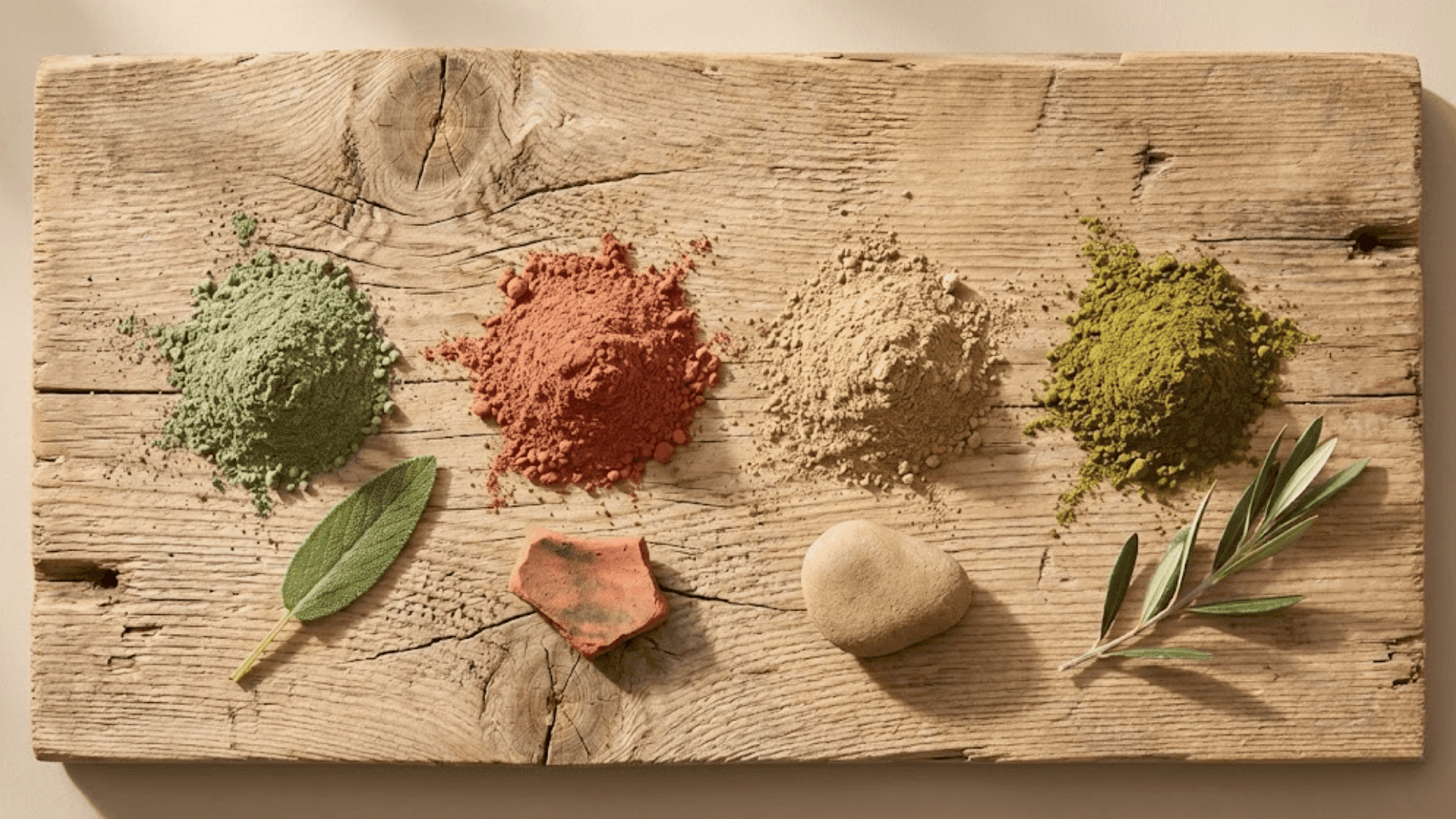
Sage Through Time & Culture
Sage takes its name from the silvery-green herb prized for centuries across Mediterranean and Native American cultures.
While the plant symbolized wisdom and healing, the color itself gained traction in Victorian-era interiors before fading into the background.
Sage made a quiet comeback in mid-century design, appearing in muted kitchen palettes and pastoral wallpapers.
Fast forward to today, and Sage has found its true moment in modern minimalist and Scandinavian-inspired spaces. Its resurgence aligns perfectly with our collective shift toward wellness, sustainability, and biophilic design.
What started as a botanical reference has become shorthand for intentional, nature-connected living.
Common Mistakes & How to Avoid Them
Sage is forgiving, but a few missteps can throw off your entire design.
Here’s what to watch out for and how to course-correct.
- Using Sage Everywhere: Too much sage creates a flat, monotonous space; break it up with neutrals, wood tones, or one contrasting accent color.
- Pairing with Neon Brights: Sage clashes with highly saturated colors like electric blue or hot pink; stick to muted, earthy, or pastel companions instead.
- Ignoring Undertones: A warm sage in cool-toned spaces (or vice versa) feels off; match your sage’s undertone to your existing metals and finishes.
- Forgetting the Lighting Test: Sage shifts dramatically under different light sources; always test samples in both natural daylight and artificial evening lighting.
- Choosing the Wrong Finish: High-gloss sage can look murky; opt for matte or eggshell finishes that let the color breathe and feel natural.
Once you sidestep these pitfalls, sage becomes one of the easiest colors to work with, adapting beautifully to your vision.
Wrapping Up
So, what color is sage? It’s that perfectly imperfect green that brings nature indoors without trying too hard.
Sage graces serene bedrooms and thoughtful branding alike, adapting to your style while maintaining its signature calm.
This hue works just as well in a cozy cottage as it does in a sleek modern space, proving its staying power across aesthetics and eras.
Ready to bring sage into your world? Share your favorite sage pairing or project in the comments below. We’d love to see how you’re using this enduring shade to create spaces that feel authentic to you.