Simple painting ideas usually appeal because they promise something that looks good without feeling overwhelming. But there’s confusion around that word.
“Simple” gets mistaken for “basic” or “boring.” And more than once, I’ve picked an idea that looked easy online, only to realize it quietly required steady hands, careful blending, or way more detail than I expected.
I’ve been through this many times. You sit down excited to paint, and 30 minutes later you’re frustrated because it’s not turning out right.
In this guide, I’ll give you ideas you can actually start today. More importantly, I’ll explain what actually makes them work. Once you understand that part, choosing your next painting becomes much easier.
Simple painting ideas are designs that limit color range, reduce fine detail, and rely on forgiving structures like gradients, silhouettes, and repetition. These features hide small mistakes and reduce precision demands, making them easier for beginners to complete successfully.
Quick Start – 15 Simple Painting Ideas You Can Try Today
These are arranged from the most forgiving to the slightly more controlled. For each one, you’ll see what makes it hold together and where to be careful as you paint.
1. Two-Color Gradient Sunset
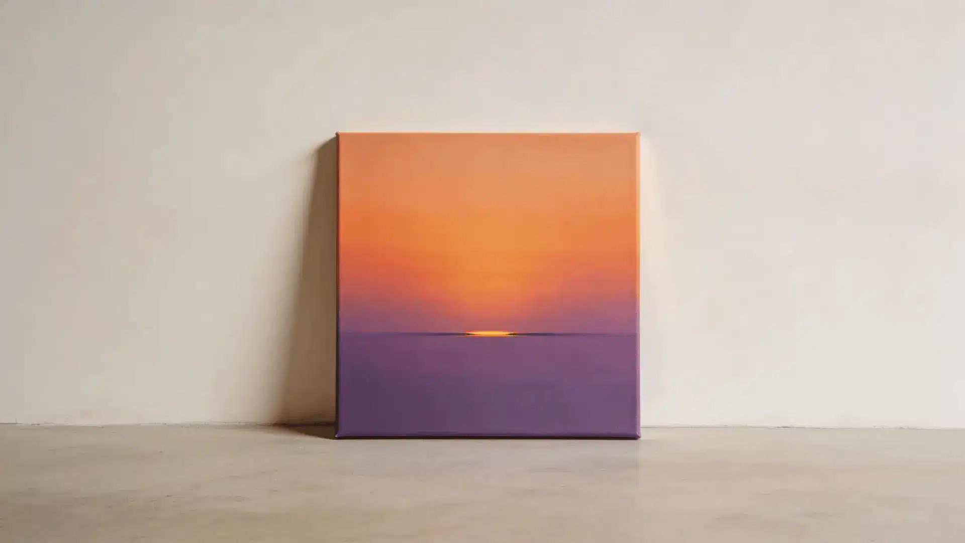
This whole design is built around softness.
When two colors slowly blend into each other, brush marks stop standing out. The eye expects a sky to shift gradually. So small streaks don’t look like mistakes. They just look like light changing.
Where it usually falls apart is when you keep blending after the paint starts to dry. At that point, the colors stop flowing and start mixing into each other too aggressively. That’s when everything turns muddy.
The real control here is limitation. Two main colors and white are enough. Blend while the paint is still moving easily, and once it looks smooth, let it be.
2. Simple Horizon Beach Scene
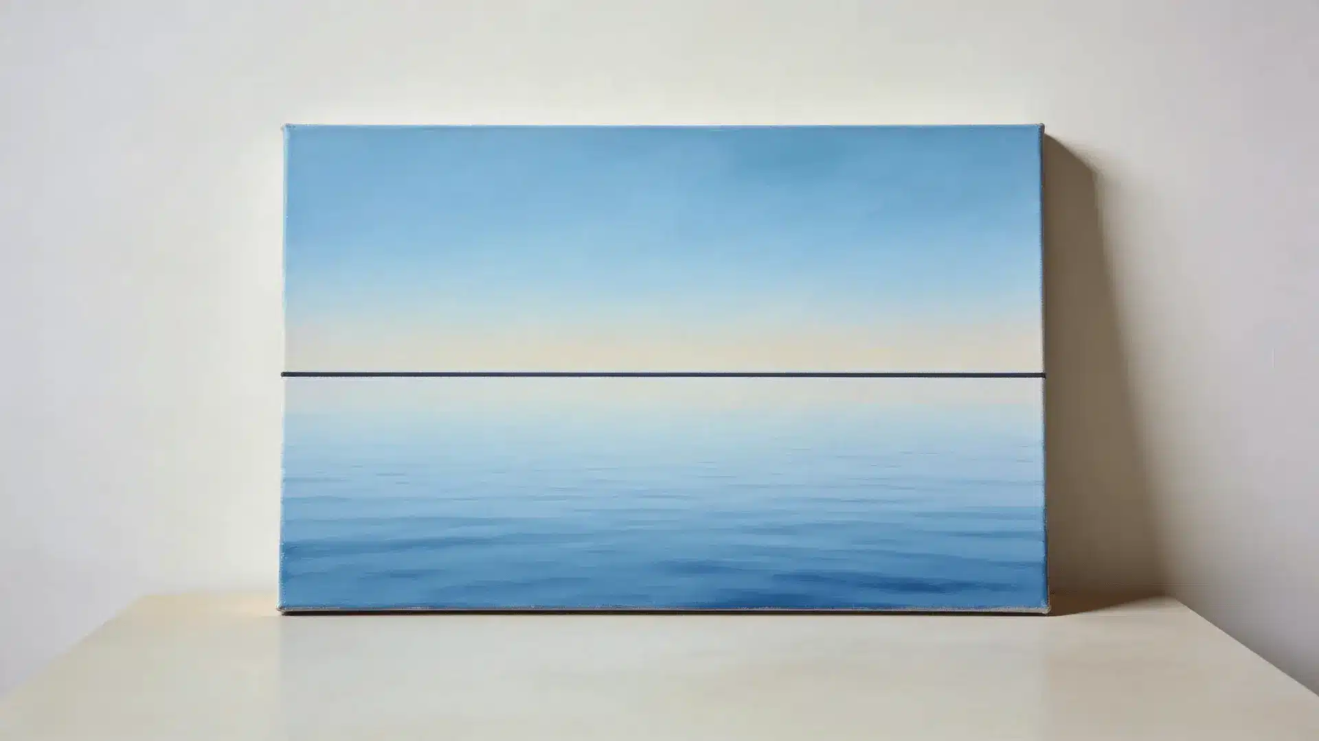
This idea feels calm because the structure is simple.
A horizontal line divides the canvas into clear sections. Sky above. Water below. Your brain understands that layout instantly. Even if the line isn’t perfect, it still reads correctly.
Things get complicated when you start adding extra elements too soon. Waves, reflections, birds, and shoreline details all demand more precision. Suddenly, the simplicity disappears.
Let the large color areas carry the image so it stays balanced. Clean separation between sky and water does most of the work.
3. Tree Silhouette Against a Bright Sky
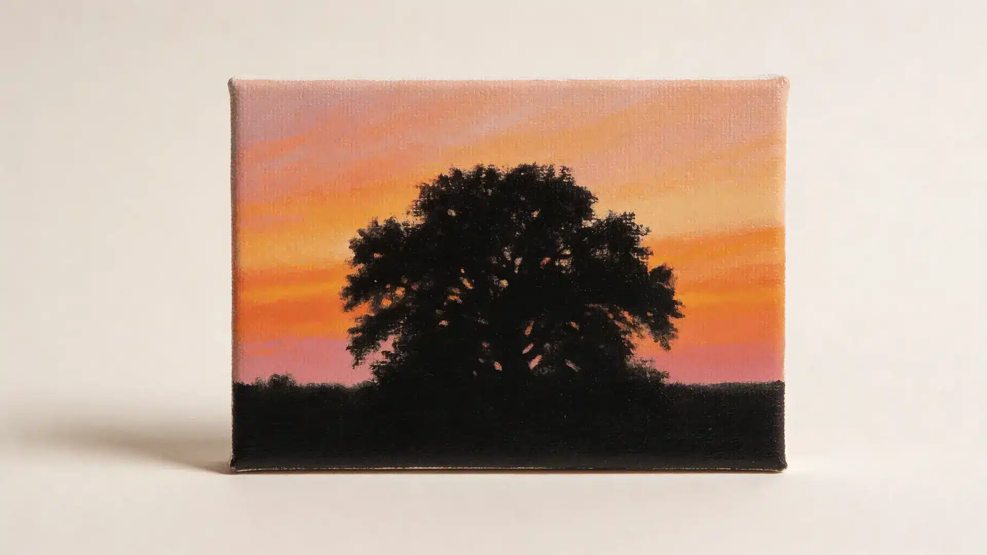
Contrast is doing the heavy lifting here.
A dark shape placed over a lighter background removes the need for detail. As long as the overall outline feels believable, your brain fills in the rest. You don’t need to paint every leaf or carve every branch.
The trouble starts when branches get too thin or too intricate. Reworking those edges again and again weakens the form and makes it look hesitant.
If you think in terms of mass instead of texture, the painting holds together. Strong trunk. Confident branches. Let suggestion replace precision.
4. Minimal Mountain Range
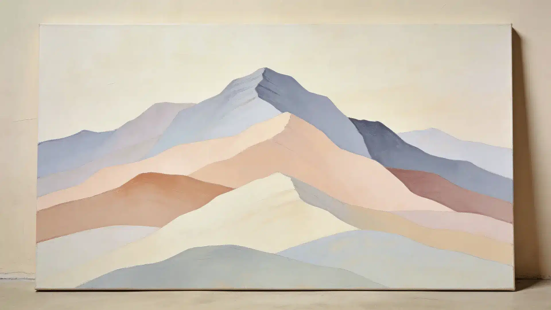
Mountains are forgiving because nature isn’t symmetrical.
When you layer simple shapes in slightly different tones, depth appears on its own. The eye reads overlap and distance without needing texture.
The shift toward complexity happens when you try to add snow lines, rock detail, or sharp highlights too early. That increases edge pressure and exposes uneven strokes.
If the forms stay broad and the tonal changes stay subtle, the image feels complete without extra carving.
5. Galaxy Splatter Painting
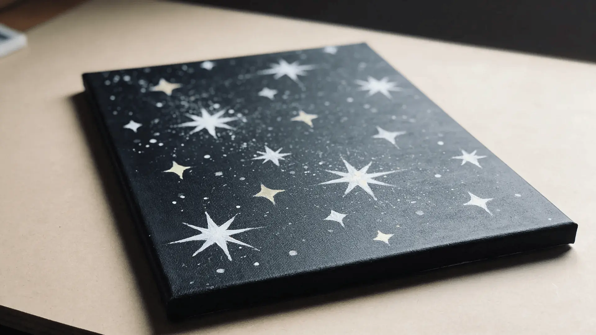
This works because randomness is expected.
Stars aren’t evenly spaced. They vary in brightness and size. That natural irregularity protects the painting. Small splatter differences look intentional instead of wrong.
It starts to break down when too many colors get blended together. Once dark areas lose contrast, the whole surface feels flat.
Keeping a strong dark base and adding highlights carefully preserves the illusion. Empty space matters here more than filling every inch.
6. Abstract Color Blocks
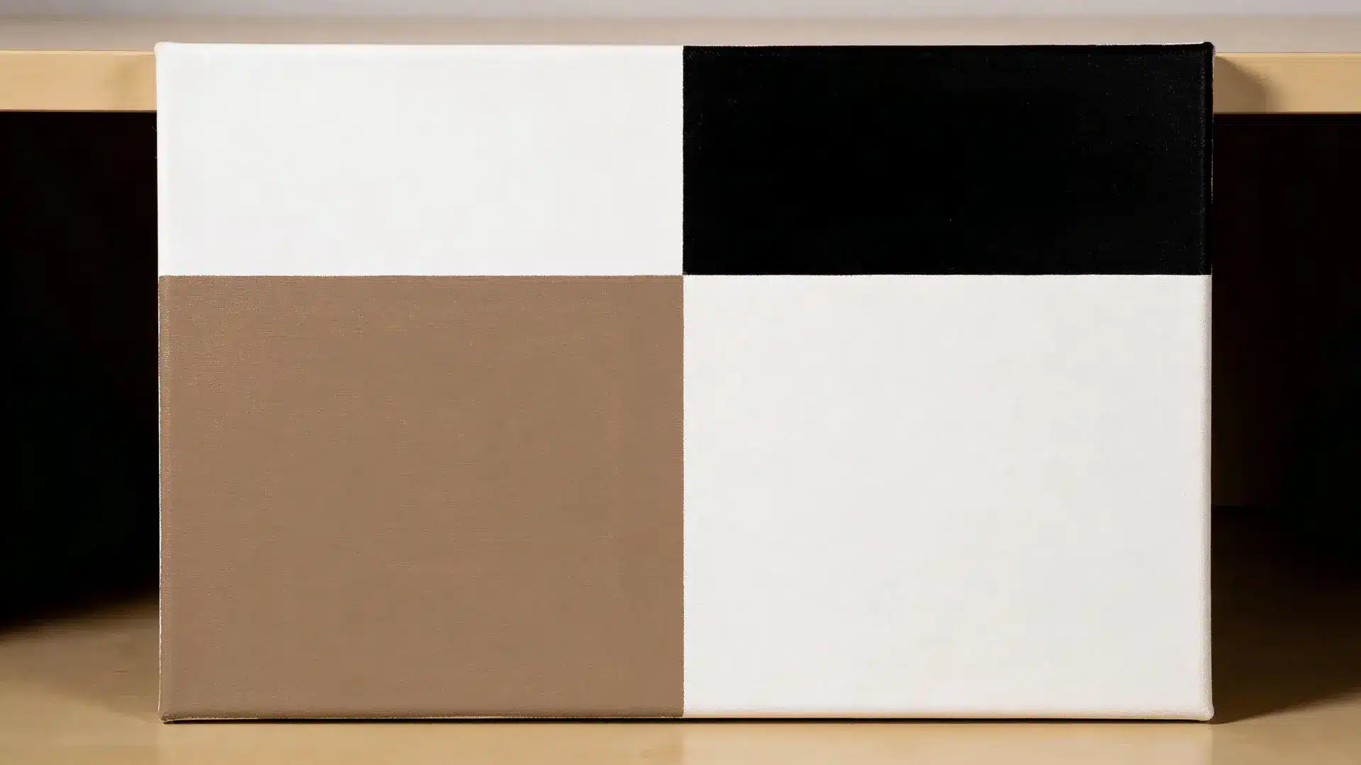
This idea simplifies the process by isolating decisions.
Large sections let you focus on one area at a time. You’re not solving everything at once. Clear edges between colors create structure and keep the canvas from feeling chaotic.
Problems show up when the blocks get smaller and more numerous. Every new edge adds pressure and increases the chance of uneven lines.
If the shapes stay bold and the palette stays limited, the painting feels deliberate instead of busy.
7. Repeating Polka Dot Canvas
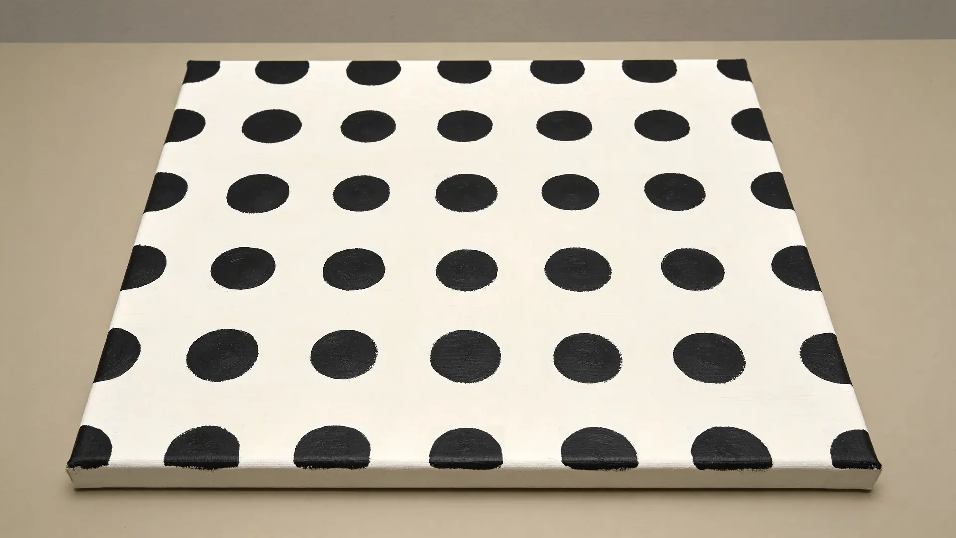
Repetition shifts the experience from thinking to rhythm.
Once the first few dots are placed, your hand starts to move consistently. The pattern builds cohesion without requiring technical skill.
It loses strength when spacing drifts, or pressure changes, and the dots vary unintentionally. That pulls attention towards inconsistency.
If you maintain steady pressure and consistent spacing, the rhythm will carry the design without needing extra variation.
8. Simple Floral Outline
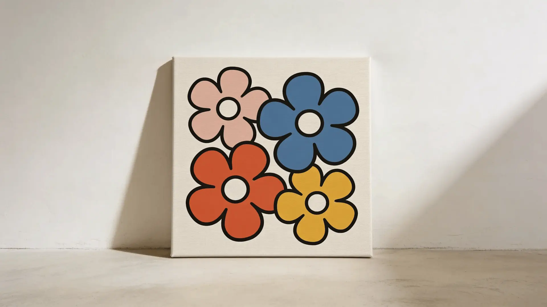
This works because rounded shapes are forgiving.
Flowers don’t need perfect symmetry to feel right. Slightly uneven petals still look natural because organic forms are expected to vary. The viewer focuses on the overall shape, not the precision of each edge.
It starts to feel complicated when you add shading inside every petal or try to layer texture too early. That increases control demands and exposes small inconsistencies.
Keep the petals bold and flat, then add a darker center for contrast. The form will read clearly without needing extra detail.
9. Cat or Bird Silhouette
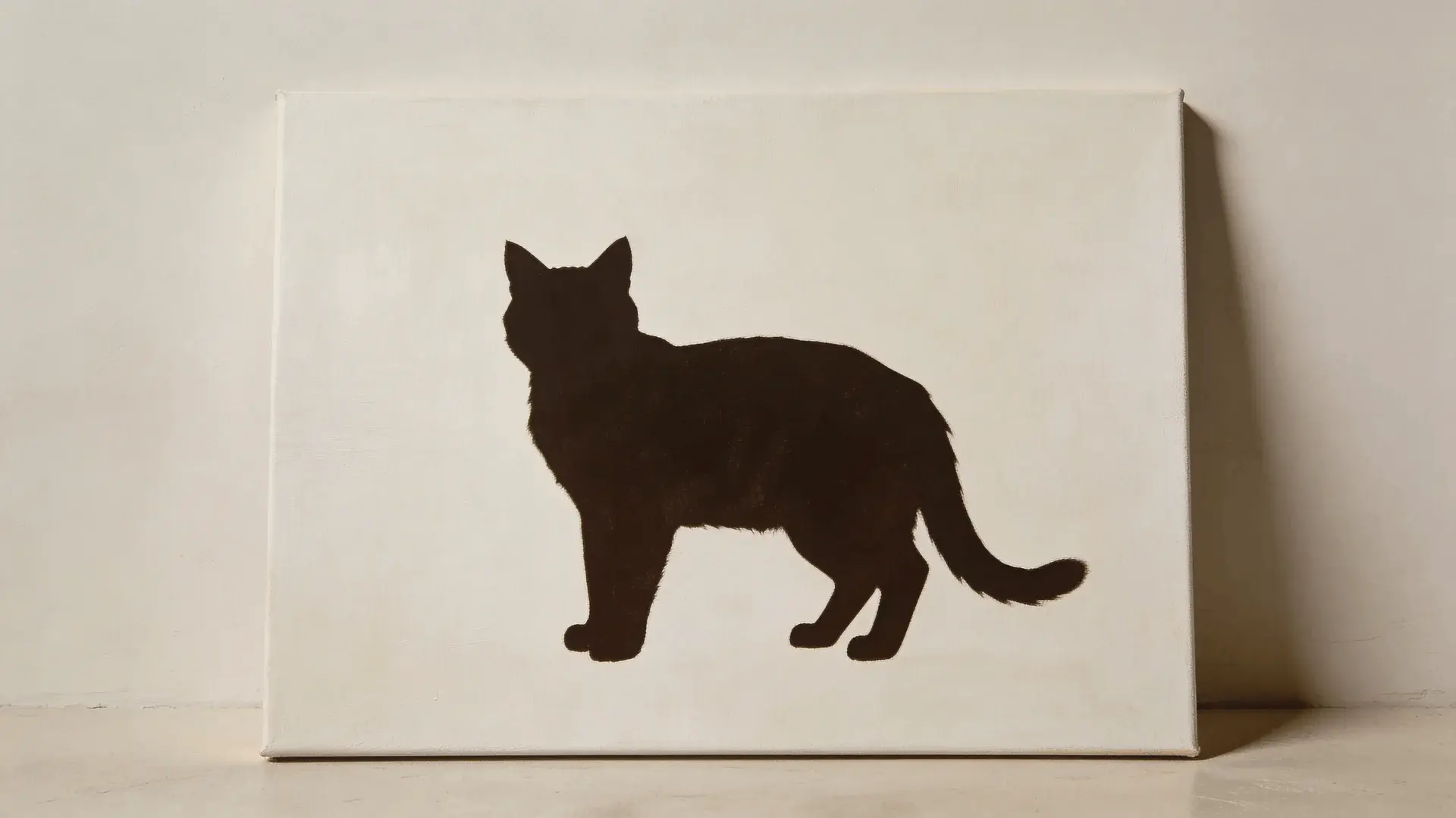
This one relies on recognition more than detail.
A single dark shape against a lighter background is enough for the brain to identify the subject. Once the outline feels believable, the viewer fills in fur, feathers, and texture mentally.
The problem begins when interior detail is added. Texture inside the silhouette breaks the clean contrast and makes small mistakes more visible.
Maintain one solid shape with clean edges, the clarity will stay strong, and the simplicity will hold.
10. Pastel Sky with Single Object Focus
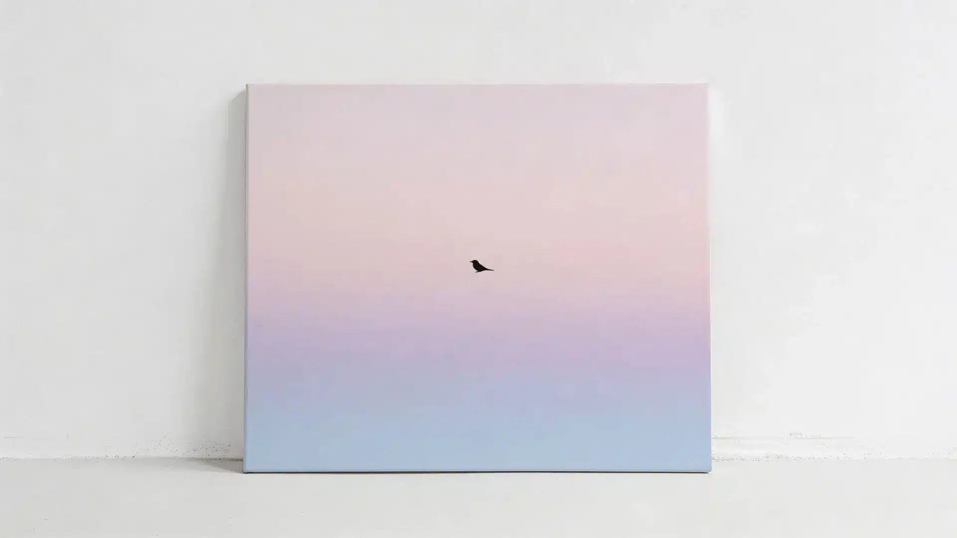
This composition limits attention. A soft sky creates a calm background, and one clear object gives the eye a place to settle. When there’s only one focal point, the composition holds together even if the blending isn’t perfect.
It becomes harder when extra elements are added. Multiple objects compete for attention and increase edge work and proportion control.
Let the background stay soft and allow a single object to carry the focus, and the balance will stay intact.
11. Simple Moon Phases Canvas
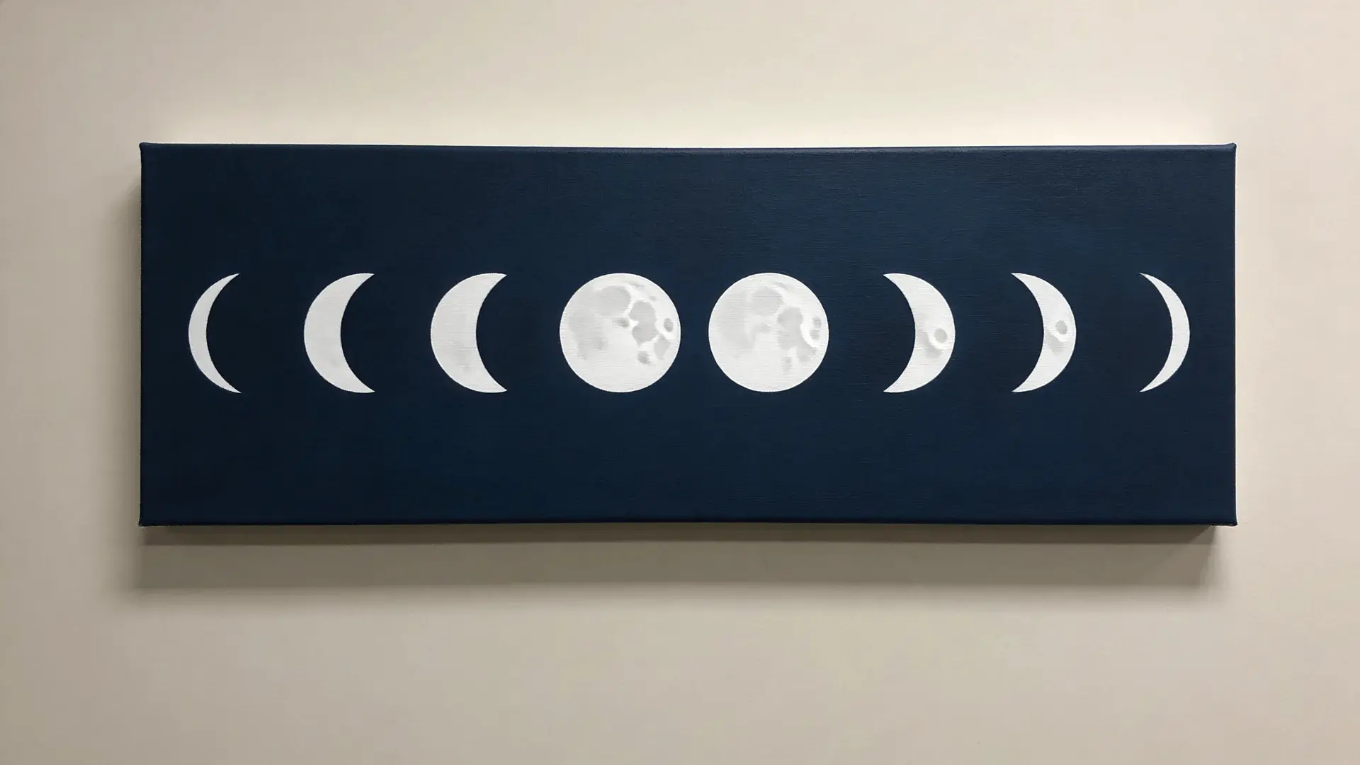
Use the same circular form across the canvas to reduce decision-making. Circles are forgiving shapes, and slight unevenness reads as surface texture rather than error.
It gets complicated when shading, craters, or fine details are added unnecessarily. That shifts the painting from graphic to realistic and raises the difficulty level.
If the moons stay flat and the phase changes are created with clean negative space, the sequence reads clearly without added complexity.
12. Minimal One-Line Face Silhouette
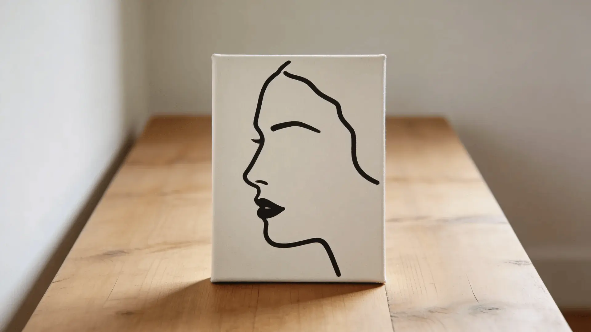
A single continuous line can imply a face without drawing every feature. The brain completes what isn’t shown, which removes pressure to perfect details.
The difficulty appears when the line is retraced or corrected repeatedly. That thickens areas unevenly and breaks the flow.
Move slowly and commit to the stroke; slight irregularities will become part of the character rather than mistakes.
13. Simple Night City Skyline
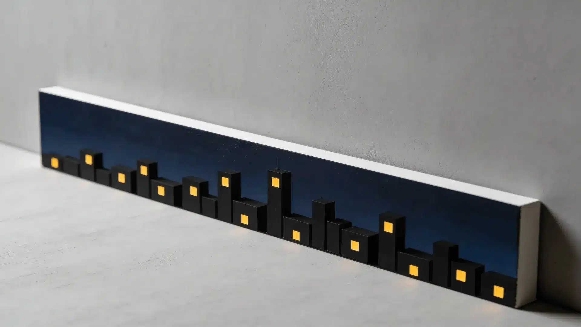
This feels manageable because it uses geometric forms.
Rectangular buildings are easier to control than organic shapes. Repeated window dots add rhythm without requiring advanced blending or shading.
It becomes unstable when perspective is forced or windows are over-detailed. Too much alignment pressure exposes uneven spacing.
Vary building heights slightly and scatter window lights naturally, the skyline will feel more alive without becoming technical.
14. Minimal Sunflower Close-Up
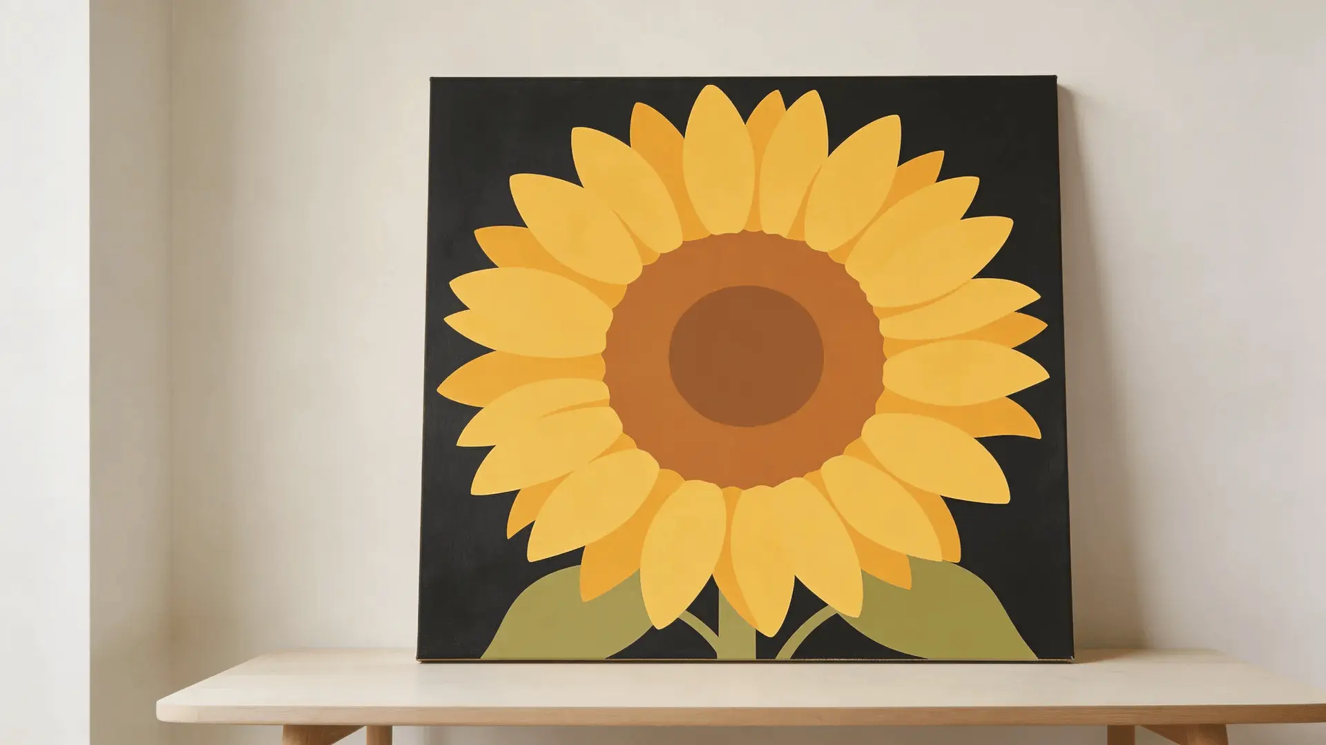
Focus on one dominant subject.
When a single large flower fills most of the canvas, composition becomes straightforward. Radial petals guide the brush outward from the center, which helps maintain balance.
It becomes complex when each petal is individually textured or shaded too early. That increases edge precision and slows the flow.
If the petals remain bold and flat and the center is deepened for contrast, the image holds together without overworking it.
15. Abstract Brush Stroke Texture Canvas
This design removes pressure by making texture the feature.
Visible brush strokes are intentional here. Instead of hiding marks, you highlight them. That shifts the goal from smooth blending to controlled movement.
It starts to lose strength when strokes are repeatedly softened or blended out. The texture that gave it energy disappears.
For best results, apply confident strokes in one direction and stop while the surface still feels active; the painting keeps its clarity and momentum.
What Actually Makes a Painting Idea “Simple” for Beginners
“Simple” isn’t about how a painting looks at the end; it’s about how much control it demands while you’re working on it. A piece can look impressive and still be easy to execute.
What really determines difficulty is the number of decisions, adjustments, and corrections required along the way. In beginner painting, structural demand matters more than visual complexity.
- Fewer colors mean fewer interactions. Every additional color increases mixing complexity and raises the chance of muddy tones. When you stay within three or four colors, mistakes stay contained because there are fewer variables to manage.
- Large shapes are easier than fine detail. The eye reads mass before it reads precision. Silhouettes and bold forms hide small edge inconsistencies, while thin lines and intricate details expose hand movement immediately.
- Soft blending zones are naturally forgiving. Skies, gradients, and atmospheric backgrounds disguise streaks because variation is expected. Hard transitions and sharp contrast edges are far less tolerant.
- Timing affects simplicity. Paint blends smoothly while it’s still workable. Once it begins to dry, pigment drags instead of flows, and corrections become more visible.
- Simplicity usually breaks through overworking. Adding highlights before the base is stable, scaling up to a large canvas too quickly, or repeatedly fixing areas that were already balanced tends to create new problems rather than solve them.
Simplicity holds when the structure stays clear, the palette stays limited, and restraint stays in place.
How to Choose the Right Idea Based on Your Skill Comfort
I’ve learned that choosing the wrong idea is what usually creates frustration. It’s rarely about talent. It’s about a mismatch. When the idea fits your comfort level, the whole experience feels steadier and more enjoyable.
| Skill Preference | Try This | Why It Works | Watch For |
|---|---|---|---|
| Blending over outlining | Gradient sunsets, soft skies, galaxy splatter | These rely more on color flow than edge precision. | If blending gets muddy, reduce the number of colors. |
| Structure over freeform | Color blocks, polka dots, minimal mountains | These reward planning and controlled zones. | If you feel overwhelmed, lightly sketch first. |
| Fewer decisions and less pressure | Single object paintings, silhouettes, one focal point designs | Fewer elements mean fewer decisions. | Avoid adding extra details that increase complexity. |
The best painting idea isn’t the trending one. It’s the one that fits your current skill comfort.
Simple Setup Guide So Your First Painting Doesn’t Get Overcomplicated
Before you start, a few small setup choices make a big difference. Most early frustration doesn’t come from skill. It comes from overcomplicating the starting conditions.
- Start smaller. Large canvases magnify small inconsistencies and make corrections feel dramatic. A medium or small canvas keeps mistakes manageable.
- Limit your palette to three or four colors. The more colors you introduce, the more mixing variables you create. Fewer colors mean cleaner results and easier adjustments.
- Use fewer brushes. Too many tools slow decision-making. A medium flat brush and one smaller round brush handle most beginner ideas without hesitation.
- Let the paint stay workable. Blending is easiest while the surface is still open. Once it starts to dry, dragging creates streaks and forces corrections.
The goal isn’t to prepare perfectly. It’s to remove unnecessary pressure before you even begin.
Why Popular Beginner Painting Ideas Work and When They Fail
Some beginner ideas keep showing up for a reason; they’re built on structures that protect you from common mistakes.
Sunsets work because soft gradients hide uneven strokes. The eye expects light to shift gradually, so small streaks disappear inside the blend. They start to fail when you keep brushing after the paint begins to dry and the colors lose clarity.
Silhouettes work because contrast does most of the heavy lifting. A dark shape against a lighter background removes the need for internal detail. They fall apart when too much texture or thin edge work gets added and the clean shape breaks down.
Galaxy splatter paintings work because randomness is expected. Uneven stars don’t look wrong. They look natural. They lose strength when too many colors get mixed and the dark base loses contrast.
In each case, the idea itself isn’t complicated. The breakdown happens when extra detail gets layered in too early.
Paintings hold up when their structure stays intact. They fail when simplicity gets replaced with correction and overworking.
Wrapping Up
Simple painting ideas aren’t about lowering your standards. They’re about lowering resistance, so you actually begin. When structure supports you instead of challenging you, progress happens faster, and frustration stays low.
The real shift comes when you stop chasing impressive results and start choosing ideas that match your current control and comfort.
That’s where confidence builds naturally. Over time, what once felt manageable becomes second nature. Simple painting ideas succeed because they reduce decisions, limit precision demands, and use forgiving visual structures.
Start with one idea that feels steady, not ambitious. Set up simply. Finish it fully. Then build from there. Pick your canvas, limit your colors, and begin today.
Frequently Asked Questions
What is the easiest thing to paint as a beginner?
The easiest thing to paint as a beginner is a two-color gradient sky with one dark silhouette. It hides uneven strokes and removes detail pressure.
What are easy painting ideas when you’re bored?
Abstract color blocks or splatter galaxies work well. They require low precision, welcome variation, and can be completed without heavy planning.
Are acrylic paintings easier than watercolor for beginners?
Acrylic painting is generally easier for beginners because it is opaque and allows mistakes to be layered over once dry.
How do I keep my painting from looking messy?
Limit your palette, avoid over-blending, and stop adding detail too early. Most messiness comes from too many adjustments rather than a lack of skill.