You ever notice how a white cabinet can make your kitchen look clean but also kind of…plain? I did too.
It’s like a blank sheet of paper; full of potential, but hard to start. Choosing the right kitchen paint colors that pair well with white cabinets isn’t just about looks. It’s about how the space feels when you walk in.
Does it feel too cold? Too bright? Just “meh”? I’m going to help you figure that out.
In this blog, I’ll go over paint colors that make your kitchen feel alive, calm, or somewhere in between without overcomplicating it.
You’ll get solid color ideas that match with white cabinets naturally, so your kitchen looks like you meant it, not like you guessed. Keep reading, this gets easier.
How to Choose the Right Wall Color for White Kitchen Cabinets
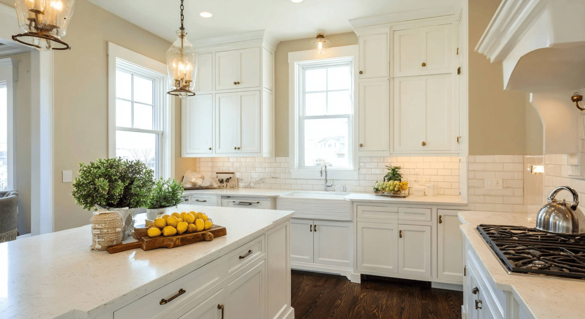
Picking the right wall color for white kitchen cabinets isn’t just about what looks pretty. A few key things need to work together to get it right. First, check the undertone of your white cabinets. If they have a warm tone (like creamy or off-white), go with soft beiges, greiges, or warm taupes.
If they’re a cool white (with hints of blue or gray), try cooler wall colors like light gray, pale blue, or crisp white for a clean look.
Lighting also plays a big role. Natural light brings out true color, while artificial lighting can make shades look warmer or cooler. Test paint samples at different times of day before you decide.
You’ll also want to think about your countertops, backsplash, and flooring. These should all feel like part of the same color story; nothing should clash.
Last, think about the mood. Do you want calm and soft? Go light and neutral. Want contrast? Try deep gray or navy. Want warmth? Use warm tones like sandy beige or soft peach. Each choice affects the whole feel of your kitchen.
Best Neutral Kitchen Paint Colors With White Cabinets
Neutral colors are the go-to choice for kitchens with white cabinets. They’re simple, calming, and won’t go out of style. Neutrals help your kitchen feel clean and open, while giving you flexibility to decorate around them. Below are great options that pair well with white cabinets:
1. Warm Light Gray
Warm light gray works great when you want a clean look that isn’t cold.
It balances the brightness of white cabinets while softening the overall space. It’s a smart pick for homes that get lots of natural light and want a peaceful feel without being too stark.
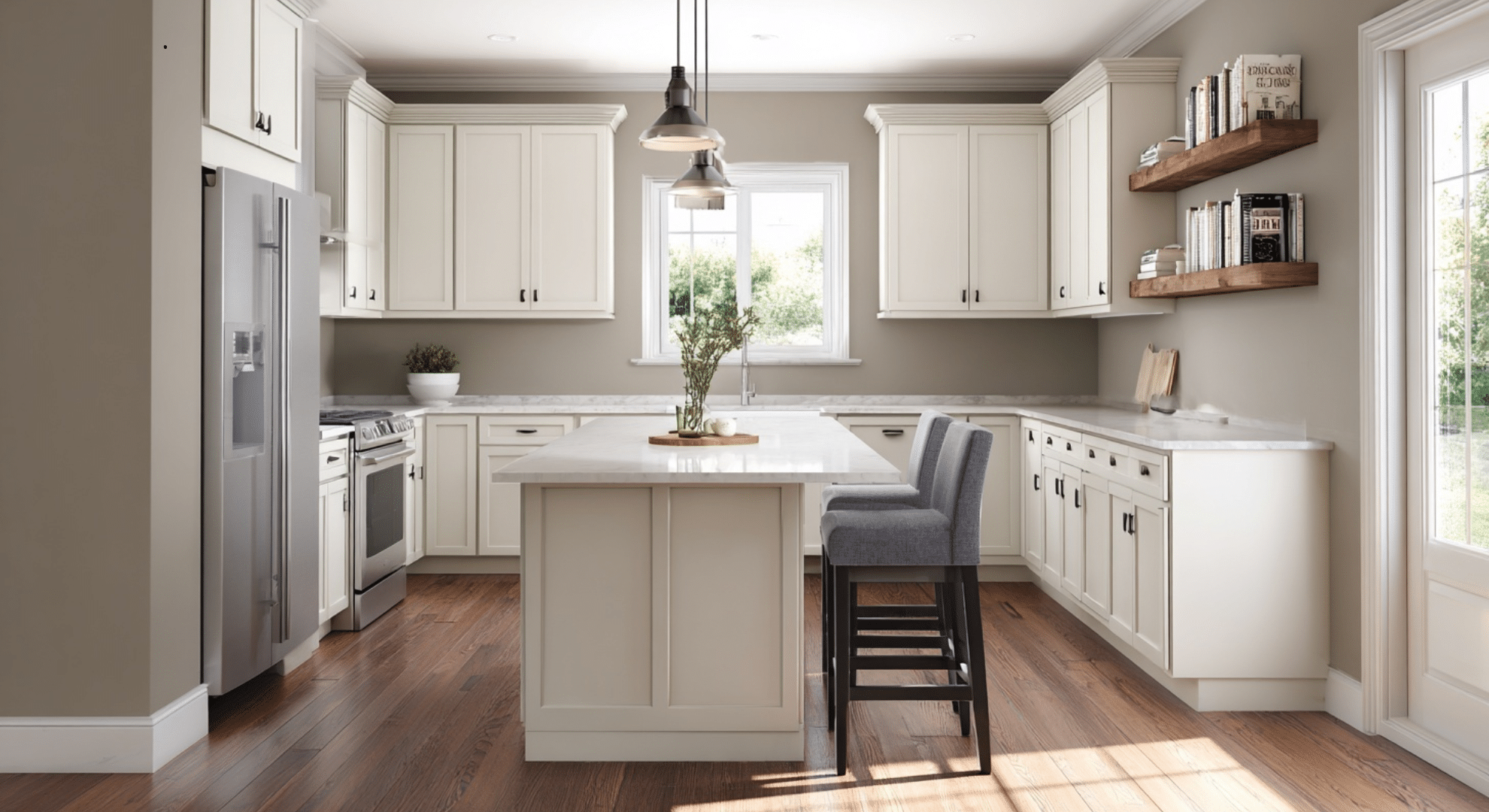
2. Greige (Gray–Beige Blend)
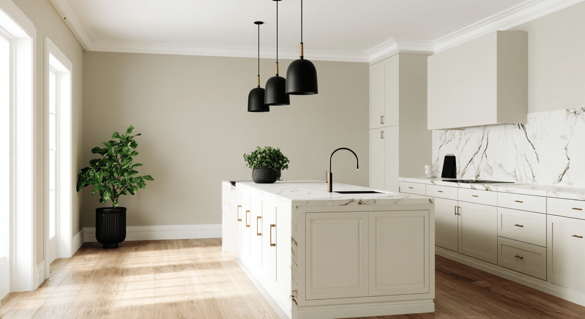
Greige gives you the best of both worlds. It’s not too warm and not too cool.
This makes it easy to pair with white cabinets and other finishes. It works well if you’re using both wood and metal touches in your kitchen and want everything to flow together.
3. Soft Beige
Soft beige adds warmth but won’t make white cabinets look dingy or yellow.
It’s a great choice when you want a cozy feel without too much color. It keeps things light and works well with warm wood floors or bronze hardware.
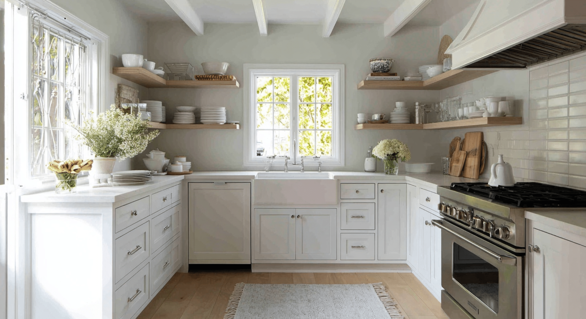
4. Creamy Off White
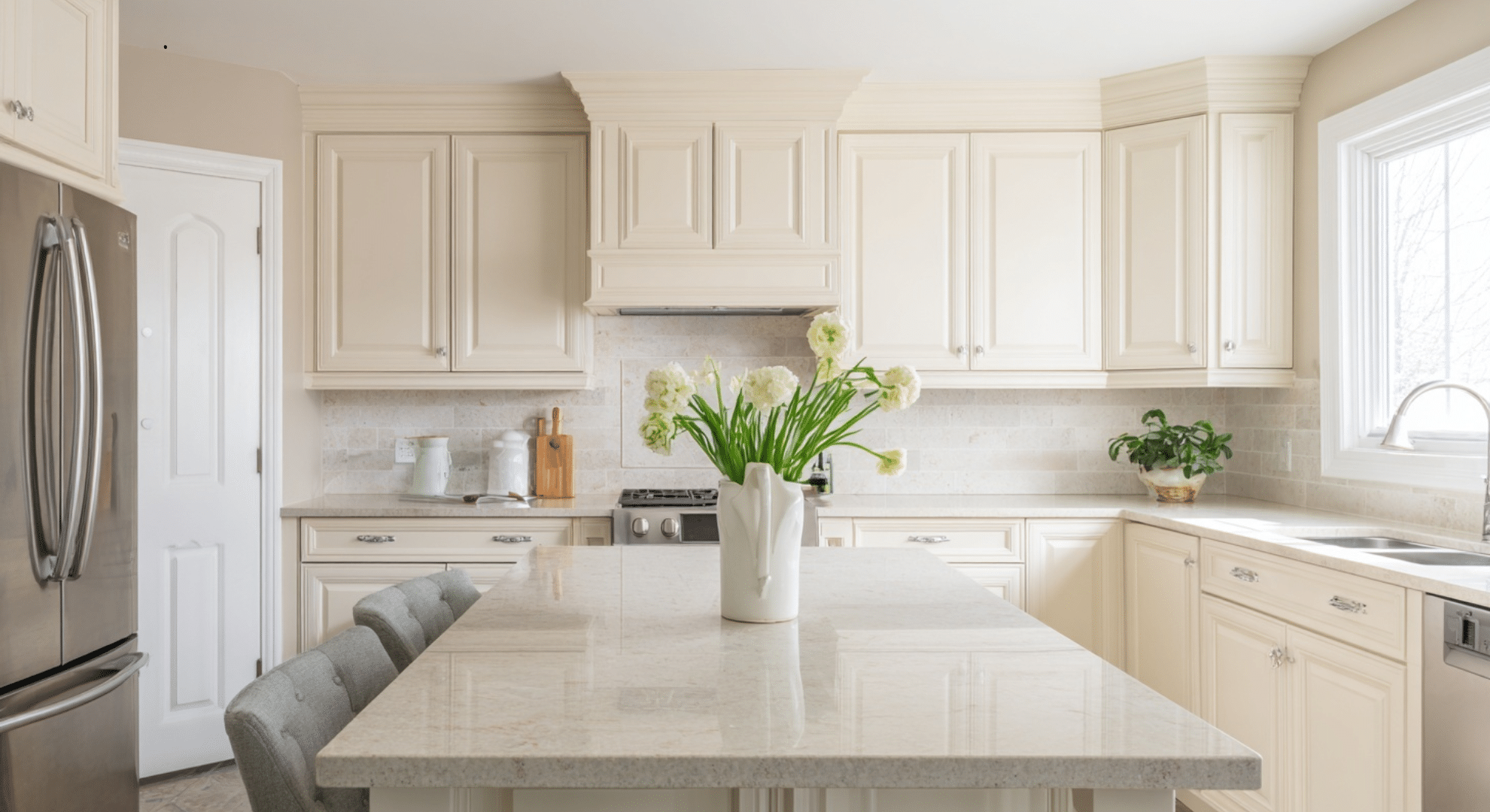
Creamy off white creates a gentle difference between the walls and the cabinets.
It stops the space from feeling too white or flat. It’s a good pick if you want a soft and inviting look that’s still bright and clean.
5. Light Taupe
Light taupe is a color that has a bit more richness than gray or beige.
It gives your kitchen a grounded look but keeps the space light. It works well when you want to make the room feel warm and balanced without drawing too much attention.
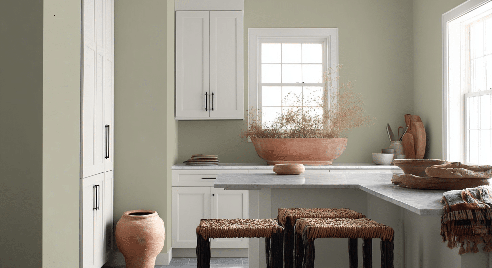
6. Pale Mushroom
Pale mushroom has earthy tones that work great with stone backsplashes or tile floors.
It’s light enough not to fight with the cabinets, but has enough color to bring out the details in natural materials. It’s a nice pick if you like subtle warmth.
7. Warm Putty Tone
Grounds the room gently. A warm putty tone feels stable and neutral.
It gives a nice base for white cabinets and works with lots of different counters and flooring. It’s especially good in traditional or farmhouse kitchens where you want a homey feel without going too dark.
8. Soft Sand Tone
Brightens low-light kitchens. Soft sand tones add warmth and brightness to kitchens that don’t get much sun.
They make the space feel cozy but still light. With white cabinets, this shade helps open up the room and keep it feeling clean and happy.
Soft Color Paint Options
Adding a bit of soft color can make your kitchen feel more personal without making it loud. These shades keep the peace while still offering a fresh look:
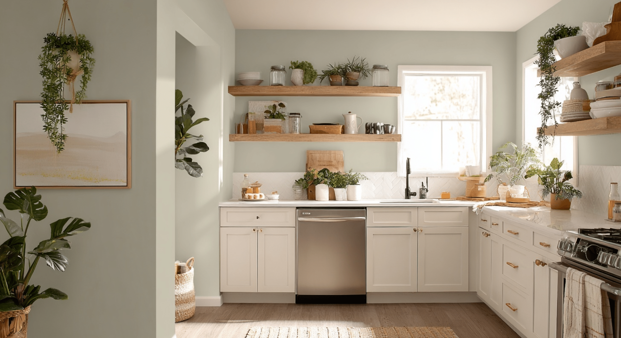
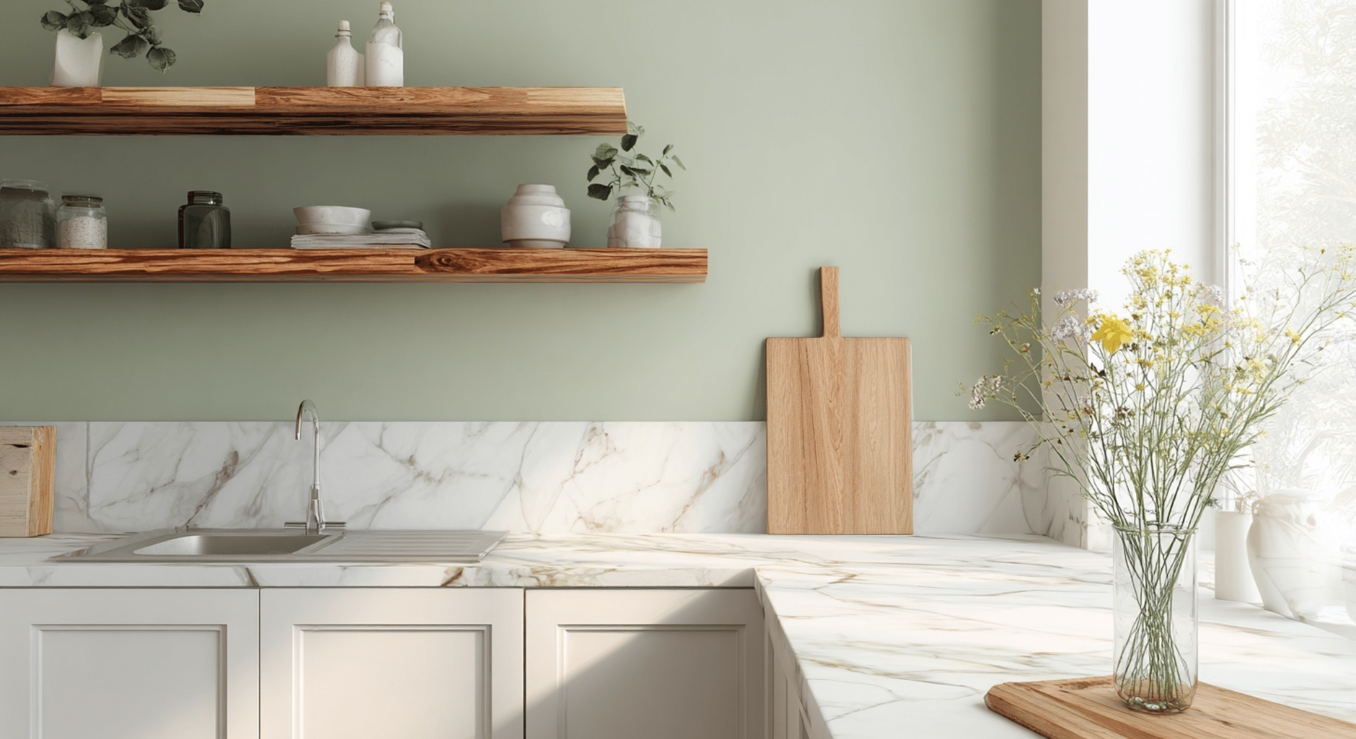
9. Sage Green
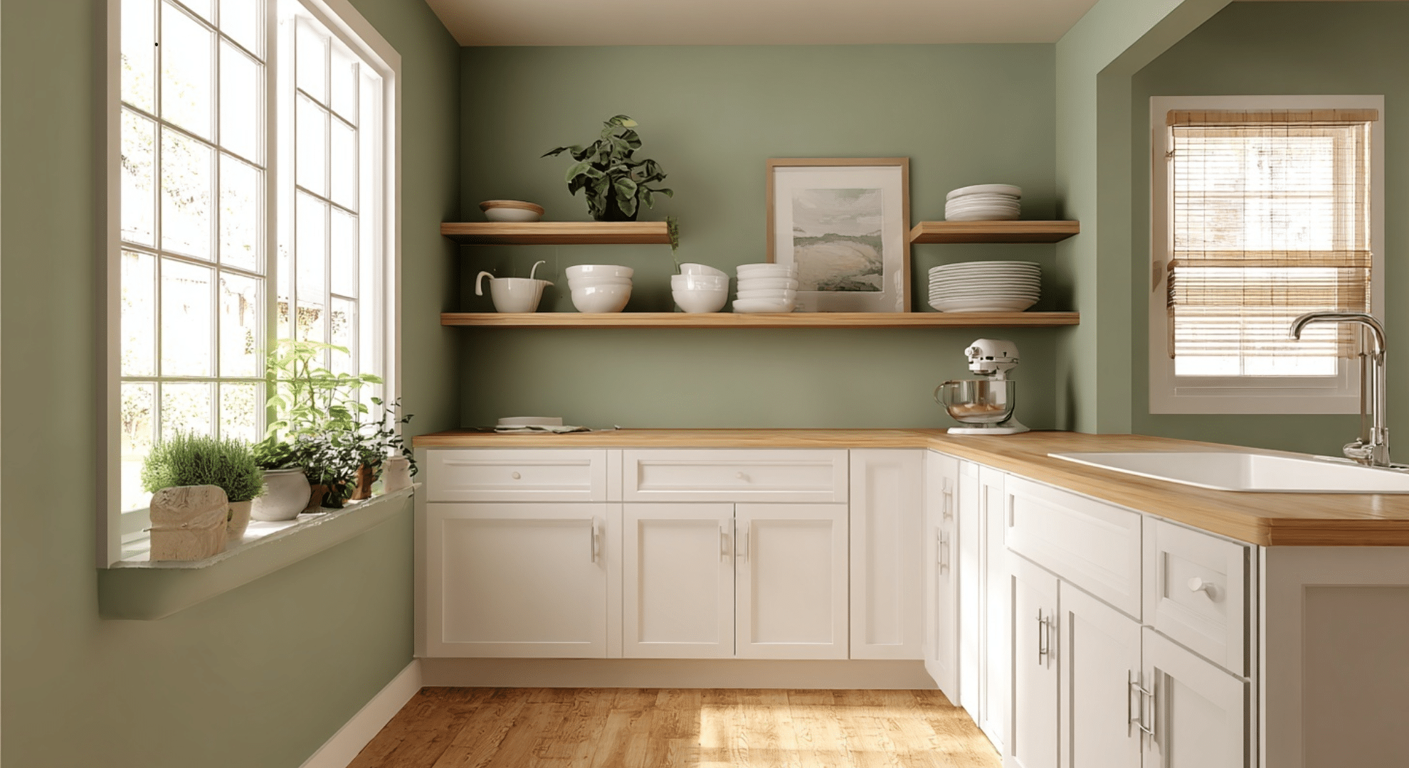
Soft and easy to match. Sage green is gentle and calm.
It works really well with white cabinets and gives your kitchen a natural, soothing vibe. It’s great for anyone who wants a bit of color but still wants things to feel peaceful and grounded.
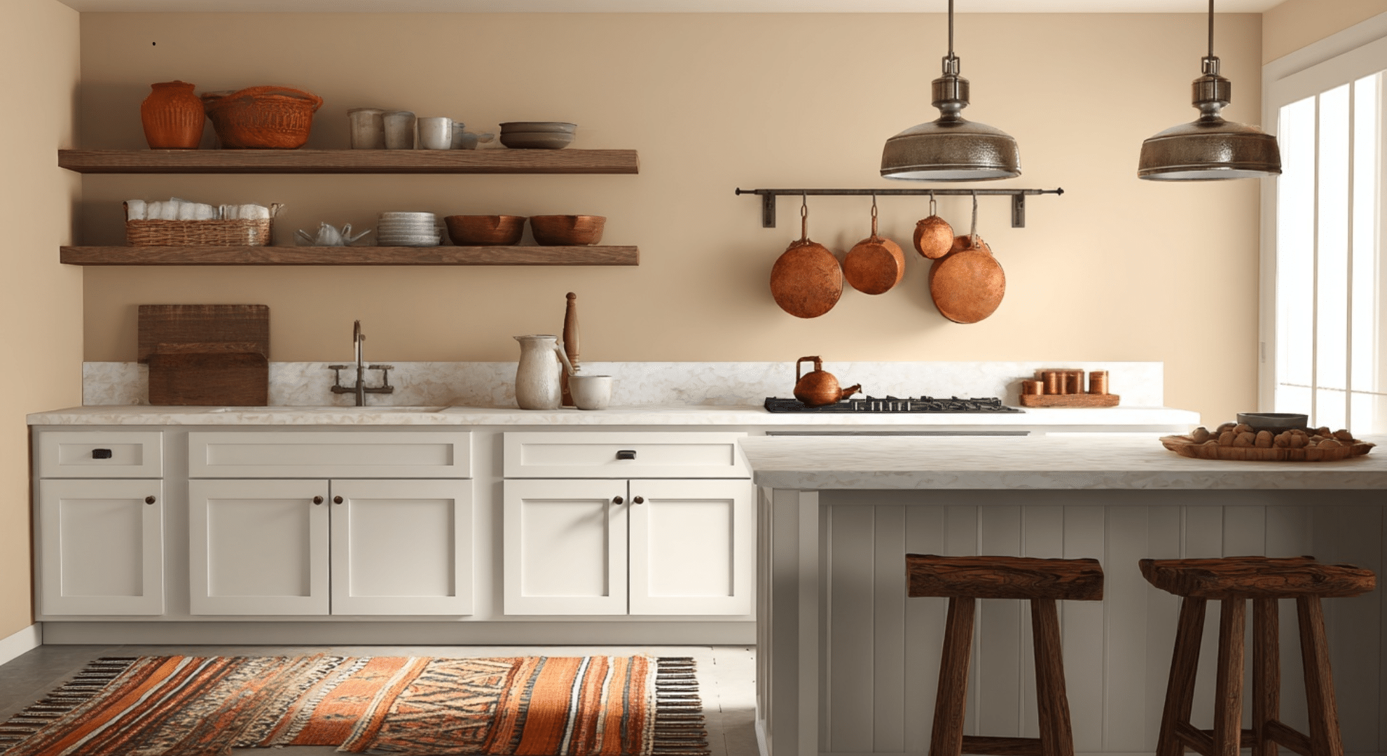
10. Soft Olive
Soft olive brings warmth and a slightly earthy feel.
It’s richer than sage but still calm. It looks especially good with wood shelves, copper touches, and natural elements like baskets or stone counters.
11. Muted Blue Gray
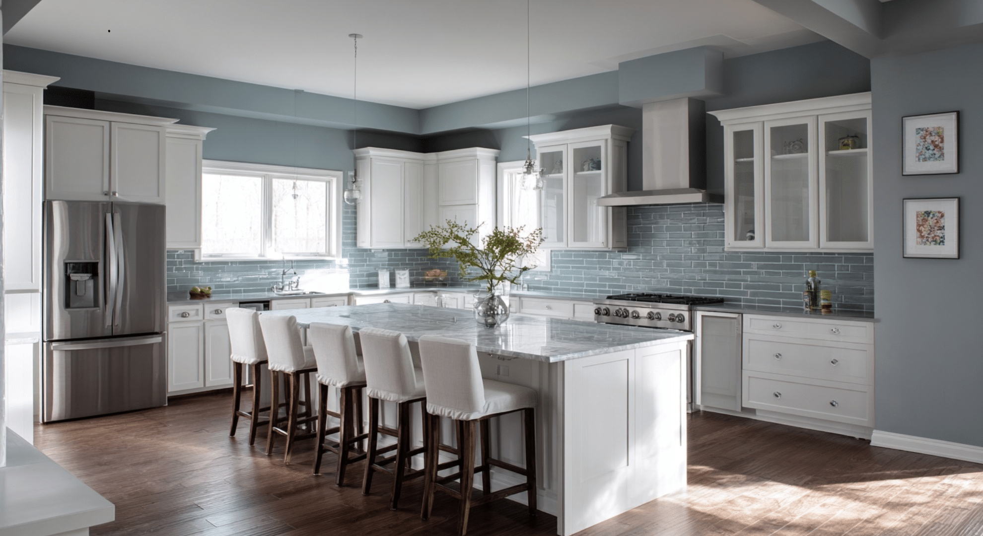
Muted blue-gray gives off a relaxing feel but doesn’t look icy.
It blends well with white cabinets and can make your kitchen feel more open. It’s a good choice if you like blues but don’t want them to feel too strong.
12. Dusty Blue
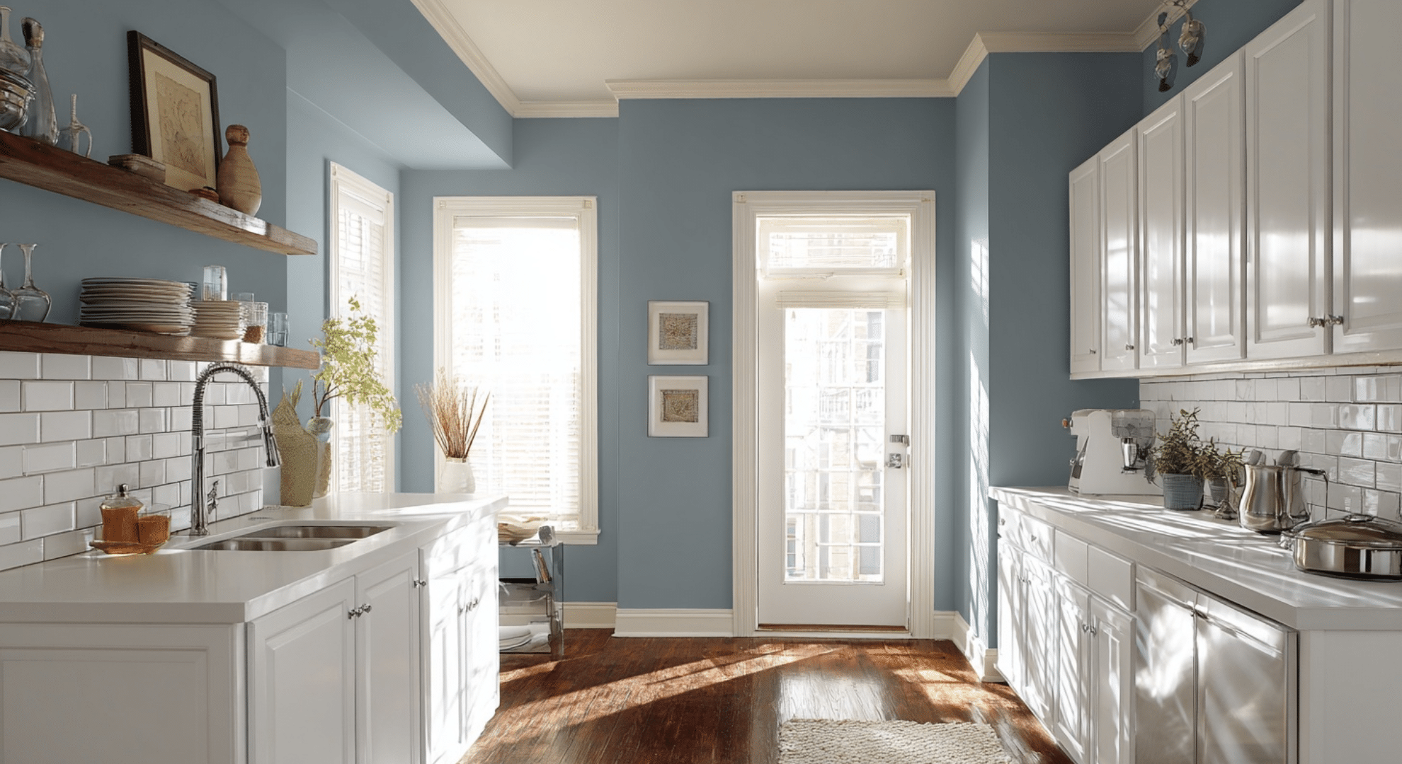
Brightens spaces with lots of light. Dusty blue shines in kitchens that get lots of daylight.
It adds a soft pop of color without being bold. It’s cheerful without being loud, and it works well with white tile, light woods, and chrome finishes.
13. Gray Green
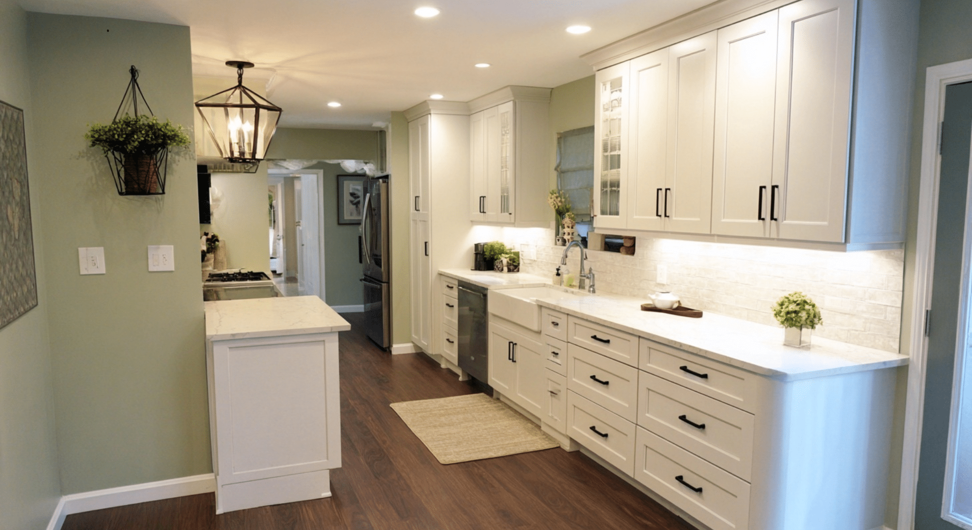
Mixes warm and cool in one shade. Gray-green is calm and steady. It fits well with both warm-toned hardware and cooler surfaces like stainless steel.
It’s a great in-between color that doesn’t pull too far in any one direction.
14. Pale Eucalyptus
Pale eucalyptus is a light, leafy green that feels clean and soft. It’s not too bright, and it doesn’t follow fast-changing color trends.
It works well if you want a soft nature-inspired look that still feels timeless.
Dark and Contrast Paint Colors for White Cabinets
If your kitchen gets plenty of light and has space to handle bolder choices, these deeper shades can make a big impact. They add drama without making things feel too heavy:
15. Navy Blue
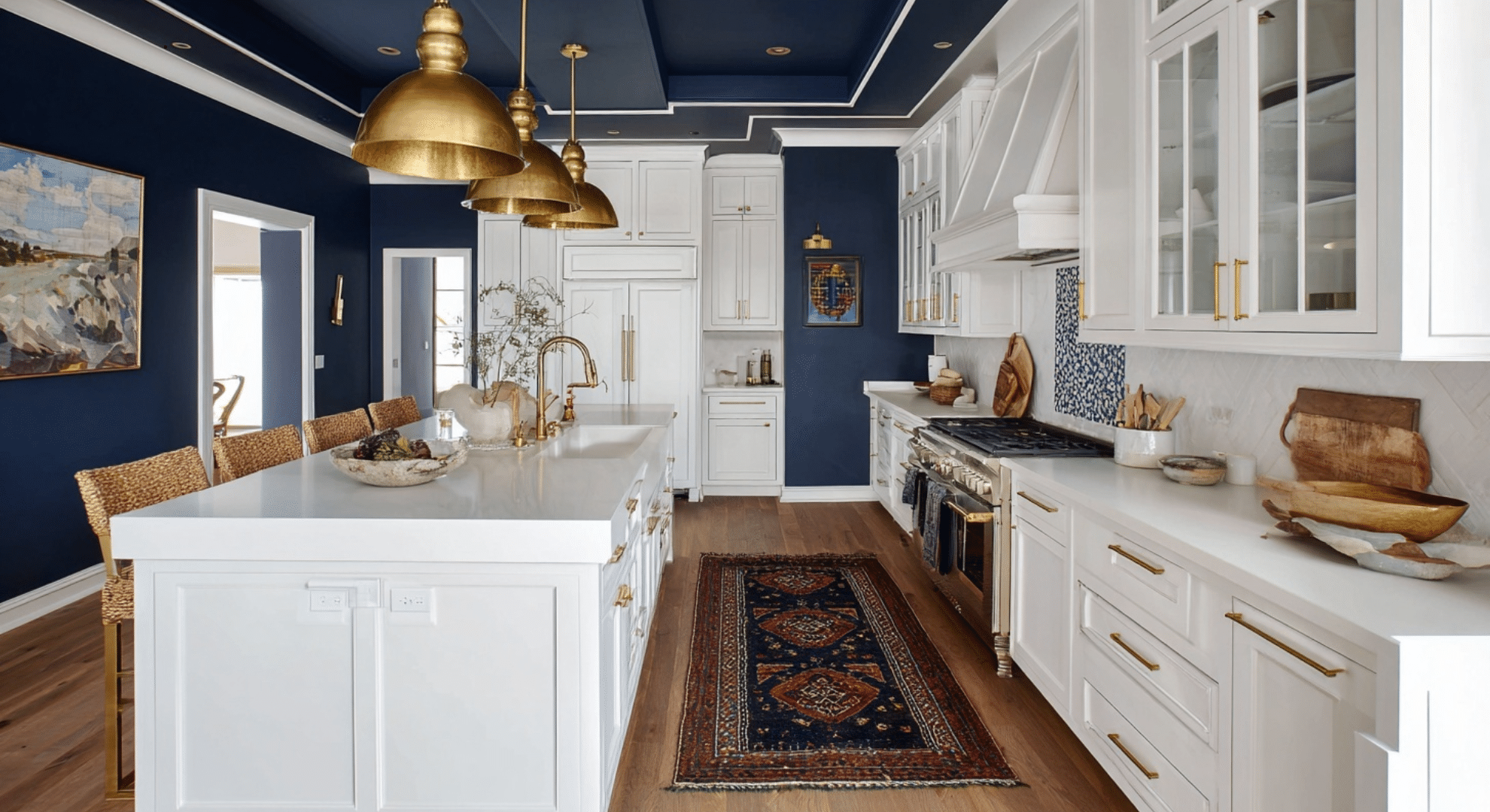
Navy blue looks sharp with white cabinets. It gives a strong contrast but doesn’t overpower the space.
It’s best in rooms with lots of light, and pairs well with gold, brass, or wood accents.
16. Charcoal Gray
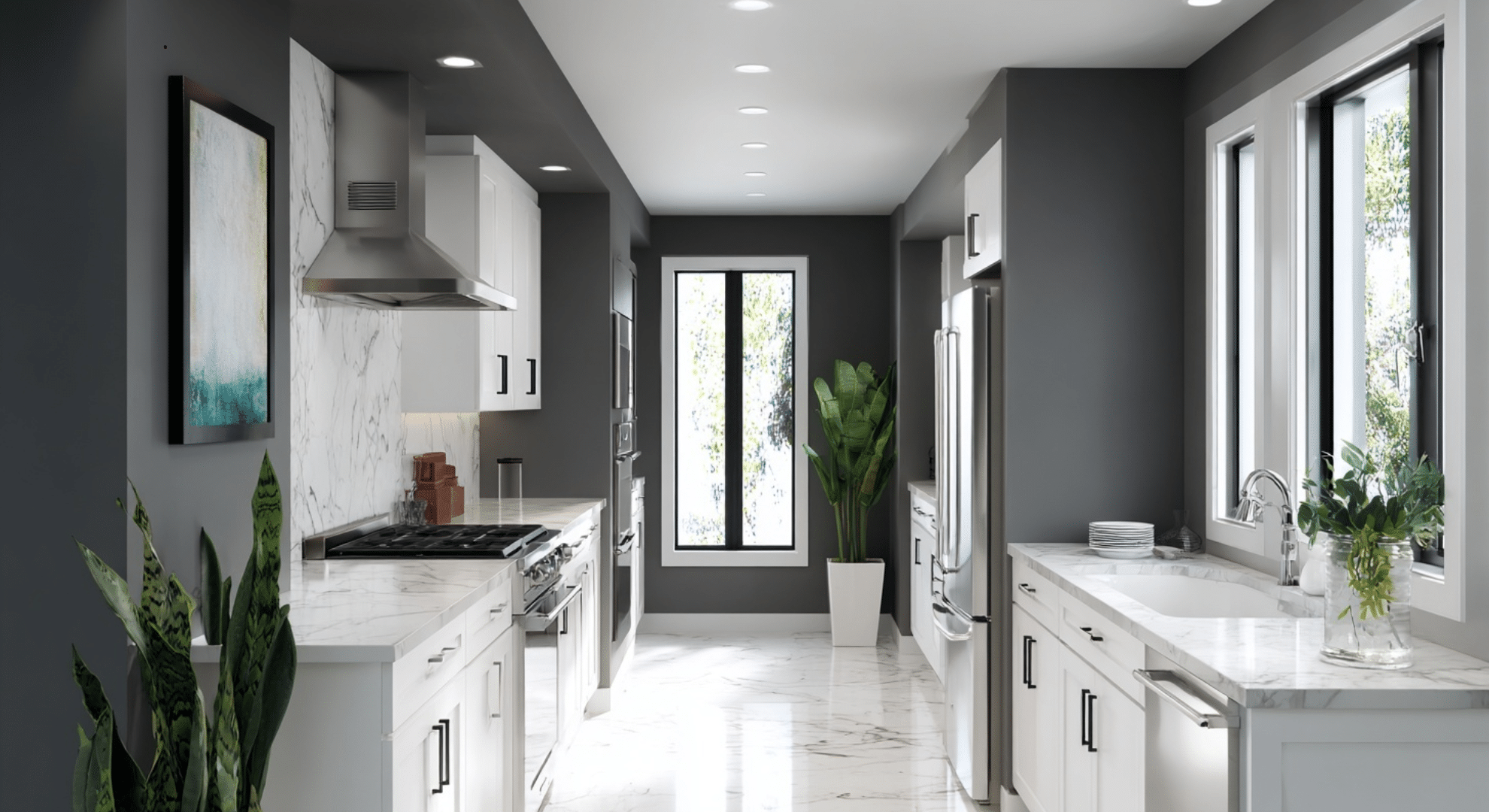
Modern look without going too dark. Charcoal gray brings a clean, modern feel. It’s bold but controlled.
It works best when you want a bit of edge without going full black. It matches well with stainless steel and white counters.
17. Deep Forest Green
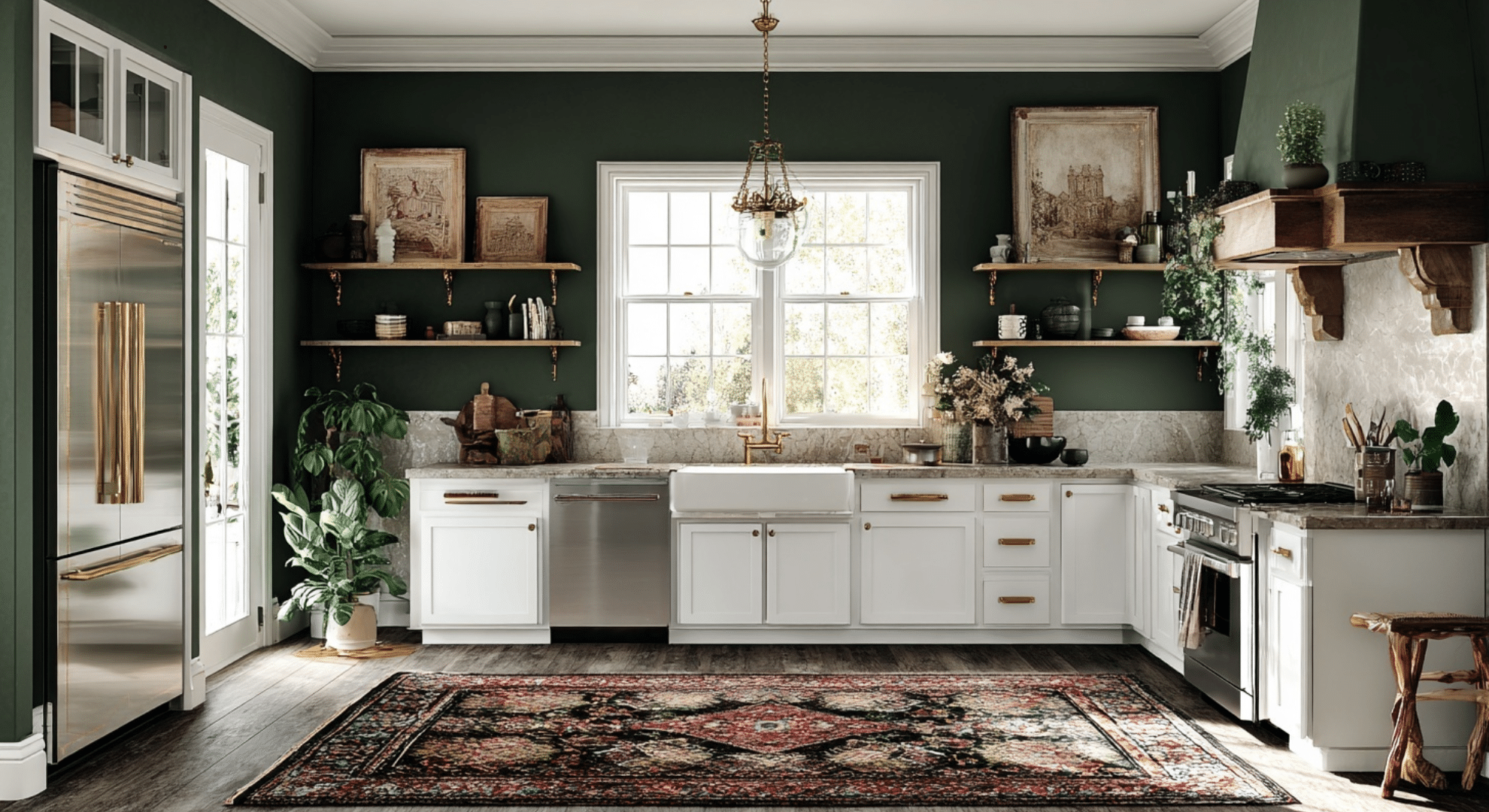
Deep forest green adds depth and richness. It works well in classic kitchens or rustic styles.
It feels grounded and pairs well with wood, brass, or stone. Use it when you want something bold but still warm.
18. Soft Black or Off Black
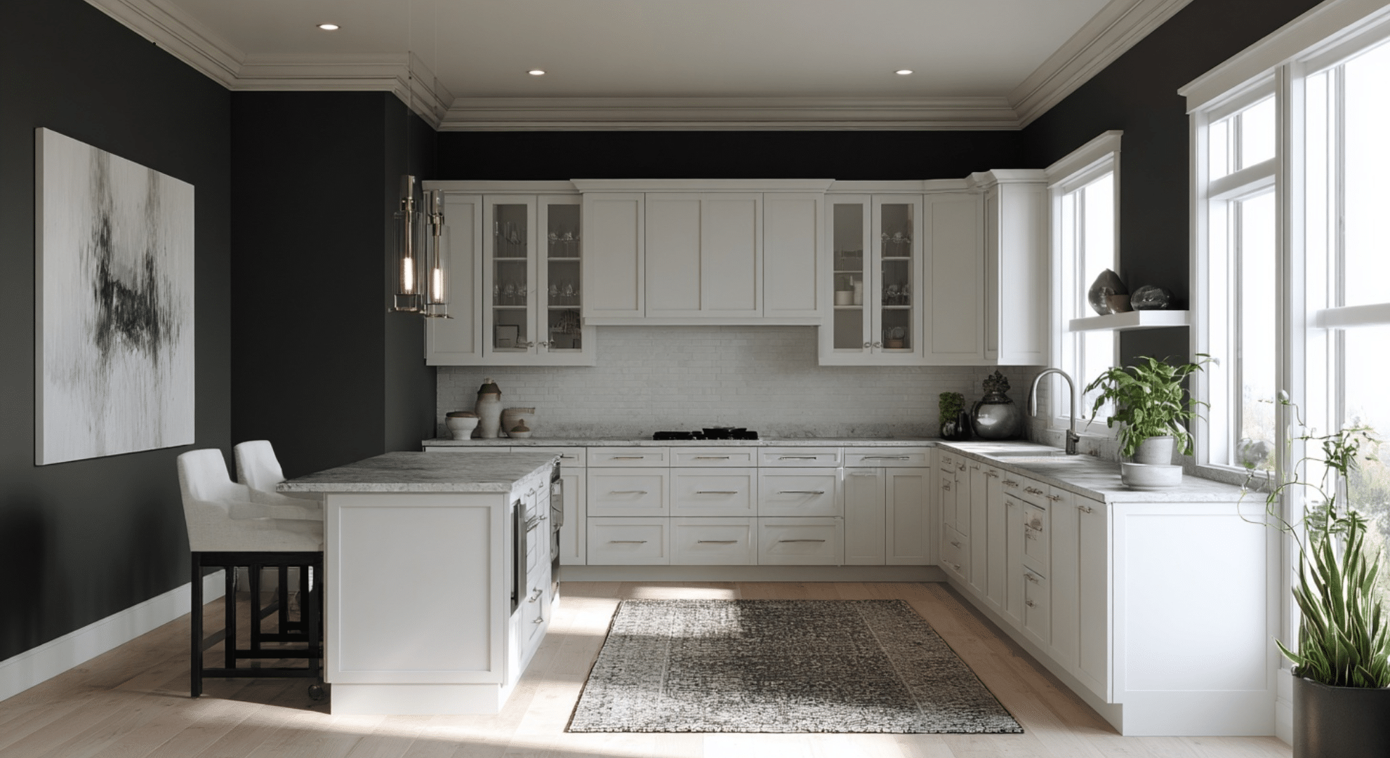
Soft black gives contrast but isn’t too harsh. It’s a smart pick for adding depth while keeping the room from feeling small.
Off black tones work best when paired with white trim, bright lighting, and simple design.
Subtle Bold Paint Colors
These colors add a little personality without taking over.
They’re best used as a feature wall or in smaller kitchens where you want a cozy feeling:
19. Muted Terracotta

Warm and easy to live with. Muted terracotta adds an earthy warmth.
It works nicely with white cabinets and gives a slightly rustic feel. It’s a good way to bring in color without making things feel loud or busy.
20. Soft Clay or Blush Neutral
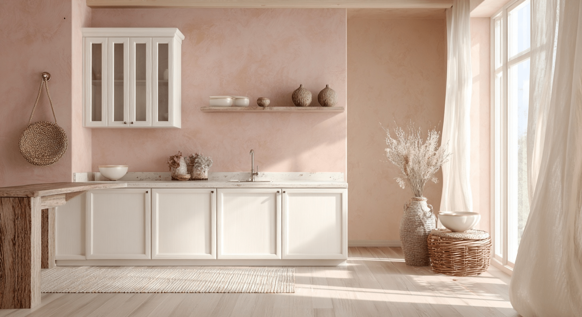
Soft clay or blush gives just a touch of color. It adds warmth without being too bright.
These tones are nice in kitchens with gold or bronze hardware, soft woods, and simple decor.
Choosing a Paint Color Based on Your Kitchen Setup
Your kitchen layout, lighting, and materials all affect which wall colors will look best. Instead of picking a color randomly, use what’s already in your space to guide your choice.
| Kitchen Setup | Best Paint Colors | Why It Works |
|---|---|---|
| Gray Countertops | Warm Light Gray, Greige, Muted Blue Gray, Charcoal Gray | These colors match cool tones and keep the space balanced |
| Warm Wood Floors | Soft Beige, Sage Green, Creamy Off White, Warm Putty Tone | These shades highlight natural wood warmth and feel cozy |
| Small Kitchens with Low Light | Soft Sand Tone, Pale Eucalyptus, Dusty Blue, Creamy Off White | Light, soft shades help reflect light and open up tight spaces |
| Open-Concept Kitchens | Greige, Light Taupe, Gray Green, Soft Olive | These colors blend well with other rooms and don’t feel too bold or too plain |
Use this table to pick a color that fits your space instead of fighting with it. A well-matched wall color can make your whole kitchen feel more connected, calm, and easy to enjoy.
How Lighting Changes Paint Color in a White Kitchen
Lighting can totally change how a paint color looks in your kitchen, even if the walls and cabinets stay the same.
North-facing light is cooler and makes colors look more gray or blue. Warm paint colors can help balance this.
South-facing light is warmer and makes colors look brighter and softer. Even cool colors can feel more inviting here.
Artificial lighting also changes things. LEDs can be warm or cool, depending on the bulb. Incandescent lights add yellow tones, while fluorescent lights can make colors look flat or too cool.
That’s why paint samples often look one way during the day and completely different at night. Natural light fades, and your bulbs take over. A color that looks perfect at noon might feel off after sunset.
Always test paint in different corners, at different times of day, and with your kitchen lights on, it makes a big difference.
How to Test Paint Colors the Right Way
Testing paint the right way helps you avoid picking a color that feels wrong once it’s on every wall.
Start by painting samples on multiple walls in your kitchen, not just one spot. Paint near the cabinets, under windows, and by light fixtures. This shows how the color reacts to shadows, sunlight, and artificial lighting.
Look at the samples for at least 2–3 days. Check them in the morning, afternoon, and evening. A color that looks warm in daylight might feel cold at night.
Don’t test too many at once. Stick to 3 or 4 colors side by side. If you test too many, they can blur together, and it gets hard to compare.
You can also use large paint swatches on poster board if you don’t want to paint directly on the wall. Just make sure you move them around the kitchen to see every angle.
Common Mistakes to Avoid With White Kitchen Cabinets
White cabinets are clean and classic, but picking the wrong wall color can throw off the whole look. Here are mistakes to watch out for so your kitchen stays bright, balanced, and welcoming:
- Using the same white for walls and cabinets: This can make the room feel flat or too sterile.
- Ignoring undertones: Cool whites with warm walls (or the opposite) can clash without you realizing it.
- Choosing bold or dark colors without enough light: This can make your kitchen feel smaller or gloomy.
- Skipping sample tests in different lighting: Colors shift throughout the day, and poor testing leads to surprises.
- Using trendy colors without checking how they pair with cabinets: Not every “popular” color works in your space.
- Painting everything the same color: No contrast can leave the space looking unfinished or plain.
- Not considering flooring and counters: These surfaces impact how wall colors look next to your cabinets.
- Overlooking trim and ceiling colors: They affect how the wall color appears, especially next to white cabinets.
Being careful with your color choices helps your white cabinets stand out the right way: clean, bright, and well-matched with the rest of your kitchen.
Conclusion
Choosing kitchen paint colors white cabinets work well with doesn’t have to feel like guesswork.
I broke down the colors that actually make sense and feel right, no matter if you want cozy, bright, or calm. I’ve seen how just a small change in paint can shift the whole mood of a room.
Now you’ve got ideas you can trust, not just random swatches on a screen. Think about how you want your kitchen to feel when you walk in, then pick the color that helps it feel that way.
Keep in mind, paint isn’t permanent. It’s one of the easiest ways to shape a space without starting over. If this helped, there’s more where this came from.
Check out other blogs on the website for more real-world tips that make your space feel like you!