Most people jump into diy home decor thinking the more projects they do, the better their space will look. Then the room feels busy, or worse, like a craft fair exploded in the corner.
I’ve made that mistake myself. I copied ideas without thinking about scale, spacing, or light. That led to realising that the project wasn’t the problem. The placement was.
Good decor isn’t about doing more. It’s about making the right changes in the right spots. You’ll get clear project ideas here, but you’ll also see why they work, when they don’t, and how to avoid the “homemade” look.
Let’s cover the basics before you pick up a paintbrush.
Before You Start: How to Pick the Right DIY Home Decor Project
Not every project creates the same level of impact. Some upgrades shift the entire feel of a room. Others are subtle and only make sense if the foundation already feels balanced.
I like to think in three layers:
- High impact – Walls, lighting, large furniture.
- Medium impact – Shelving, rugs, hardware.
- Low impact – Small decor pieces and accents.
If your room feels empty or flat, start with high-impact projects. When it feels “almost there,” focus on medium or low impact instead.
Skill level matters more than people admit. A painted wall is often easier than a detailed faux stone finish, and a hardware swap is much faster than repainting cabinets.
Surface compatibility is real, too. Peel-and-stick products behave differently on textured walls. Heavy shelves need studs. Gloss paint reflects more light and highlights flaws in a way matte paint won’t.
The biggest mistake I see is picking a project because it looks trendy, not because it solves the room’s problem. Solve the problem first. Then choose the project.
Wall Decor DIY Ideas that Instantly Create a Focal Point
Walls control attention. Your eye naturally searches for something dominant, and when it doesn’t find one, the room can feel scattered.
A focal point works because of scale and contrast. Larger pieces pull attention, and contrast in color or texture helps them stand out.
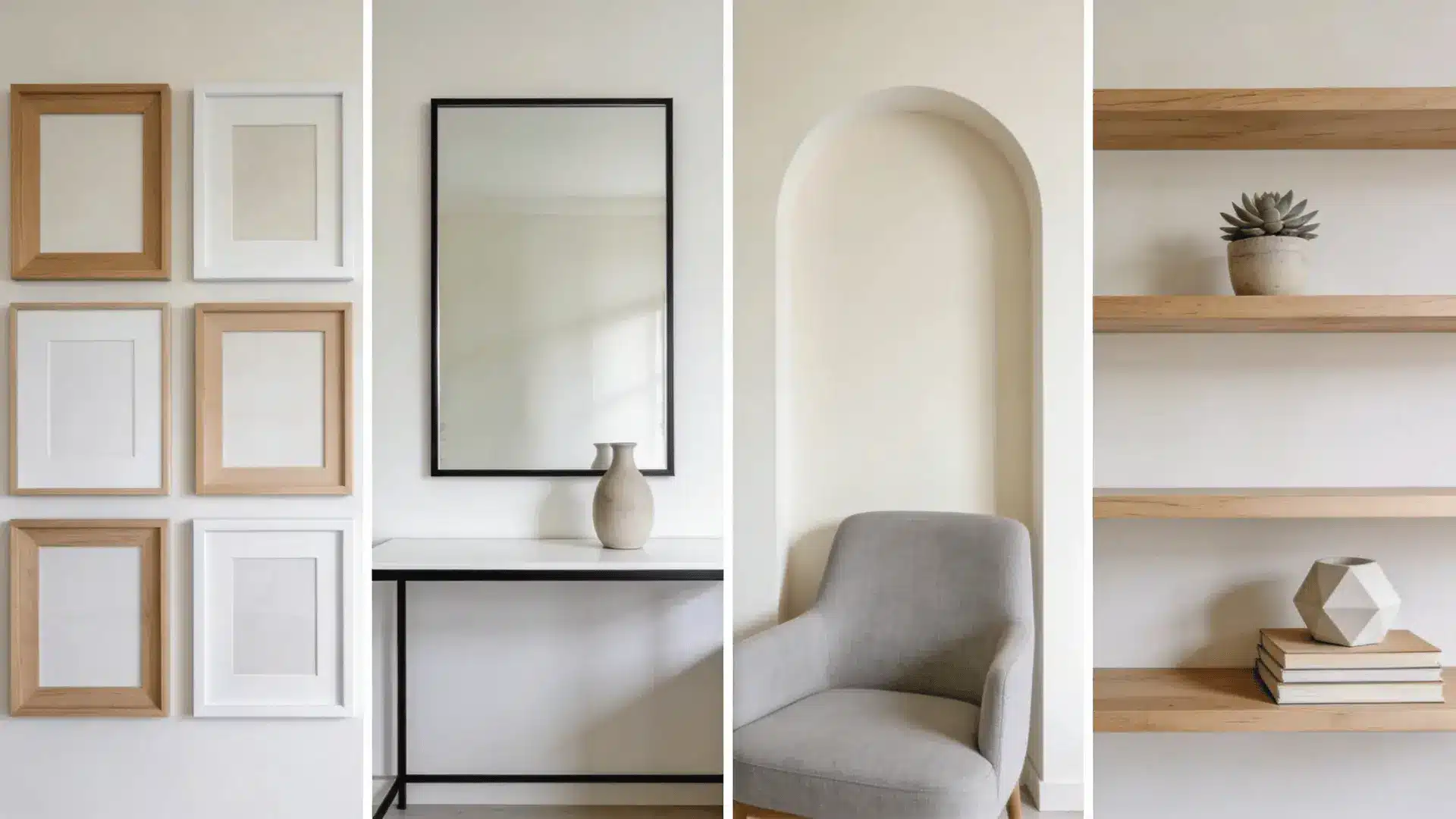
1. Gallery Wall with Balanced Spacing
A gallery wall works when the spacing feels consistent and the layout forms one clear visual shape. Keep 2–3 inches between frames and anchor the arrangement around a central piece. Mixing sizes is fine, but repeat one frame color to create cohesion and avoid visual clutter.
2. Oversized Framed Mirror Upgrade
An oversized mirror expands visual space by reflecting light and movement. It works best when placed across from a window or a styled area, not a blank wall. Choose a frame that contrasts slightly with your wall color to create definition without overpowering the room.
3. DIY 3D Textured Wall Art
Textured art adds depth because raised surfaces create natural shadows. Plaster panels, layered canvas, or geometric wood shapes all work well. Keep the color palette neutral so the texture stands out without competing with other elements in the room.
4. Painted Arch or Accent Shape
A painted arch or soft shape defines a zone without adding furniture. Use it behind a bed, desk, or reading chair to create a focal area. Choose a tone slightly deeper or lighter than the wall to create contrast without overwhelming the space.
5. Chalkboard Feature Wall
Chalkboard paint adds function and personality, especially in kitchens, offices, or kids’ spaces. It works best when limited to one defined wall section. Pair it with lighter decor nearby so the dark surface feels intentional rather than heavy.
6. Floating Wood Shelves
Floating shelves create vertical rhythm and useful storage. Space them evenly and avoid overfilling them with decor. A mix of books, one plant, and a single sculptural object keeps the display intentional instead of crowded.
7. Framed Fabric Panels
Fabric panels soften hard walls and introduce subtle pattern. Choose textiles that repeat an existing room color to maintain cohesion. Larger panels often feel more refined than many small ones scattered across the wall.
8. Minimalist Large-Scale Canvas Art
One large canvas creates strong hierarchy and anchors a room instantly. Keep the design simple and bold rather than detailed and busy. A single oversized piece often feels more modern and confident than multiple small artworks.
Furniture & Hardware DIY Upgrades that Modernize a Room
Furniture carries visual weight, and hardware or finish determines whether it feels heavy, modern, or dated.
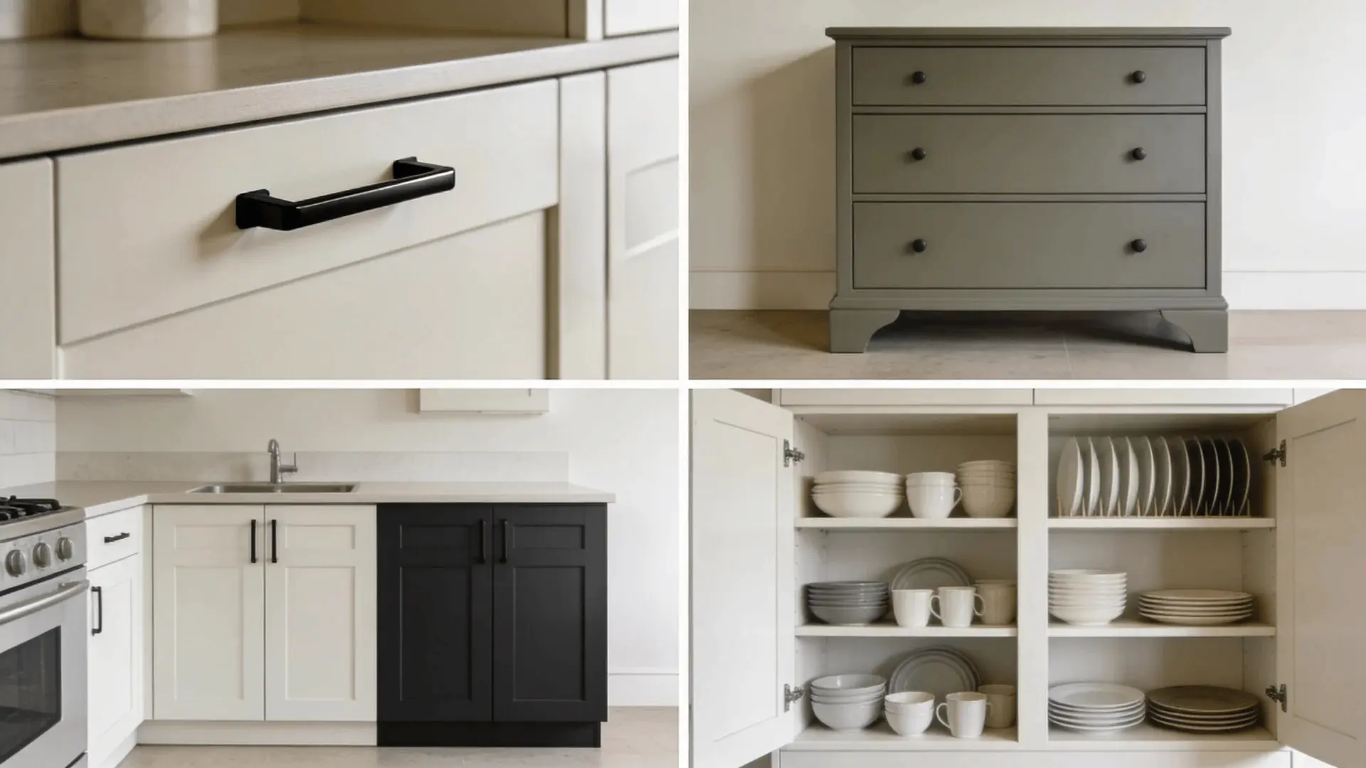
9. Swapping Cabinet Knobs and Pulls
Changing hardware is small but powerful. Larger pulls create stronger horizontal lines and instantly modernize cabinets. Match finishes across the room for cohesion. If cabinets are dark, lighter hardware adds contrast; if they’re light, darker pulls create definition.
10. Painting Outdated Dressers
A fresh coat of paint reshapes how light interacts with furniture. Matte finishes feel soft and modern, while satin offers subtle sheen without highlighting flaws. Prep matters here; smooth sanding and thin coats prevent streaks that make the piece look rushed.
11. Two-Tone Cabinet Refresh
Two-tone cabinets add depth through contrast. Darker lowers ground the space while lighter uppers keep it open and airy. Keep the tones in the same color family so the transition feels intentional instead of disconnected.
12. Faux Wood or Stone Finish
Faux finishes work well when subtle. Light layering and controlled veining create believable texture. Avoid heavy contrast or exaggerated patterns, which quickly look artificial. The goal is suggestion, not perfection.
13. Decorative Trim Molding Add-On
Adding trim introduces clean shadow lines that elevate flat furniture. Align trim with drawer edges for symmetry and proportion. Too many layers can feel busy, so keep profiles simple and repeat the style across similar pieces.
14. Open Shelving Conversion
Removing upper cabinet doors creates openness and visual breathing room. Style shelves with restraint—leave empty space between items. Consistent dish colors or matching containers prevent the look from becoming cluttered.
15. Statement Side Table Makeover
A bold side table can anchor a seating area. Choose a strong color or finish that complements, not competes with, nearby furniture. Keep surrounding decor minimal so the table feels intentional and balanced.
Budget DIY Home Decor that Looks High-End
Expensive-looking decor follows patterns. It relies on proportion, controlled color, and thoughtful texture contrast. Price matters less than perception.
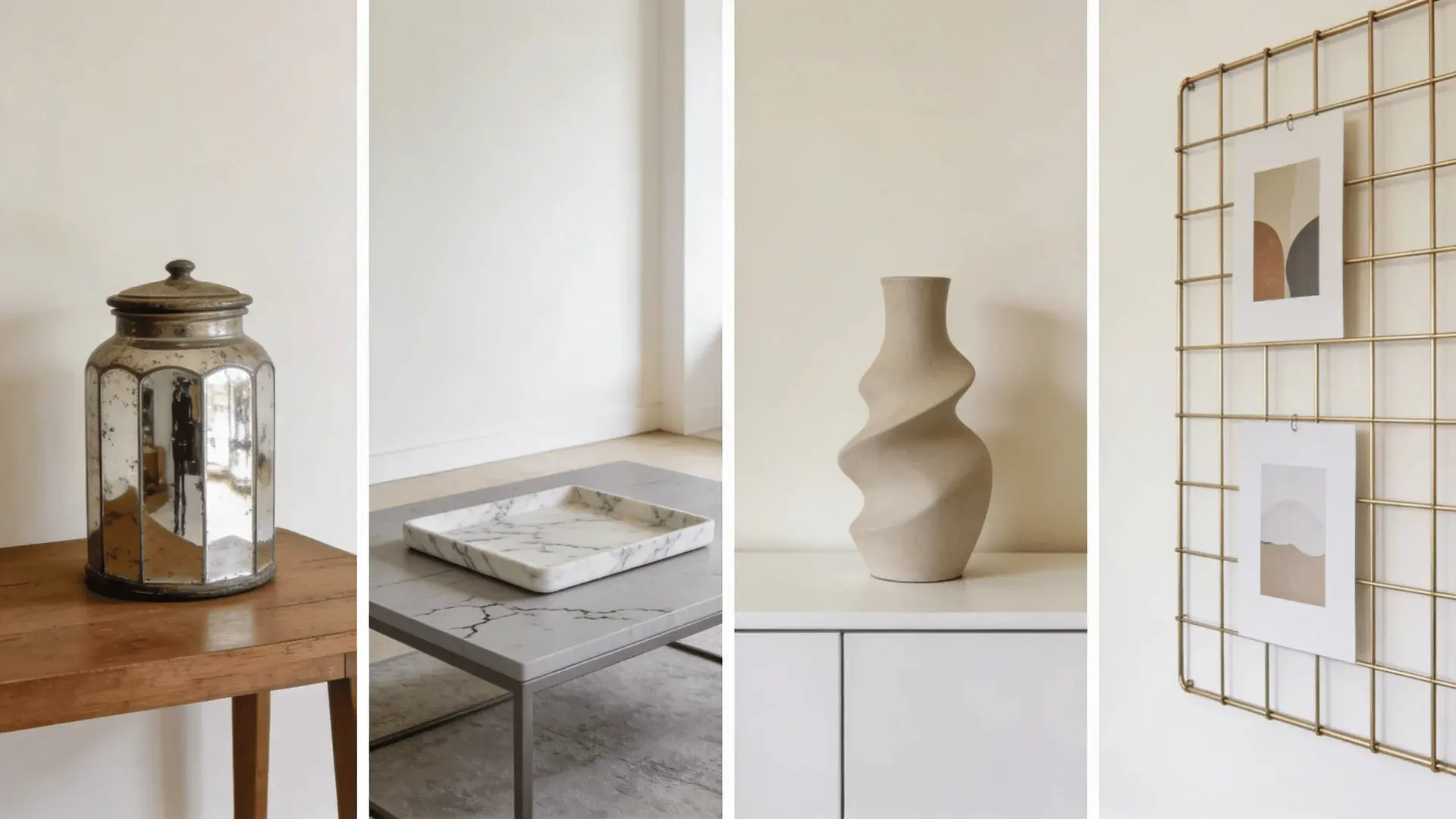
16. Faux Antique Mirror Jars
Create an aged-glass effect by lightly distressing the inside of clear jars with layered paint and gentle blotting. Keep contrast low so it feels worn, not painted. Subtle variation looks believable. Group two or three together so they feel curated instead of randomly placed.
17. Elevated Candle Holders
Upgrade basic holders with stacked bases, matte paint, or soft metallic accents. Vary heights slightly to create rhythm while keeping finishes consistent. Limit shine so the look stays refined. A controlled palette helps the arrangement feel intentional rather than decorative clutter.
18. Gold-Framed Wall Grid
Spray a simple wire grid in matte gold or brushed brass for a structured accent. Display a few neutral prints or leave negative space visible. Overcrowding the grid weakens its impact. Clean spacing keeps the piece looking modern and elevated.
19. Decorative Storage Box Upgrade
Wrap plain boxes in linen-textured paper or matte fabric for a tailored finish. Add slim trim lines for structure, not decoration. Keep colors neutral and edges crisp. When surfaces are clean and restrained, the box reads custom rather than handmade.
20. Marble-Look Trays
Use thin, soft veining with low contrast to mimic real marble. Keep movement organic and subtle. Heavy streaks or dramatic lines look artificial. A balanced surface with gentle variation feels polished and believable in both modern and classic spaces.
21. Designer-Style Vases
Focus on strong, simple silhouettes instead of busy patterns. Paint vases in muted or earthy tones to create cohesion. Matte finishes often look more refined than glossy ones. Let shape carry the visual weight while keeping surface details minimal.
22. Textured Wall Panels
Install lightweight panels or foam shapes to add depth through shadow. Keep spacing even and patterns restrained. Oversized or overly bold designs can overpower small rooms. Subtle dimension creates interest without making the wall feel crowded.
23. Statement Planter Stands
Raise plants on clean-lined stands to introduce vertical variation. Use similar finishes across multiple stands so they feel coordinated. Too many mixed materials disrupt balance. Controlled repetition helps the arrangement feel styled rather than improvised.
24. Rustic Wood Clock
A large wooden clock adds warmth and anchors a blank wall. Choose a wood tone that echoes existing finishes in the room. Mixing too many tones reduces cohesion. Let the clock remain the main feature without competing accessories nearby.
25. Minimalist Floating Ledge Display
Install a slim ledge and style it with only a few carefully spaced objects. Leave visible negative space so each item stands out. When every inch is filled, the ledge loses clarity. Restraint is what gives this display a modern feel.
Soft Decor & Texture DIYs that Add Depth without Clutter
Soft decor changes how a room feels emotionally. Texture creates warmth because it absorbs and diffuses light instead of reflecting it sharply.
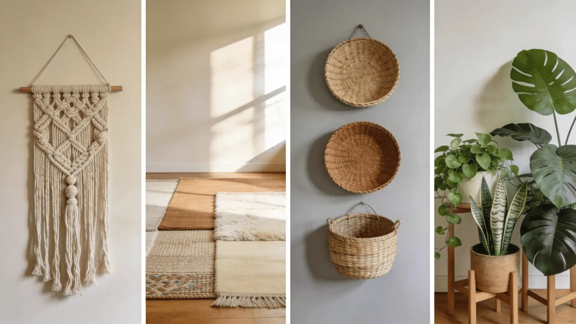
26. Macramé Wall Hanging
A macramé piece softens sharp lines and adds natural texture to blank walls. It works best in rooms with clean shapes and neutral tones. Choose one medium-to-large piece instead of several small ones. Too many fiber elements can make the wall feel visually busy.
27. Diy Throw Pillow Covers
Sew or wrap new pillow covers using fabrics that share one common color. Mixing textures like linen and cotton adds depth without overwhelming the space. Limit patterns to two or three. Too many prints quickly create visual noise instead of comfort.
28. Layered Area Rugs
Layer a smaller textured rug over a larger neutral base to add warmth and structure. Make sure the top rug is clearly smaller so the layering looks intentional. If both rugs are similar in size, the effect feels accidental instead of styled.
29. Woven Basket Wall Display
Arrange woven baskets in an odd-number grouping to create natural balance. Keep spacing consistent and sizes varied for rhythm. Stick to similar tones so the wall feels cohesive. Random placement weakens the structured, collected look.
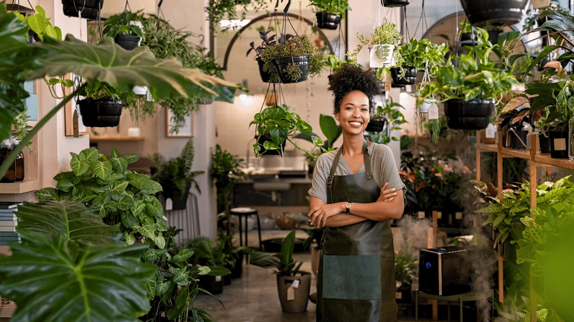
30. Indoor Plant Clusters
Group plants in sets of three with varied heights to create movement. Use similar pot finishes to maintain cohesion. Spreading single plants across the room often feels scattered. Clusters create visual weight and a stronger focal point.
31. Seasonal Wreath Creation
Create one well-made seasonal wreath instead of multiple themed items. Keep the color palette restrained and repeat one accent tone from the room. Over-layering seasonal decor can make the space feel temporary rather than intentional.
Simple Lighting DIYs that Change the Mood of A Room
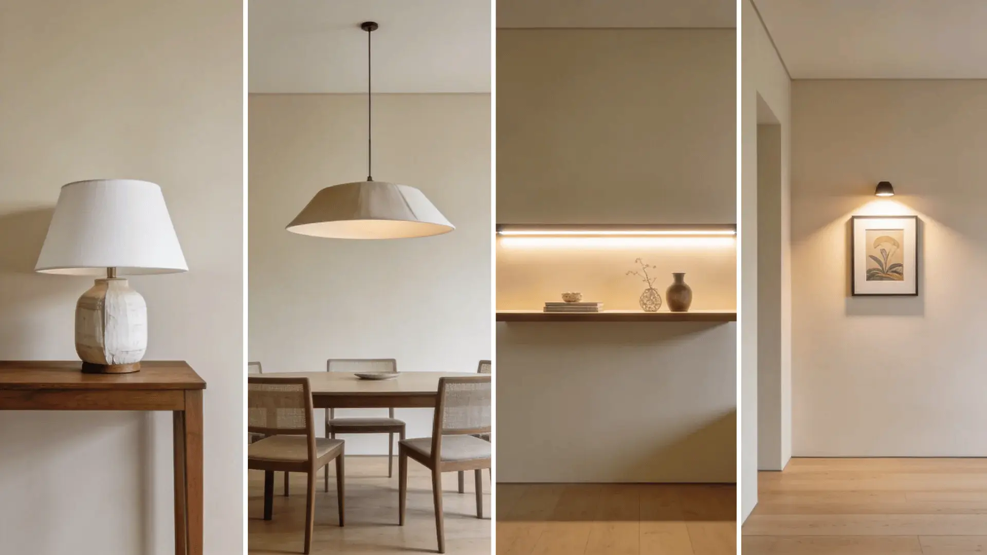
Lighting changes color, shadow, and mood in ways people often underestimate. Warm light feels cozy. Cool light feels crisp and modern.
32. Updating Lamp Shades
Swapping a lampshade changes how light spreads through a room. White or light shades diffuse brightness evenly, while darker shades focus light downward for a softer mood. Match the shade scale to the lamp base. A shade that’s too small or too wide throws off proportion.
33. Diy Pendant Light Covers
A new pendant cover can reshape both style and light direction. Wide shades spread light across the ceiling, making rooms feel open. Narrow or dome shapes create focused pools of light below. Keep the size balanced with the room so it enhances, not dominates.
34. Led Strip Backlighting
LED strips placed behind shelves or headboards create a subtle floating effect. Soft, warm tones add depth without glare. Keep brightness low so the glow feels ambient rather than harsh. Too much intensity makes the lighting feel artificial instead of layered.
35. Rustic Branch Chandelier
A branch-style chandelier introduces texture and organic contrast overhead. Choose a size that fits the room’s scale so it doesn’t feel heavy. Keep surrounding decor minimal so the fixture remains the focal point instead of competing with other elements.
36. Battery-Powered Accent Lighting
Small accent lights can highlight artwork, plants, or shelving details. Place them strategically to create gentle shadow contrast. Overusing accent lights flattens the effect. Focus on one or two key areas to maintain balance and atmosphere.
Decorating Rules: The 3-5-7 Rule and When It Fails
The 3-5-7 rule suggests grouping decor in odd numbers instead of even ones.
Odd numbers create slight visual tension, and that tension adds interest. Even numbers feel symmetrical and calm. Odd numbers feel more dynamic and relaxed.
The rule works because your eye doesn’t split an odd grouping evenly. It keeps moving, which makes the arrangement feel natural instead of staged.
Where it fails is with scale and proportion.
Three tiny objects on a large table look lost. Five large objects on a small shelf feel crowded. The number may follow the rule, but the size relationship is wrong.
Pattern mixing follows the same idea. You can combine different patterns, but repeat at least one common color to tie them together. Without that link, the pieces compete.
Decorating rules guide decisions. They don’t replace judgment. When scale, balance, and proportion are right, the 3-5-7 rule works. When they’re off, counting alone won’t fix it.
Wrapping Up
Great spaces aren’t built by accident. They’re shaped by small, thoughtful changes that work together. DIY home decor becomes powerful when you stop decorating randomly and start adjusting with purpose.
The right wall treatment can anchor a room. A simple hardware swap can modernize it. Lighting can completely shift the mood.
When you pay attention to proportion, contrast, and placement, even budget projects feel intentional. You don’t need to overhaul everything at once. Choose one area that feels off and improve it with clarity.
Take action on a single project this week, and notice how the space responds. That’s how real change begins.
Frequently Asked Questions
What is the 3-5-7 rule of decorating?
It’s a guideline to group items in odd numbers. Odd groupings create visual tension and often feel more natural than even, perfectly symmetrical arrangements.
What is the rule of 3 in decorating?
The rule of 3 focuses on grouping three objects of varied height or size to create balance and rhythm without looking overly staged.
How can I make DIY decor look expensive?
Control proportion, limit your color palette, repeat textures intentionally, and avoid overcrowding. Subtle contrast and clean finishes matter more than price.
What are easy DIY home decor ideas for beginners?
Start with hardware swaps, painted accent shapes, simple shelf styling, or pillow cover changes. These projects offer high impact with low risk.