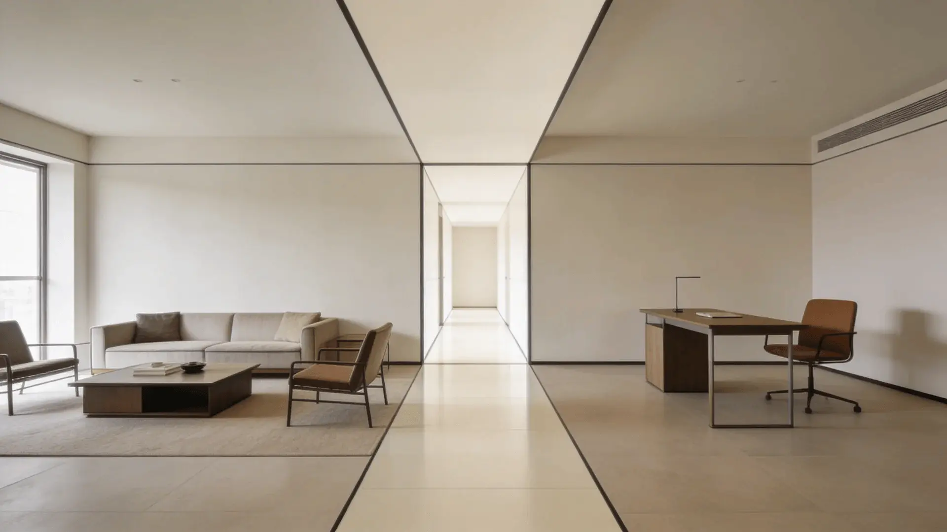
When people search for room layout ideas, they usually expect a list of pretty arrangements. A few diagrams. Maybe a tip about pushing the sofa against the wall.
But copying a layout rarely fixes a room. Most frustration comes from skipping the hidden structure underneath.
A layout works because of function, scale, and movement, not because it looks good in a photo. I’ve seen rooms with expensive furniture still feel awkward simply because the layout ignored traffic flow or focal points.
So instead of jumping straight to inspiration, I’m going to build this from the ground up, step by step. When you move your furniture, it should feel right, not forced.
Step 1 – Define the Room’s Function and Constraints Before Moving Anything
Before you slide a single chair, define what the room is supposed to do. Layout is not decoration. It is structure. If the function changes, the layout has to change with it.
Identify Primary Activities and Seating Density
Ask yourself what actually happens in this room.
- Is it mostly conversation?
- Is it TV watching?
- Is it reading and quiet use?
- Is it a mix of everything?
The activity determines seating density. A conversation-focused living room needs chairs facing each other within speaking distance. A TV-focused room allows deeper seating aimed in one direction. A mixed-use room requires flexibility.
Here’s where people get stuck: they arrange furniture for how they want the room to look, not how they truly use it day to day.
A room used by one person can handle more open space. A family room with kids needs wider paths and stronger anchoring. The more movement and people involved, the more circulation space you must protect.
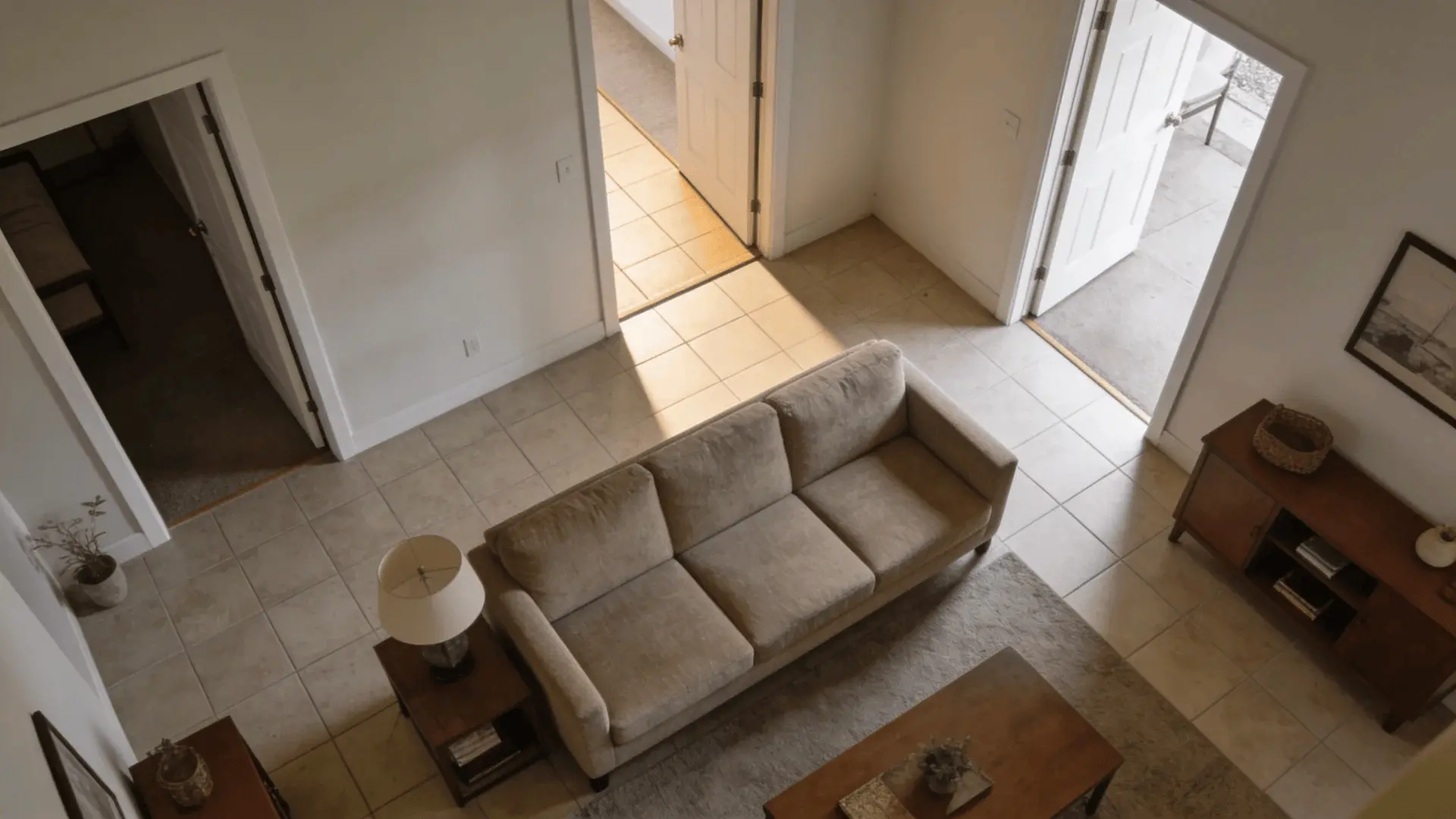
Map Fixed Elements (Doors, Windows, Built-Ins)
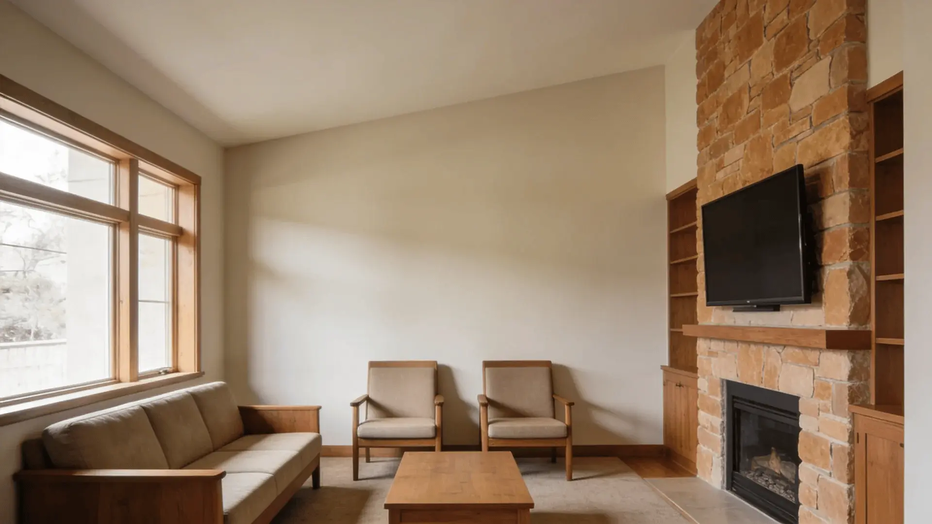
Now look at what cannot move. Doors create natural walking paths. Windows pull attention. Fireplaces anchor walls. Built-ins limit depth and placement options.
These fixed elements create constraints, and those constraints limit where large pieces can realistically go.
If a doorway cuts through the center of a wall, placing a sofa there will compress movement. The room may look balanced at first glance but feel tight when you walk through it. That discomfort usually comes from a blocked movement arc, not from bad style.
Rooms with multiple doors demand clearer pathways. Rooms with only one entry allow more flexibility. The more interruptions a wall has, the less usable it becomes for anchor pieces.
Define Usable Floor Area vs. Walkways
Not all square footage is usable in the same way. Picture drawing invisible lines between doorways. That area becomes a primary walkway. Large furniture should not sit in that corridor.
This is where many layouts quietly fail. People treat the entire room as equal space, but movement paths reduce usable zones.
A large room with three crossing pathways can function like a much smaller one. A small room with a single entry may feel larger because its usable zone stays uninterrupted.
Once you understand usable area versus traffic area, you stop fighting the room and start working with it.
Step 2 – Identify or Create a Clear Focal Point
Every strong layout has a visual center. Without it, furniture tends to float with no real logic.
What Qualifies as a True Focal Point
A true focal point naturally draws attention. It could be:
- A fireplace
- A large window with a view
- A TV
- A dramatic wall
But not every noticeable element should dominate the layout.
Functional dominance means the element people orient toward most. Visual dominance means what catches the eye first. Sometimes those align. Sometimes they compete.
A fireplace may look strong, but if everyone watches TV daily, the TV becomes the functional focal point. Ignoring that creates seating angles that feel forced.
Handling TV + Fireplace + Window Conflicts
Multiple focal points create tension. You cannot center seating equally around three directions without breaking conversation lines and sightlines.
You have to choose hierarchy.
- Primary focal point: seating faces this.
- Secondary element: supported, not centered.
- Tertiary elements: visually acknowledged but not structurally dominant.
If the fireplace and TV sit on different walls, mounting the TV above the fireplace can merge hierarchy. If that’s not possible, choose the one used most often.
The common mistake is trying to honor every focal point equally. That splits the room’s attention and weakens the layout.
What to Do When No Focal Point Exists
Some rooms have blank walls and no obvious anchor. In that case, you create one.
A large piece of art. A media console. A bold wall treatment. Even a centered sofa arrangement can define direction.
The reason is simple: people orient toward structure. If you do not define direction, the room feels scattered and unsettled.
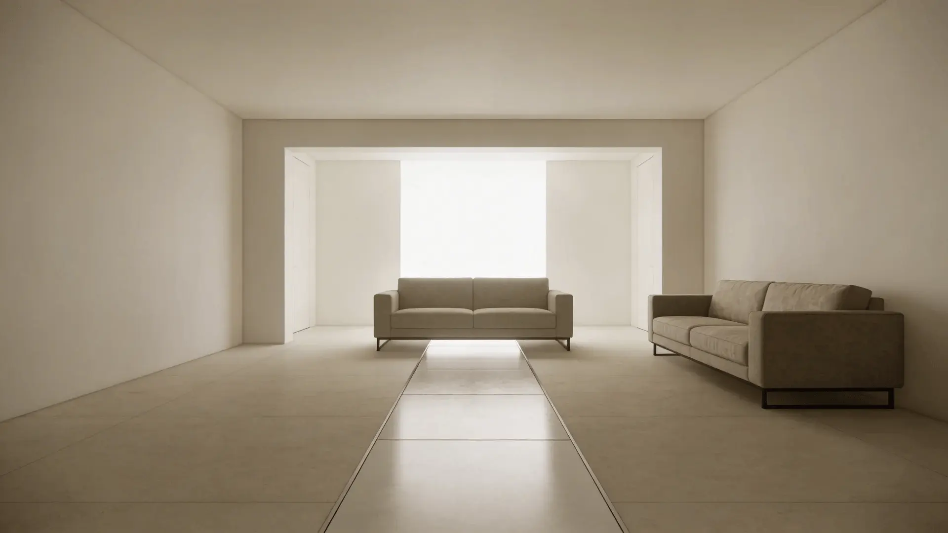
Step 3 – Place the Anchor Piece to Establish the Layout Framework
The anchor piece is usually the largest item, often the sofa. It defines spatial boundaries and sets the tone for everything that follows.
When you place the anchor first, you establish zones. Everything else supports it. If the sofa is too small for the wall, the room feels ungrounded. If it’s too large, circulation compresses and movement tightens.
Scale matters more than symmetry.
A long wall allows a longer anchor. A shorter wall may require a smaller sofa or a floating placement.
Placing the anchor flush against a wall increases open floor area but can weaken intimacy. Floating the sofa can create a defined conversation zone, yet it reduces walkway width.
Anchor placement triggers a chain reaction. It sets sightlines, walking paths, and secondary seating positions. That’s why it comes before chairs or tables.
Step 4 – Build Around the Anchor While Protecting Traffic Flow
This is the hidden mechanism behind good layouts. A room can look balanced and still feel wrong. That feeling usually comes from interrupted movement.
Primary vs. Secondary Walkways
Primary walkways connect main entry points and need the most clearance. Secondary walkways allow movement around furniture groups.
If a primary path cuts through a seating cluster, people will constantly interrupt conversation to pass through. Over time, that friction creates subtle discomfort.
A good layout allows someone to cross the room without weaving tightly around furniture.
Clearance Guidelines and Movement Arcs
Furniture depth plays a bigger role than most people realize.
Deep sofas shrink pathways. Wide armchairs can block turning space. Coffee tables placed too far from seating break usability; too close, and they block knees.
Movement is rarely straight. People curve around objects, and that curve requires space.
In high-traffic rooms, even a few inches can change the feel. In low-traffic rooms, tighter spacing may feel cozy instead of cramped. The difference depends on use patterns, not size alone.
When Floating Furniture Helps and When It Hurts
Floating furniture can:
- Create defined zones
- Improve conversation flow
- Reduce a wall-cluttered appearance
But it can also:
- Shrink usable walking space
- Make small rooms feel boxed in
- Interrupt natural pathways
Floating works best when there is enough depth behind the piece for a real walkway. If that space becomes a narrow squeeze, the effect reverses. The goal is not visual drama, but uninterrupted movement.
Step 5 – Test Sightlines, Balance, and Use in Real Movement
Once furniture is placed, you test it by actually moving through the room.
- Stand in the doorway. Notice what you see first. Does it feel centered or slightly off?
- Sit in each seat. Can you see the focal point comfortably without twisting?
- Walk from one end to the other. Do you hesitate or adjust your path?
Balance is not just symmetry. It is visual weight. A heavy sectional on one side may need visual support on the other, perhaps a pair of chairs or a console. Without it, the room feels tipped.
Failure often shows up subtly: bumping into corners, avoiding certain seats, shifting your body to see the TV.
Those signals mean the layout needs adjustment. A room should feel effortless to move through, not something you have to think about.
Common Room Layout Configurations and When They Actually Work
Not all layouts suit all rooms. Each one works under certain conditions.
1. Symmetrical (Formal) Layout
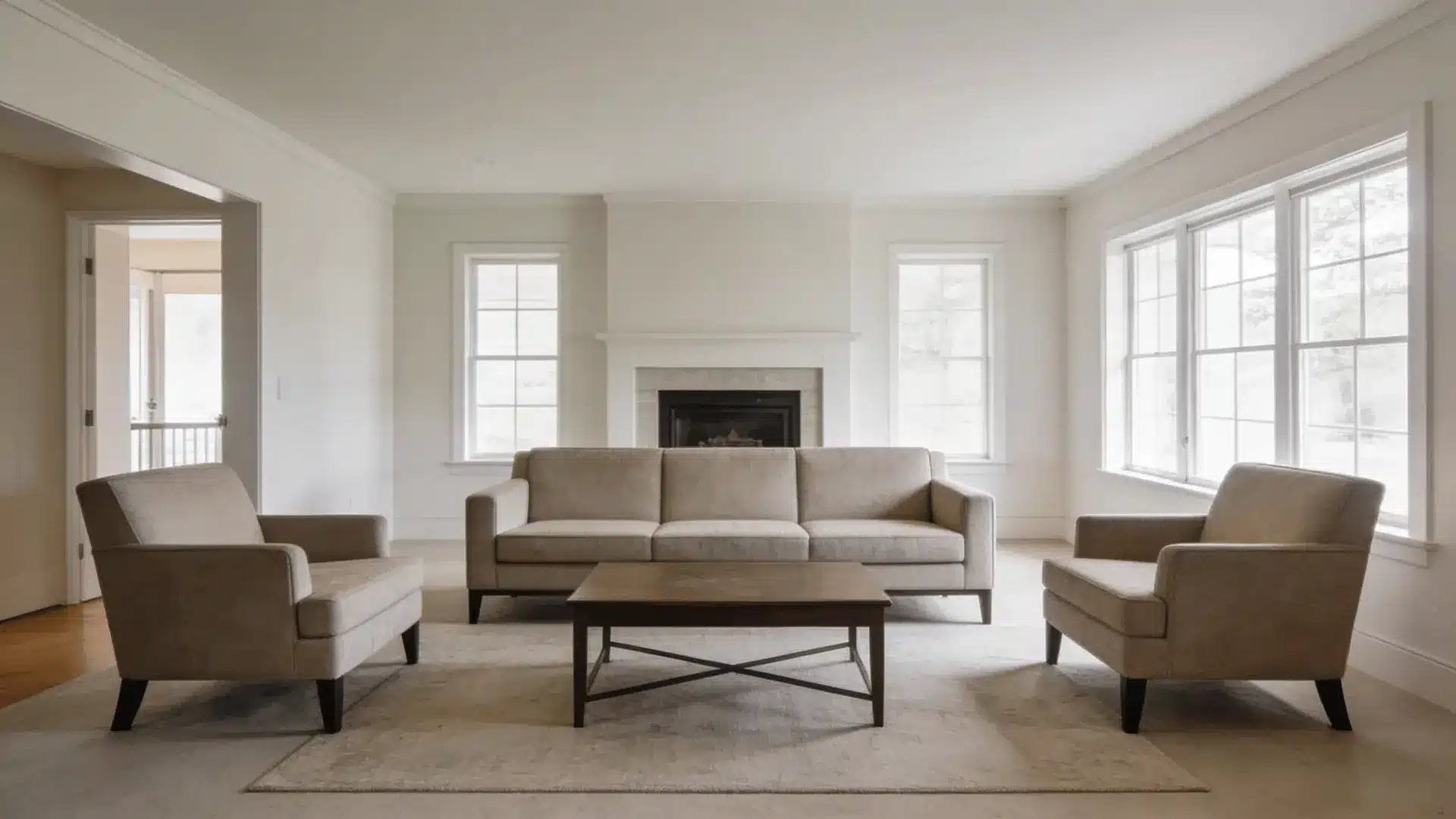
Works best in rectangular rooms with a centered focal point. Chairs mirror each other, and sofas align evenly, which supports conversation and visual balance.
It fails when the room has uneven windows, an offset fireplace, or heavy traffic on one side. Symmetry cannot correct structural imbalance.
2. Asymmetrical (Casual) Layout
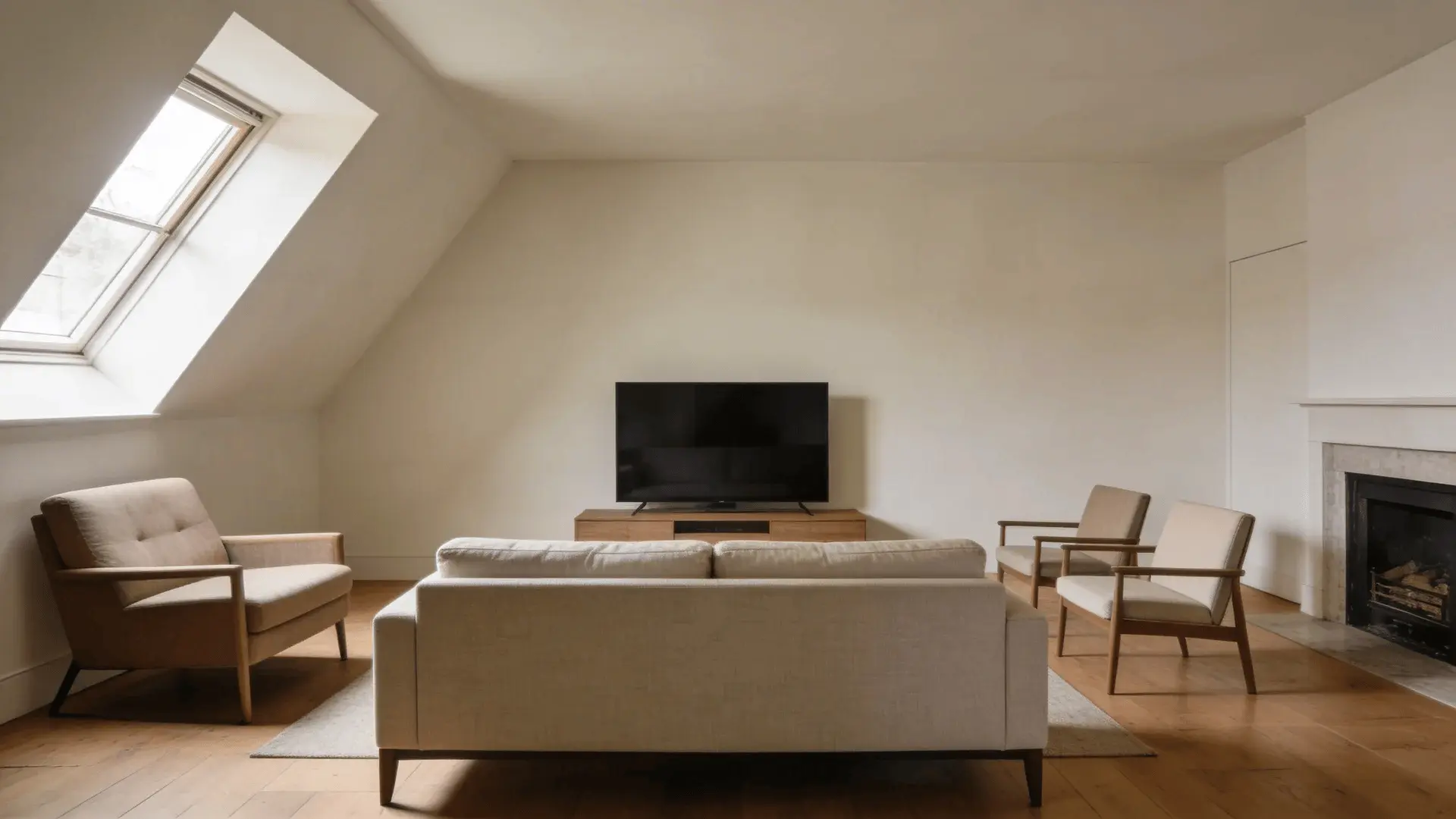
Uses varied seating and offset placement. Good for irregular rooms where strict balance feels forced, and it handles architectural quirks better than symmetry.
However, it still requires visual weight balance. Without that, the room can feel messy rather than relaxed.
3. L-Shaped Layout
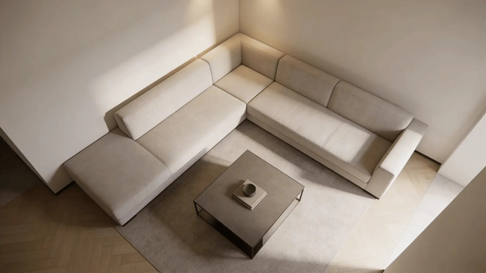
Often built around a sectional or a sofa plus chair. Works well in corners or open-plan rooms because it clearly defines a seating zone.
It fails in narrow rooms where the extended leg blocks circulation and compresses pathways.
4. Zoned or Divided Layout
Splits a large room into two functional areas. Best for open spaces where one layout would feel empty.
It works when both zones have clear focal points, but fails if walkways must cut awkwardly through both areas.
5. Wall-Hugging vs. Floating Layout
Wall-hugging increases central floor space and works in tight rooms with heavy traffic. Floating creates intimacy and structure, but only works when depth allows real clearance behind furniture.
The right choice depends on room constraints, not style preference.
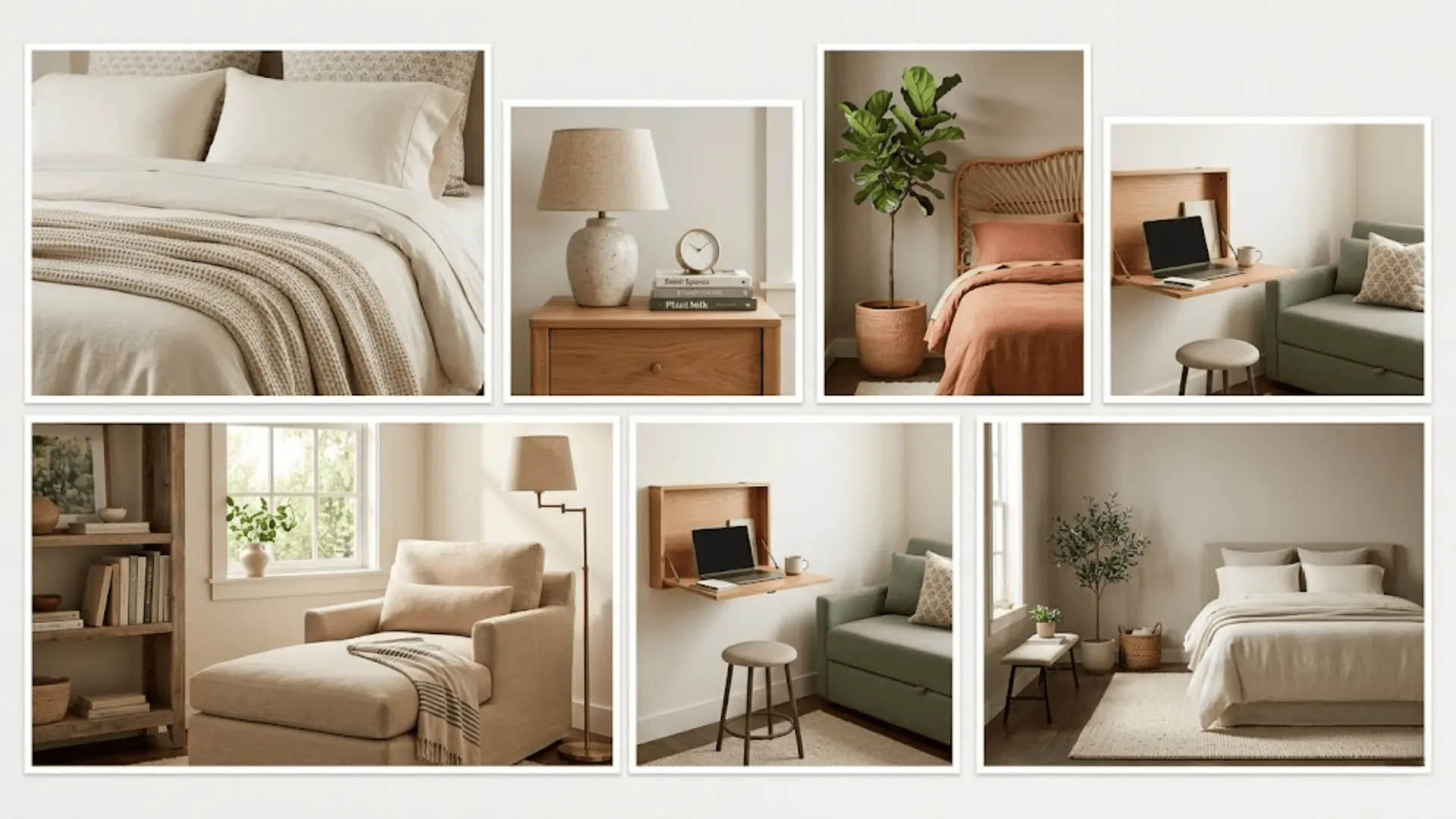
How to Arrange Furniture in a Small Room Without Making It Feel Smaller
Small rooms amplify mistakes quickly. The goal is not to fit more in, but to let the space breathe.
| Focus Area | What to Do | Why It Works |
|---|---|---|
| Managing Visual Weight | Choose one properly scaled anchor and limit secondary pieces. Avoid bulky furniture, but also avoid filling the room with many tiny items. | Large pieces compress space, but too many small ones create clutter. Balanced proportion keeps the room feeling stable and open. |
| Preserving Open Movement Paths | Keep primary walkways clear. Prioritize circulation over larger tables or extra seating. | Even small obstructions feel bigger in tight rooms. Clear movement reduces visual and physical tension. |
| Fewer Pieces, Better Placement | Reduce duplication instead of adding more storage. Use multi-functional pieces only if they replace something else. | Adding without subtracting increases bulk. Thoughtful reduction protects usable space and improves flow. |
Small spaces are less forgiving than large ones. Every inch affects how the room feels, so careful choices matter more than quantity.
Quick Room Layout Planning Checklist
Before finalizing your layout, confirm:
- The room’s main function is clear
- One focal point dominates
- Anchor piece is scaled to wall length
- Primary walkways are unobstructed
- Seating supports the main activity
- Sightlines feel natural
- No area feels cramped or unused
If one of these fails, adjust before decorating further.
Wrapping Up
A strong layout is not about copying someone else’s room. It’s about understanding why a space feels easy or difficult to use.
When you respect function, focal hierarchy, and traffic flow, the room starts supporting you instead of working against you. Room layout ideas only become powerful when grounded in real structure.
If your space still feels off, return to the steps and check the basics again. Revisit the function and movement. Small shifts can change everything.
Start there, move one piece at a time, and let the room settle into place. Share your experience and any tips in the comments section below!
Frequently Asked Questions
Is there a free app to help rearrange a room?
Yes, many free planning apps exist. They help you visualize scale and placement. They do not replace understanding traffic flow and focal hierarchy.
What is the 3-4-5 rule for decorating?
It refers to grouping items in odd numbers for visual interest. It affects styling, not structural furniture placement.
What is the 60-30-10 rule, and does it affect layout?
That rule applies to color balance. It does not determine where furniture should sit or how people move through a room.
How do you arrange furniture in a small living room?
Start with function, choose one focal point, place a properly scaled anchor, then protect clear walking paths. Movement matters more than symmetry.