
Flower Textures: The Secret Ingredient Most People Ignore (And Yes, It Matters)
If your flower arrangements always end up looking… fine. Like “nice grocery store bouquet” fine. Not “who made this?!” fine. There’s a good chance it’s not your color choices—it’s texture.
And before you roll your eyes because texture sounds like something a fancy florist whispers while misting orchids in a linen apron: stay with me. Texture is the difference between an arrangement that looks alive and one that looks like it’s waiting for a ride home.
Here’s the sneaky part: there are two kinds of texture in flowers, and they don’t always match. Once you start noticing that, you’ll pick better blooms instantly—without needing a design degree or seventeen Pinterest boards.
The Two Types of Texture: What Your Eyes See vs. What Your Hands Feel
I want you to think of flower texture like fabric shopping.
- Visual texture is what you think something will feel like from across the room—based on shadows, layers, shape, shine, and all that good stuff.
- Tactile texture is what it actually feels like when you touch it: waxy, velvety, papery, sturdy, fuzzy, prickly, etc.
And yes, flowers can catfish you.
Something can look wildly ruffled and fancy, then feel like delicate tissue paper the moment you breathe near it. Or it can look sleek and simple, but feel thick and kind of “leathery” (looking at you, calla lilies).
Visual Texture: The “Can You See It From Six Feet Away?” Test
Visual texture is basically shadow drama.
Ruffles, layers, spirals, ridges—anything that catches light and makes little dips and valleys—reads as textured even from across the room. That’s why blooms like dahlias and ranunculus look so lush: they’re basically tiny architecture.
A super simple test I use (even at the flower market, where I’m absolutely that person squinting at stems):
Does the flower look different when you tilt it?
If it changes a lot—hello, shadows—high visual texture. If it looks kind of the same no matter what, it’s visually smoother. (Not bad! Just a different job.)
Also: tiny details read as “airy” (baby’s breath, delicate grasses), while bigger petal structure reads as “bold” (dahlias, protea, big statement flowers).
Tactile Texture: The Part Everyone Forgets Until It’s Shedding All Over the Table
Tactile texture is the real life experience—what happens when you carry it, arrange it, bump it, or when someone inevitably pokes it and goes, “Ooooh.”
What affects tactile texture most:
- Surface (waxy vs. fuzzy vs. smooth)
- Thickness (paper thin petals vs. thick, sturdy ones)
- Rigidity (floppy stems vs. stiff, structural branches)
And I’m just going to say it: tactile texture matters a lot more in homes than people admit. Because in a home, flowers aren’t just “viewed.” They’re lived with. You move them to wipe the counter. Your kid sticks a finger in them. Your dog walks by and tail whips the vase like a tiny wrecking ball.
(Ask me how I know. Actually don’t. I’m still recovering.)
The Fun Part: When a Flower Looks Like One Thing… and Feels Like Another
This is where arrangements go from “pretty” to “interesting.”
A few examples you’ll start noticing immediately:
- Looks rough, feels smooth: Some protea and tropical foliage look spiky and intense, but feel surprisingly waxy or slick.
- Looks smooth, feels fragile: Ranunculus can look glossy and substantial… and then the petals bruise if you side eye them. Baby’s breath looks like a soft cloud until it starts dropping tiny bits everywhere.
- Looks delicate, feels sturdy: Calla lilies look elegant and fragile, but they’re thick and kind of leather-ish. Orchids look soft but often feel firmer and waxier than expected.
That little “wait, what?” moment is design magic. It makes people lean in.
Lighting: The Thing That Can Make Your Arrangement Look Amazing or Weirdly Flat
Here’s an annoying truth: lighting is basically the translator for visual texture.
- Directional light (window light, a lamp nearby) makes ruffles and layers look more dramatic because shadows show up.
- Flat overhead light can make even gorgeous flowers look… meh. Like someone turned the contrast down on real life.
So if your room has flat lighting and you still want that “wow,” pick flowers with strong built in shape (ruffles, layered petals, bold silhouettes), not just subtle texture that relies on shadow.
Okay, So Which Texture Should You Prioritize?
Prioritize visual texture when…
- The flowers will be seen from across the room (big centerpiece, entry table, event arrangements)
- Photos matter (cameras don’t capture “waxy vs. velvety,” they capture shape and shadow)
- It’s a more formal setting where nobody’s going to touch anything (or they shouldn’t—hands off the arrangements, Gary)
Prioritize tactile texture when…
- It’s in your home and you’ll interact with it daily
- It’s a bridal bouquet (you’re holding that thing for hours—comfort and sturdiness matter)
- It’s at eye level or lower where people naturally reach out
Touch is weirdly emotional. Soft, fuzzy, feathery textures feel cozy and personal. Rough or woody textures feel earthy and grounded. Your hands remember things your brain doesn’t.
My Go To Formula for Mixing Textures (Without Making a Chaos Bouquet)
Texture contrast is like outfit styling: if everything is ruffled, nothing is ruffled. You need opposites.
If you want an arrangement that looks intentional (not like you panic grabbed 12 random bunches), try building layered floral designs:
- Pick 2-3 main textures, not seven.
- Use foliage as your “bridge” so it doesn’t feel like every stem is yelling for attention.
If you want a simple ratio that works almost every time:
- 60% your main texture
- 30% your supporting texture
- 10% an accent texture (the little spice)
And my favorite reality check:
Stand back about six feet.
If your eyes don’t know where to land, it’s not “artistic,” it’s just busy. Edit it. (Yes, you can edit flowers. Snip with confidence.)
A Texture Cheat Sheet (So You Stop Guessing in the Flower Aisle)
Here are my quick “texture categories” when I’m building something that doesn’t look like a sad leftover bouquet.
Smooth + Sleek (clean, modern, calming)
Tulips, lilies, orchids, calla lilies, anthuriums
These give your arrangement a place to rest. They’re like the plain black tee that makes the fun jacket look even cooler.
Heads up: smooth petals show bruises and fingerprints like they’re keeping receipts.
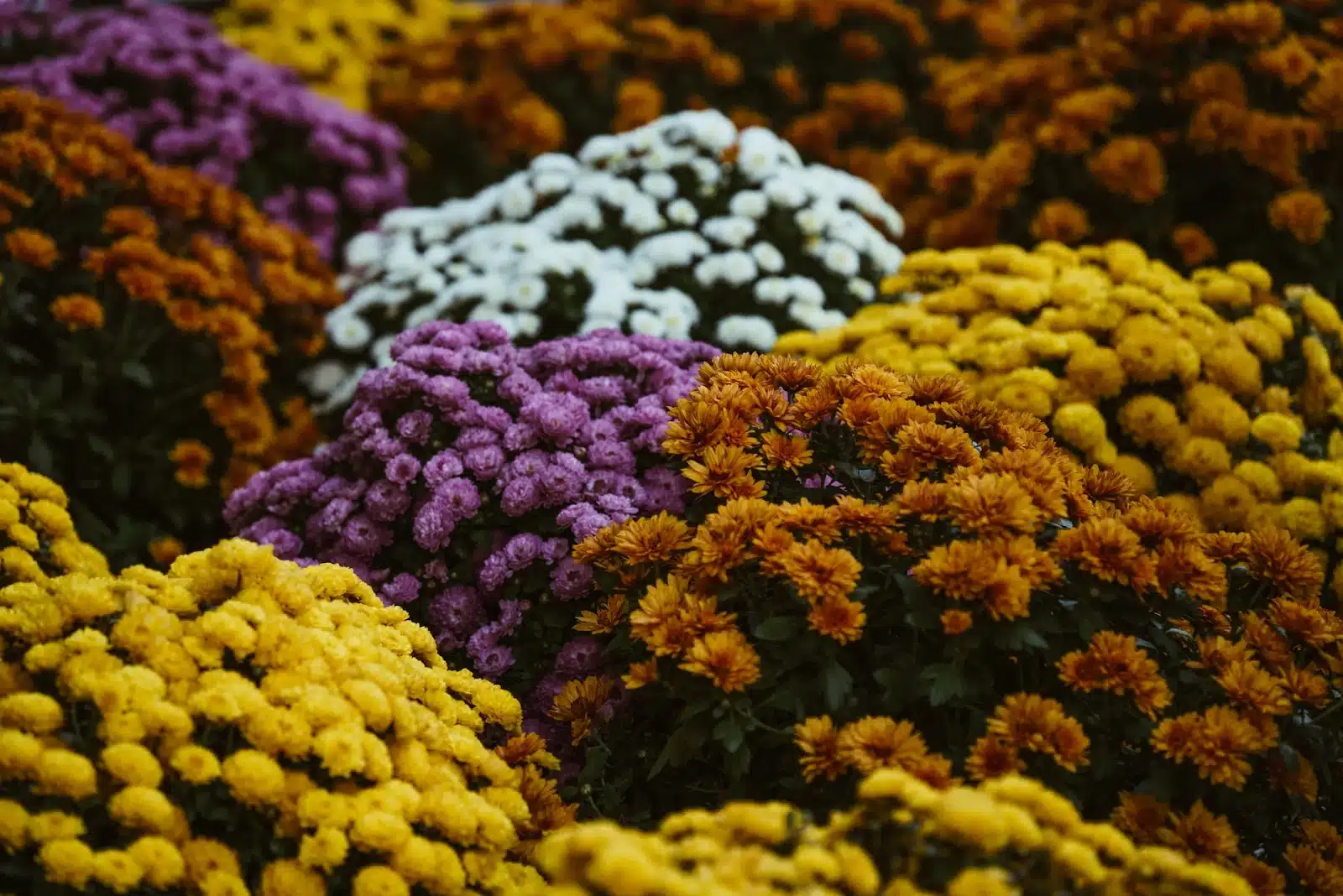
Soft + Fluffy (romantic, full, “I tried” energy)
Peonies, dahlias, ranunculus, mums, hydrangeas
These fill space fast and bring all the cozy drama.
Heads up: some of these bruise easily—transport them like you actually like them.
Rough + Structural (edge, shape, “not too precious”)
Thistles, protea, celosia, seed pods (like echinacea)
These keep an arrangement from looking like a pile of cotton candy.
Heads up: a little goes a long way. Too many and it starts feeling prickly in a “porcupine centerpiece” way.
Foliage That Helps Everything Get Along
Eucalyptus, ruscus, ferns, ornamental grasses, lamb’s ear
Foliage is the glue for bouquet greenery choices. It connects textures, softens transitions, and makes your bouquet look more expensive than it was.
Heads up: some foliage sheds, some fuzz transfers, and some drops oils—so be mindful around light fabrics and delicate petals.
If you take nothing else from this little flower texture pep talk, take this: next time you’re picking stems, don’t just look at them. Pick them up. Tilt them in the light. Touch the petals. See what’s casting shadows and what’s going to survive the walk to your car.
Pretty flowers are easy to find. Flowers that look good and feel interesting? That’s the stuff that makes people stop and stare (in a good way).