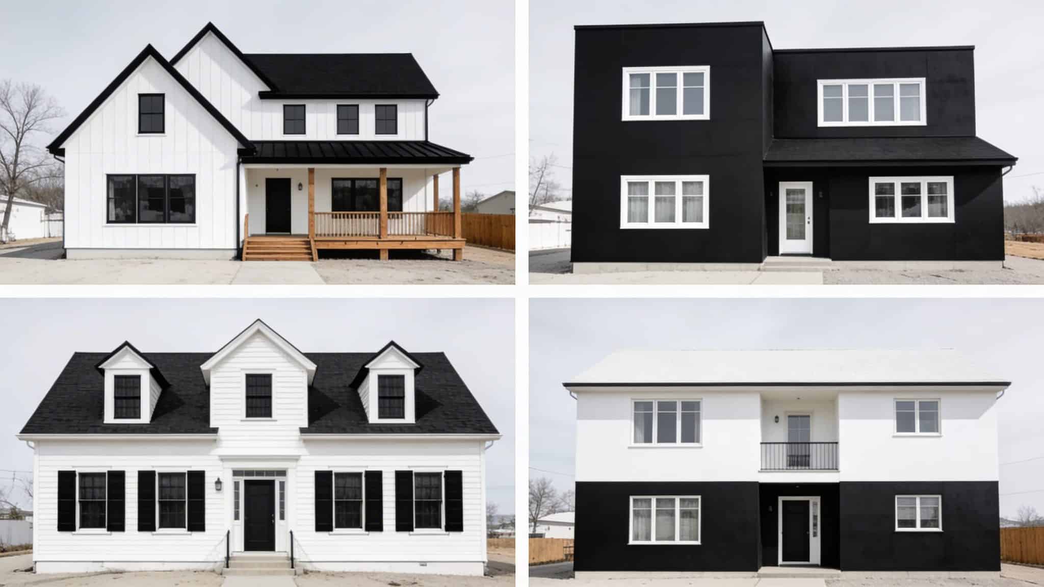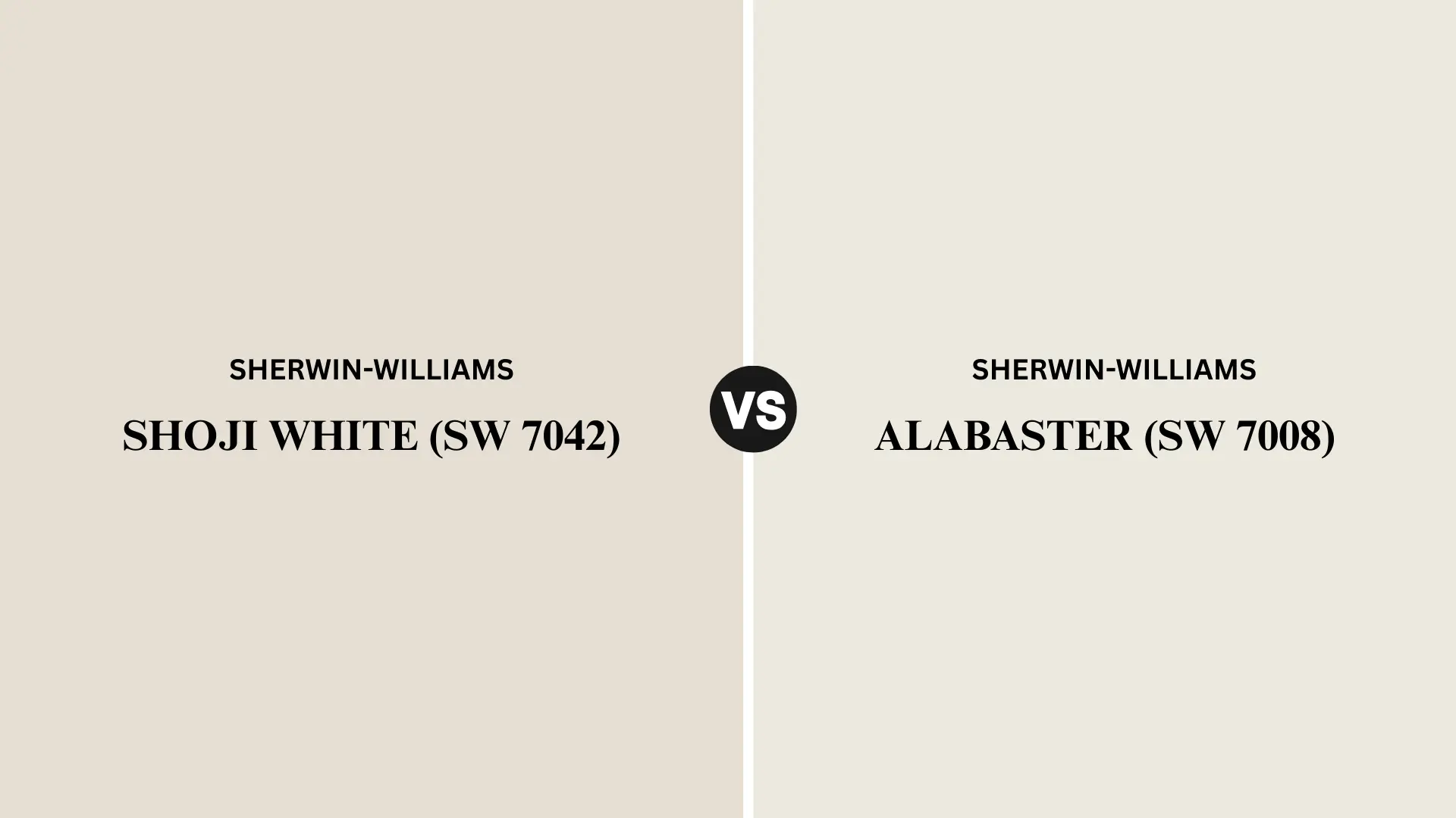
Picking a white paint sounds simple until you’re standing in the paint aisle holding swatches that all look identical under fluorescent lighting.
Shoji White and Alabaster are two of Sherwin-Williams’ most loved soft whites, and yes, they’re both warm, both beautiful, and both wildly popular on mood boards for a reason.
But they wear very differently once they hit your walls.
Undertones, lighting behavior, best uses — each one tells its own story, and this guide breaks it all down so you can finally choose the right warm white for your space.
What is Shoji White?
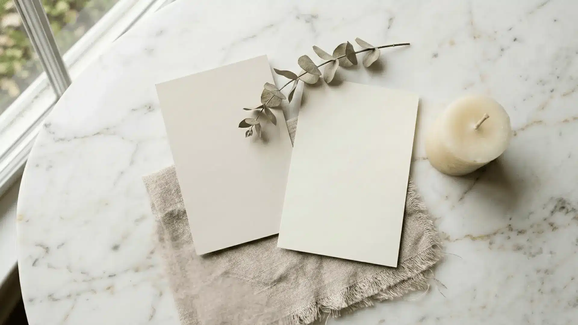
Shoji White (SW 7042) is a warm off-white with subtle greige undertones, sitting right at the intersection of beige and gray without fully committing to either.
It reads as soft and muted on walls, which is exactly why it feels so effortless in neutral, layered interiors. Designers reach for it when they want a white that has quiet depth rather than a stark, clinical finish.
It pairs naturally with modern farmhouse aesthetics, minimalist spaces, and warm wood tones, bringing calm and cohesion without overpowering the room.
What is Alabaster?
Alabaster (SW 7008) is one of Sherwin-Williams’ most beloved whites, and its popularity is very well earned. It’s a soft, warm white with creamy undertones that manages to feel bright without ever crossing into stark or cold territory.
What makes it so universally loved is its versatility; it works beautifully on walls, trim, and cabinetry without skipping a beat.
Sherwin-Williams even named it Color of the Year, and designers have been loyal to it ever since. It’s the kind of white that quietly elevates a space without demanding attention.
Shoji White vs. Alabaster: Key Differences
They’re both warm whites from the same brand, yet side by side, they tell two different stories.
Here’s where Shoji White and Alabaster actually part ways.
1. Undertones
This is the most defining difference between the two. Shoji White carries greige undertones, blending beige and gray into a muted, grounded finish.
Alabaster leans into soft, creamy undertones with a whisper of yellow warmth. Depending on your existing decor and flooring, one will feel far more natural in your space than the other.
2. Brightness (LRV)
LRV, or Light Reflectance Value, measures how much light a color bounces back. The higher the number, the brighter the color reads on your walls.
The difference between these two is small but meaningful in real rooms.
| Color | LRV | What It Means |
|---|---|---|
| Shoji White | 74 | Cozy, absorbed feel; better for well-lit spaces |
| Alabaster | 82 | Brighter and more reflective; great for darker rooms |
3. Color Depth
Shoji White leans toward a soft neutral rather than pure white, creating a layered, lived-in atmosphere. Its greige base adds depth, preventing flatness and pairing well with warm woods and earthy textures.
Alabaster stays in classic white territory, crisp enough to feel intentional but warm enough to avoid looking clinical, holding its own on walls, trim, and cabinetry alike.
Shoji White vs. Alabaster: Comparison Table
For a quick side-by-side look, here’s how the two stack up across the features that matter most.
| Feature | Shoji White | Alabaster |
|---|---|---|
| Brand | Sherwin-Williams | Sherwin-Williams |
| SW Code | SW 7042 | SW 7008 |
| HEX | #E6DFD3 | #EDEAE0 |
| RGB | 230, 223, 211 | 237, 234, 224 |
| Undertone | Greige | Creamy |
| LRV | 74 | 82 |
| Brightness | Softer | Brighter |
| Best Style | Modern neutral interiors | Classic warm interiors |
| Popular Uses | Walls, trim, cabinetry | Walls, trim, cabinetry |
Shoji White vs. Alabaster in Different Lighting
Lighting can completely transform a paint color, and these two whites are no exception. Here is how each one behaves as the light in your space shifts throughout the day.
Natural Daylight
In bright, natural light, the differences between these two become much easier to spot. Shoji White tends to lean into its greige base, reading slightly beige and grounded rather than white.
Alabaster, on the other hand, stays truer to its warm white identity, looking soft but noticeably brighter and more luminous against natural light.
Warm Artificial Lighting
Under warm bulbs, both colors deepen in tone, but in slightly different ways. Shoji White settles into a richer, cozier greige, feeling almost like a warm neutral rather than a white.
Alabaster picks up a gentle creaminess that feels inviting without tipping into yellow. Either way, both colors feel right at home in a warmly lit space.
North-Facing Rooms
North-facing rooms get cooler, indirect light all day, causing these two to behave differently. Shoji White appears more muted and gray, which works well in some spaces but can seem flat in others.
Alabaster holds up better, its higher LRV keeping the room feeling open and softly bright even without direct sunlight.
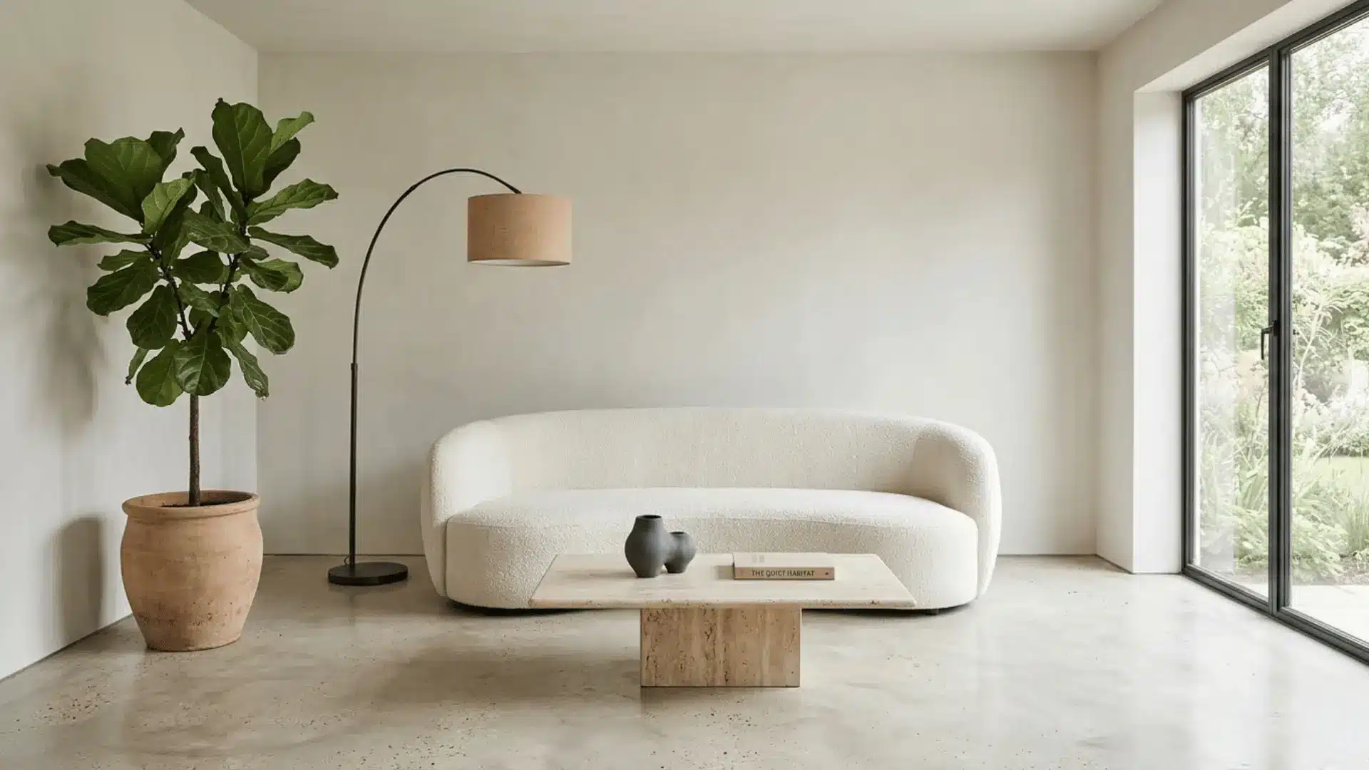
Best Rooms for Shoji White
Shoji White’s quiet, greige-leaning character makes it one of those colors that just belong in certain spaces.
These are the rooms where it truly gets to shine.
- Its muted warmth makes it a natural fit for living rooms, where it lets furniture, textures, and accents lead without competition.
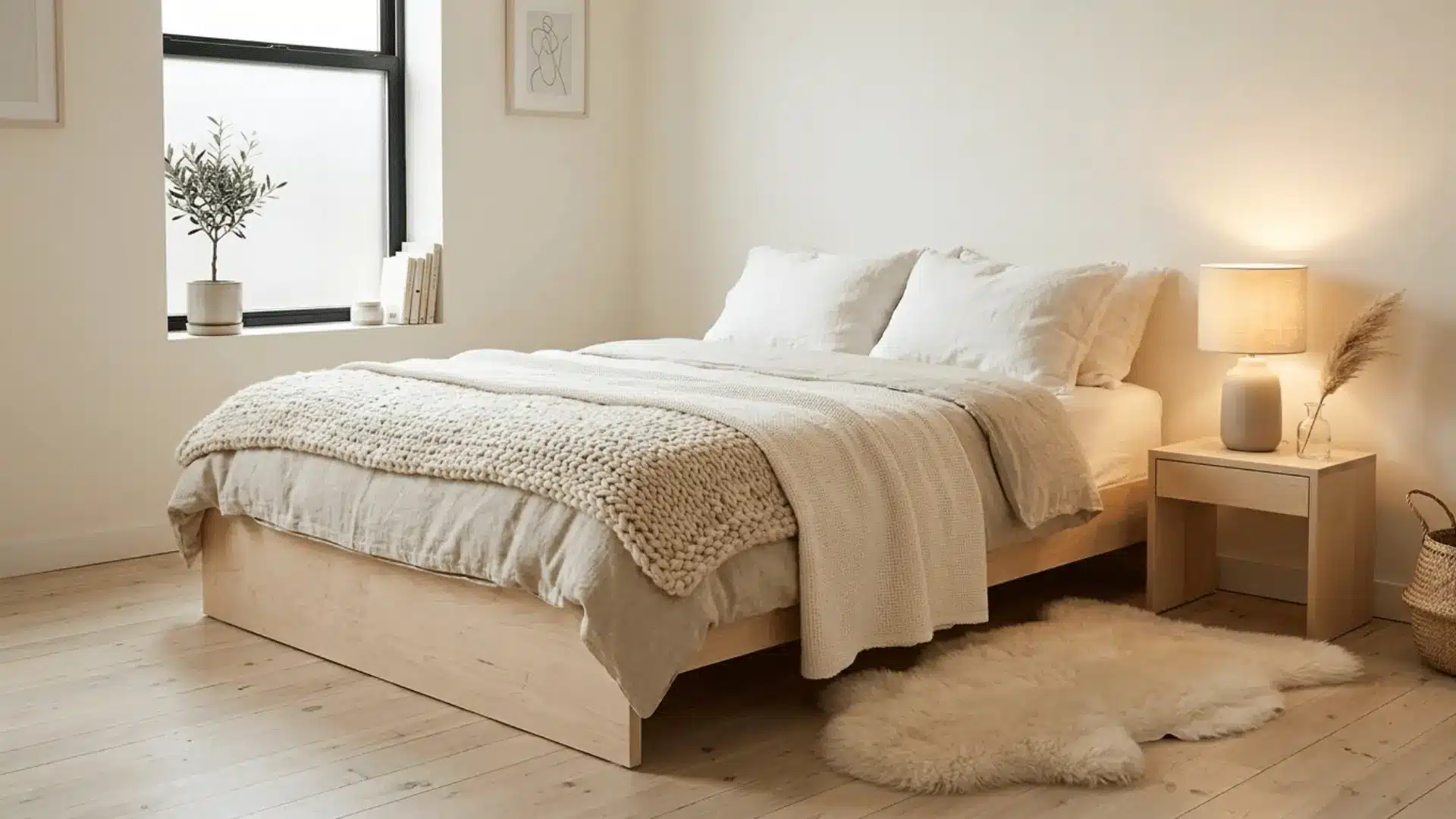
- In bedrooms, it sets a restful, retreat-like mood that cooler whites struggle to replicate, especially under warm lighting.
- Open-concept spaces benefit from its neutral consistency, flowing across connected zones without feeling repetitive or flat.
- Its subtle greige undertone feels right at home in modern farmhouse interiors, complementing shiplap, warm wood, and matte black hardware effortlessly.
Wherever you use it, Shoji White has a way of making a space feel considered and calm, like every element was chosen with intention.
Best Rooms for Alabaster
Alabaster’s warm, creamy brightness makes it a designer favorite for spaces that need to feel fresh, clean, and inviting all at once.
Here’s where it consistently delivers.
- In kitchens, its brighter LRV keeps the space feeling open and airy, complementing white countertops, warm wood cabinetry, and everything in between.
- Bathrooms love Alabaster for its ability to feel crisp and clean without the coldness that pure whites tend to bring in.
- On trim and doors, it adds a soft, polished finish that feels intentional, warming up any wall color it sits alongside without clashing.
- For cabinets, it strikes the perfect balance between bright and warm, giving kitchens and bathrooms that timeless, designer-approved look without ever feeling stark.
Alabaster’s versatility is what keeps designers coming back to it. It brightens a space the way good natural light does, effortlessly and without trying too hard.
Alabaster vs. Shoji White on Cabinets
Cabinets are one of the most committed surfaces you can paint, so choosing between these two deserves a closer look.
Here is how they each perform when the stakes are higher.
| Feature | Shoji White | Alabaster |
|---|---|---|
| Overall Feel | Soft, muted, neutral | Bright, warm, classic |
| Best Cabinet Style | Modern, minimalist, transitional | Traditional, farmhouse, timeless |
| With White Countertops | Adds depth without competing | Feels crisp and cohesive |
| With Dark Countertops | Creates subtle, grounded contrast | Offers a cleaner, bolder contrast |
| With Warm Wood Tones | Blends naturally, feels organic | Brightens the pairing, feels polished |
| With Cool-Toned Hardware | Softens the contrast beautifully | Can feel slightly mismatched |
| With Warm Metal Hardware | A natural, effortless pairing | Feels rich and intentional |
| Finish Recommendation | Satin or semi-gloss | Satin or semi-gloss |
When it comes to warm woods specifically, Shoji White feels like a natural extension of the material, settling into the warmth rather than contrasting it. Alabaster brings a little more brightness to the pairing, making wood tones pop in a way that feels deliberate and polished.
Shoji White vs. Alabaster With Popular Design Styles
The right white can either anchor a design style or quietly work against it. Here is how Shoji White and Alabaster each align with some of the most popular interior aesthetics.
1. Modern Farmhouse
Shoji White feels completely at home here, its greige undertone complementing shiplap, raw wood, and woven textures without missing a beat.
Alabaster provides a brighter, cleaner finish that complements black fixtures and vintage accents. For rustic, layered spaces, choose Shoji White. For polished farmhouse styles, Alabaster is ideal.
2. Minimalist Interiors
Shoji White’s muted, neutral quality makes it a strong choice for minimalist spaces where every element needs to feel intentional and calm. It recedes into the background in the best possible way.
Alabaster can work too, but its warmth and brightness occasionally feel like too much personality for a palette that thrives on restraint and simplicity.
3. Traditional Homes
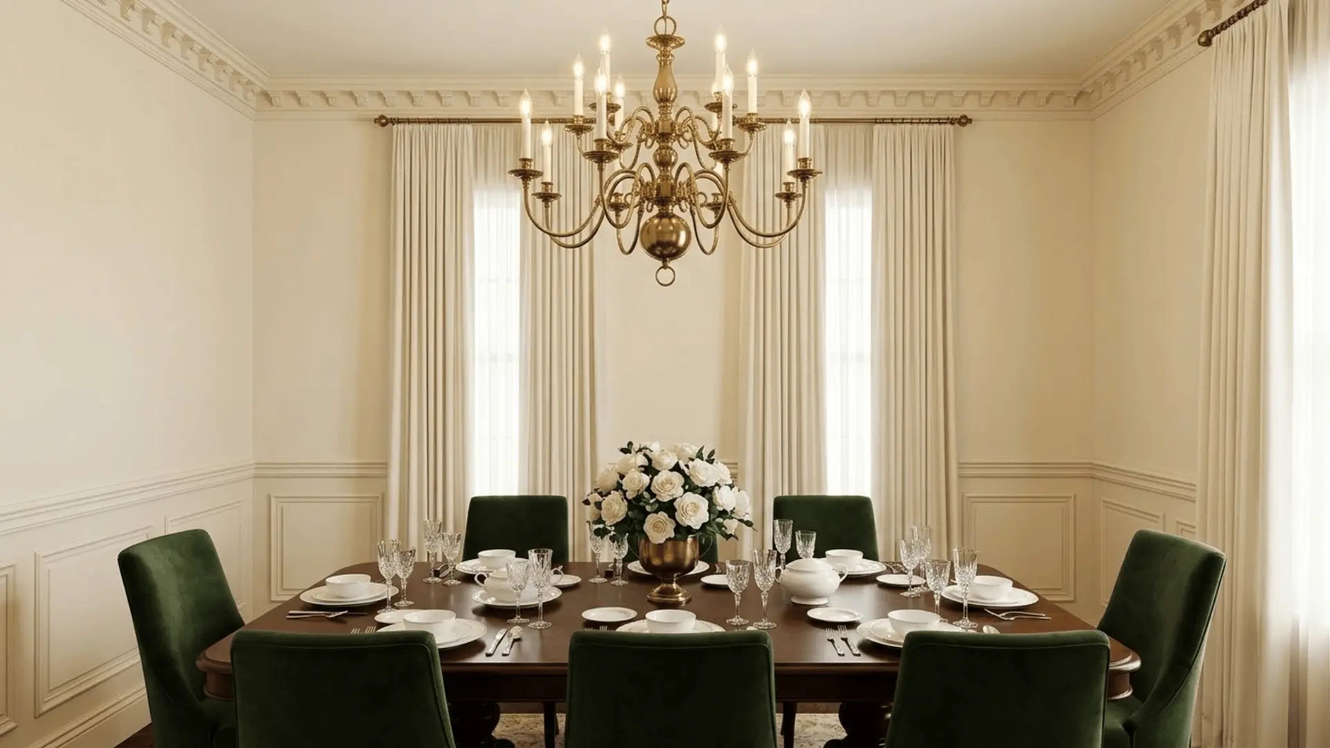
Alabaster was practically made for traditional interiors. Its warm, creamy brightness complements crown molding, classic trim, and rich wood furniture with quiet grace.
Shoji White can feel slightly too casual or understated in more formal traditional settings, where Alabaster’s refined, enduring character tends to resonate far more naturally with the overall aesthetic.
4. Scandinavian-Inspired Spaces
Scandi interiors live on light, simplicity, and warmth, and both colors can work beautifully here. Shoji White’s soft greige undertone adds that cozy hygge quality without darkening the space.
Alabaster keeps things brighter and more airy, which suits Scandi spaces that lean toward light woods and white-on-white layering rather than deeper, earthier tones.
Real Homeowner Experiences With These Paint Colors
Homeowners who have used Shoji White consistently describe it as warm but never overwhelming, appreciating how it holds its greige character across different rooms without feeling too beige or too gray.
Alabaster gets praised for being a safe, reliable white that works almost everywhere without surprises.
The most common challenge across both colors is lighting; undertones that looked subtle on a swatch can read much stronger across a full wall.
Testing samples before committing is something nearly every homeowner wishes they had done sooner.
For real homeowner discussions and firsthand experiences, this Houzz community thread on Shoji White and Alabaster is a genuinely helpful read.
Tips for Choosing the Right White Paint
Choosing between two whites that look almost identical on a swatch is genuinely tricky. These simple habits can save you from a costly repaint.
- Always test physical paint samples on your actual walls before committing; digital swatches and store chips rarely tell the whole story.
- Check your samples at different times of day, morning light, afternoon sun, and evening lamps, as each can reveal a completely different undertone.
- Consider your flooring and furniture first; warm wood tones, cool grays, and everything in between will pull the undertone of your white in unexpected directions.
- Place both swatches side by side on the same wall in the room you are painting. Context changes everything when it comes to whites.
- If your room has limited natural light, lean toward the higher LRV option since a white that looks soft in a bright showroom can feel flat and dull at home.
The right white is less about finding the most popular shade and more about finding the one that works with your specific space.
Sample generously, observe patiently, and trust what you see on your own walls.
Wrapping Up
At the end of the day, the shoji white vs alabaster debate does not have a single right answer.
Both colors are beautiful, both are warm, and both have earned their place on countless mood boards and walls for good reason.
Shoji White suits those who want something a little more grounded and neutral, while Alabaster is for those who love a soft, bright, classic white.
The best way forward is to sample both, live with them for a few days, and let your space decide.
Which one are you leaning toward? Drop your thoughts in the comments!