
The Texture Trick Behind Pro Looking Bouquets (AKA Why Yours Might Be “Fine”… but Flat)
You know the “squint test”? When you squint at a bouquet and it turns into one fuzzy blob like a pastel meatball? Yeah. That’s not a color problem. That’s a texture problem.
Texture is the secret sauce that makes a bouquet look like you casually woke up with “florist hands.” It’s what gives you shadows, little edges, movement stuff your eye can grab onto. And the best part: you don’t have to spend more money. You just have to stop buying twelve versions of the same smooth flower and calling it a day (I say this with love, because I’ve done it).
Let me show you how to layer texture like a pro, without turning your kitchen table into a floral crime scene.
Why Texture Matters More Than Color (Sorry, Color)
Color sets the vibe. Pink says romantic. Yellow says cheerful. White says “I’m hosting brunch and pretending I’m not stressed.”
But texture? Texture is what makes it look intentional.
Put three different pink flowers together—one ruffly, one smooth, one airy—and it looks designed. Put three pink flowers together that are all basically the same shape and finish and it looks like you panic grabbed whatever was closest to the register. (Again: I’ve been that person. Twice.)
Texture is how petals catch light. It’s the difference between “pretty” and “who made that?”
The Only Texture “Categories” I Actually Want You to Remember
I’m not trying to make you memorize a botany textbook. You just need a few buckets to think in when you’re staring at the flower cooler like it’s going to give you answers.
- Ruffled / layered (peonies, ranunculus, garden roses): big, fluffy, dramatic. Gorgeous… and also very capable of turning your bouquet into a cupcake pile if you don’t add contrast.
- Airy / feathery (cosmos, astilbe, sweet peas, grasses): the “breathing room.” This is what keeps arrangements from looking stuffed.
- Spiky / sculptural (delphinium, thistle/eryngium, allium): adds height and edge. Think of these as your eyeliner—useful, powerful, don’t smear it everywhere.
- Clustered (hydrangea, lilac, berry stems): instant volume, fewer stems. Great base building energy.
- Smooth / refined (tulips, calla lilies, orchids): sleek, light bouncy, attention grabbing. Too many can start to look… weirdly artificial. Like a hotel lobby.
My go to cheat: Put something matte next to something glossy for visual and tactile contrast. It instantly reads “fancy.” Like, a berry cluster next to soft dusty miller, or a waxy anemone center next to a velvety celosia. Your eyes go, “Ooooh, depth!” even if you couldn’t explain it in court.
If you do nothing else: pick three textures for every bouquet—one dense (or ruffled), one line-y/spiky, and one airy. That’s it. That’s the whole glow up.
My Foolproof 4-Step “Build Order” (So You Don’t Just Shove Stems In and Hope)
When people tell me “I can’t arrange flowers,” what they usually mean is: “I don’t have a system, so I keep moving the same three stems around until I get mad.”
Here’s the system.
Step 1: Choose roles, not a million flower types
Think in jobs:
- Focal: the main character bloom (the one you want noticed first)
- Mass: adds volume and supports the focal
- Line: creates height/direction (breaks the “round dome” look)
- Airy/Accent: light, fluttery, fills negative space
If you want a fifth role, add foliage/structure (greens/branches). In winter, this is basically the whole personality of the bouquet.
Step 2: Use a simple ratio so it doesn’t get lopsided
You can get nerdy with percentages, but here’s the version I actually use:
- More mass + airy than you think
- Fewer focals than your heart wants (your wallet will thank you)
- Enough line to break up the blob
If your bouquets always look heavy, it’s almost always because you skipped line and airy, then tried to fix it with… more big flowers. (A relatable mistake.)
Step 3: Build in this order (trust me)
- Greens/structure first (if you’re using them) to set the shape
- Mass next to create your base
- Focals placed around—not all on top like a floral toupee
- Line stems threaded through gaps to add movement
- Airy accents last, especially around the edges
Step 4: Do the 20-second “does this look expensive?” check
Step back. Squint. And ask:
- Is it all one texture? Add contrast (smooth + ruffled, matte + glossy, etc.).
- Is it a tight dome? Pull a few line/airy stems out and up.
- Does it feel heavy? Add airy pieces instead of more big blooms.
Make one change, then reassess. Two quick rounds usually fixes everything without you spiraling into bouquet despair.
Seasonal Texture Ideas (Because Spring Flowers Behave Nothing Like Winter Greens)
Different seasons naturally hand you different textures. If you work with what’s abundant, your bouquet instantly looks more “right,” and you’re not paying out of season prices for sad stems. Win win.
Spring: Soft, Glowy, and Slightly Delicate
Spring is all about lightness—papery petals and that fresh, translucent vibe.
- Focal: ranunculus, peonies
- Mass/contrast: tulips, anemones (I love anemones because those dark centers add instant depth)
- Line: larkspur, snapdragons, delphinium
- Airy: sweet peas, orlaya, bupleurum
My spring warning: if you do peonies + ranunculus + garden roses with no line element, it will look like a dessert tray. Beautiful, yes. Dimensional? Not so much.
Summer: Abundance (and the Temptation to Overstuff)
Summer is the season of “everything is available and I want all of it.” The trick is leaving gaps so your eye can rest.
- Focal: dahlias, hydrangea, celosia
- Mass: roses, lisianthus
- Line: allium, eryngium/thistle, tall sunflowers (use sparingly unless you want “farmstand chaos,” which is a valid aesthetic)
- Airy: cosmos, yarrow, astilbe
Lisianthus appreciation moment: it’s like a rose that’s tougher, lasts longer (often 8-10 days), and doesn’t wilt the second your kitchen gets warm. Summer hero.
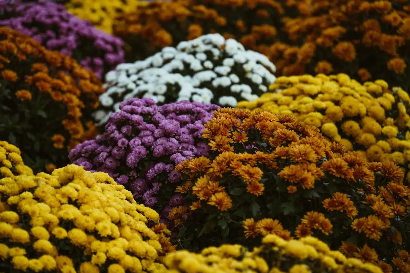
Fall: Texture Does the Heavy Lifting
Fall is my favorite for “expensive looking” arrangements on a normal person budget. Pods, berries, grasses, crinkly leaves—nature is basically doing design work for you.
- Focal: late dahlias, mums, celosia
- Line/movement: amaranthus (the rope-y cascading stuff that makes everything look editorial)
- Structure: eucalyptus, ornamental grasses, berried stems
- Accent: seed pods, late zinnias, little dried bits
My fall rule: pick one color family and don’t invite every flower to the party. Fall can get “craft store explosion” fast if you throw in too many focal types.
Winter: Greens First, Flowers Second
Winter is when flowers stop being the main event. It’s all about branches, evergreens, and shape—then you tuck in a couple blooms like little surprises.
- Structure (the star): cedar, fir, pine, eucalyptus, dusty miller
- Line/shape: curly willow, birch branches
- Accents: berries, thistle, brunia, snowberries
- Focal (sparingly): amaryllis, hellebores, paperwhites
In winter, I’ll happily let greens be 60-70% of the whole arrangement. It looks lush, it lasts longer, and it’s usually cheaper than trying to force a “summer bouquet” vibe in January. (January doesn’t want that. January wants soup and candles.)
Budget Tricks That Make People Think You Spent More (You Don’t Have to Tell Them)
The big money saving truth is this: people read “full” as layers that add dimension, not as “27 expensive focal blooms.”
So instead of buying five pricey focal stems, try buying two and then adding interesting texture with a couple types of filler—airy stems, berry clusters, grasses, eucalyptus, whatever’s abundant and fresh.
A few of my best “looks fancy but isn’t” picks:
- Budget MVPs: mums, zinnias, celosia, grasses, amaranthus
- Middle tier workhorses: hydrangea, lisianthus, eucalyptus
- Save for focal splurges: peonies, specialty dahlias (gorgeous, but they add up fast)
Also: ignore Pinterest when it’s telling you to use a flower that’s clearly not in season where you live. Walk the market, see what looks fresh and plentiful, and build your texture story from that. The freshest stems always look the most “professional,” even if they’re not trendy.
Your Next Bouquet Plan (Simple Enough to Actually Do)
If you want your next arrangement to look instantly better, here’s what I want you to do:
- Pick one focal texture you love (ruffly peony, sleek tulip, bold dahlia—whatever).
- Add one line texture (something tall/spiky/branchy).
- Add one airy texture (something fluttery to keep it light).
- Build in order: greens (optional) → mass → focal → line → airy.
- Step back and do the squint test. Adjust one thing. You’re done.
Three textures. Four roles. One bouquet that doesn’t blur into a blob. Go make your flowers look like they have a stylist.