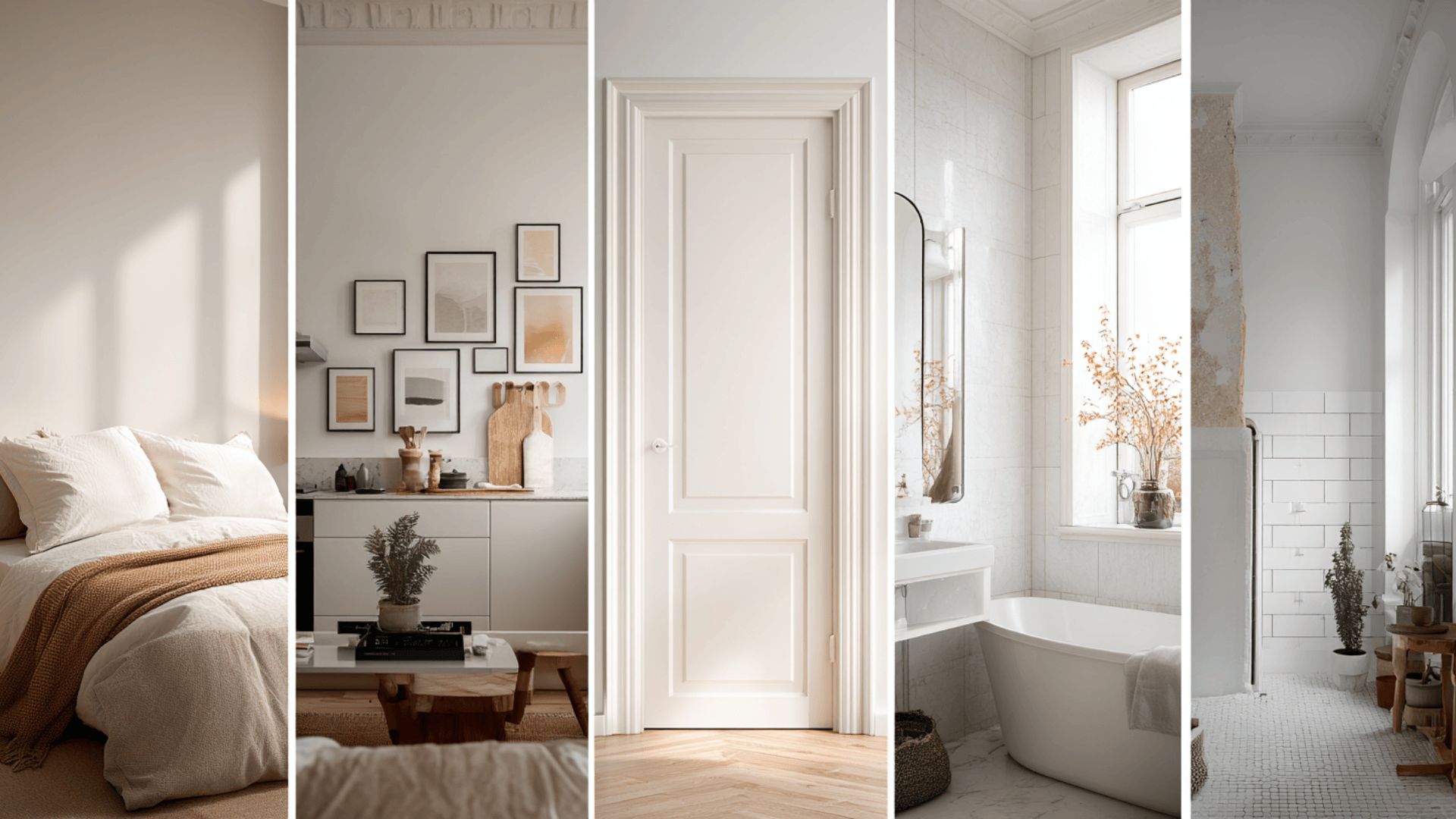
White walls seem like an easy choice until you’re staring at dozens of shades. Some look too yellow, others too icy, and before long, picking the right one starts to feel overwhelming.
If you’re looking for the best white paint for interior walls, you’re in the right spot.
I’ll walk you through how to pick the right white based on lighting, room type, and undertones. We’ll also look at designer go-tos, budget-friendly picks, plant pairings, and which finishes work best in each part of the house.
By the end, you’ll know exactly what to look for and what to avoid. Let’s find the white paint that works for your space.
Quick Picks: Best White Paints for Interior Walls
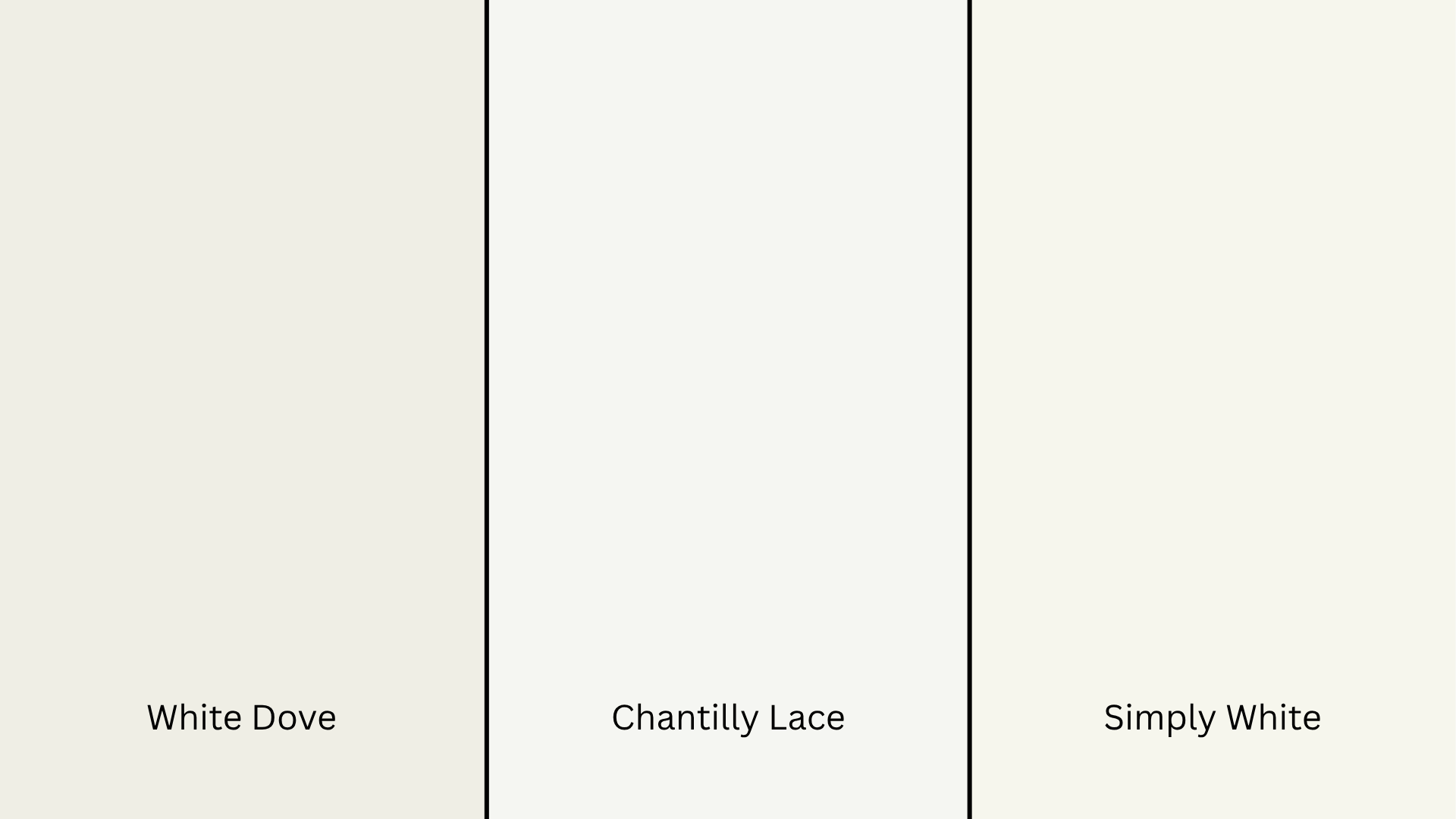
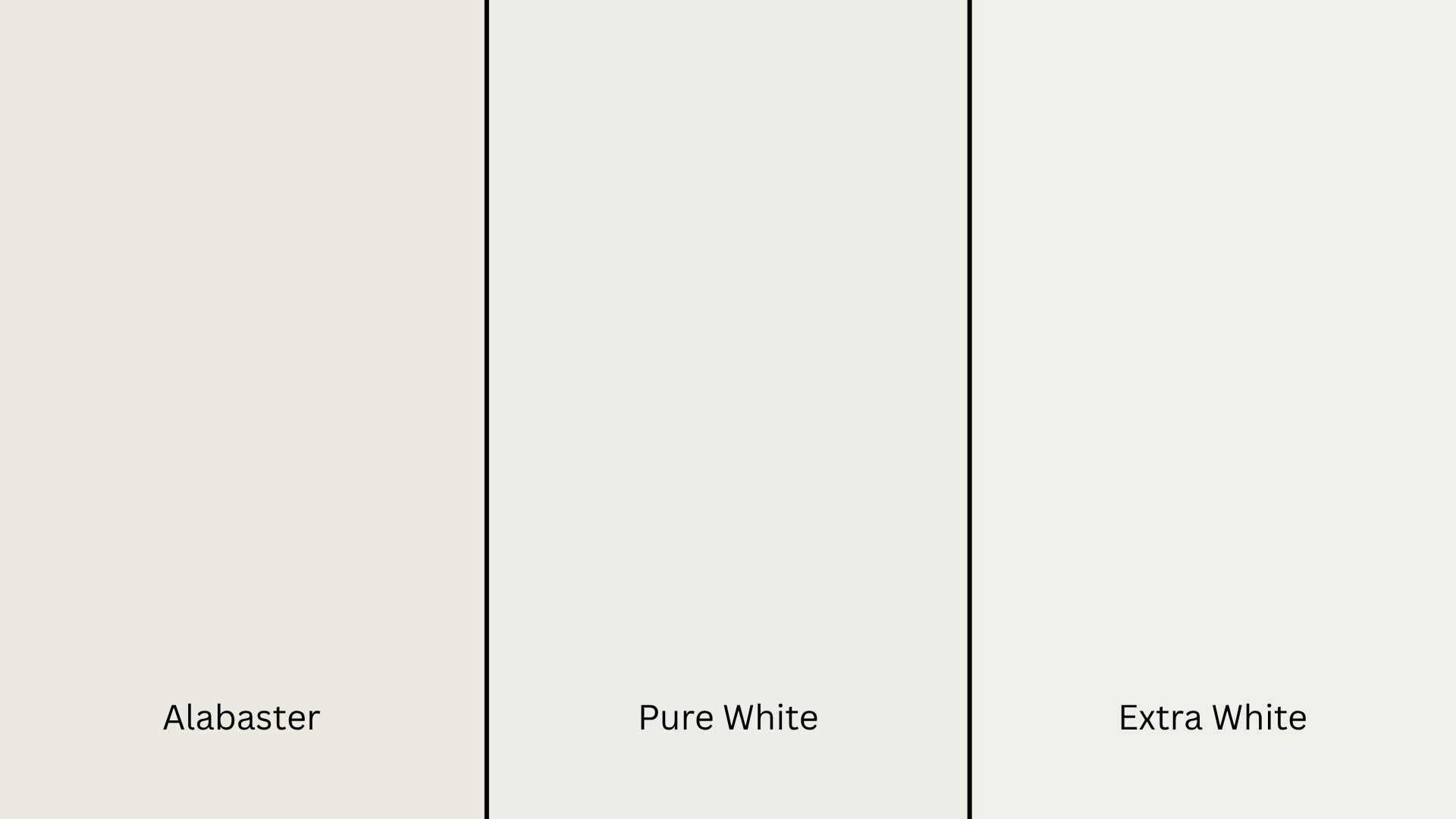
Not all white paints are created equal. Some are bright and crisp, while others feel soft and warm. Here’s a quick comparison of top white wall paints to help you decide quickly and confidently:
| Paint Name | Undertone | Best For | Finish Options | Brand |
|---|---|---|---|---|
| White Dove | Warm | Living rooms, bedrooms | Eggshell, Satin, Matte | Benjamin Moore |
| Chantilly Lace | True white | Modern spaces, trim, and ceilings | Flat, Satin, Semi-Gloss | Benjamin Moore |
| Simply White | Slightly warm | Whole-home use | Matte, Eggshell, Semi-Gloss | Benjamin Moore |
| Pure White | Neutral | Kitchens, bathrooms, trim | Satin, Semi-Gloss, Gloss | Sherwin-Williams |
| Alabaster | Warm/creamy | Farmhouse style, cozy rooms | Flat, Eggshell, Satin | Sherwin-Williams |
| Extra White | Cool | Minimalist or high-contrast spaces | Semi-Gloss, Gloss | Sherwin-Williams |
| Night Blooming Jasmine | Cool gray | Clean, bright walls | Flat, Satin | Behr |
| All White | True neutral | Classic look | Estate Emulsion, Modern Emulsion | Farrow & Ball |
Each of these paints is a favorite for good reason. You’ll spot them often in designer roundups and real homes alike.
Understanding Undertones in White Paint
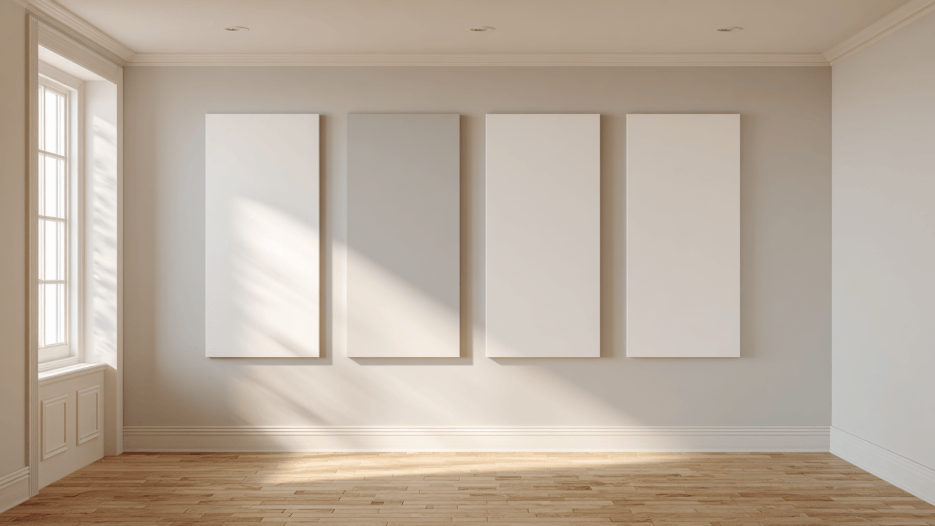
White paint can look surprisingly different depending on its undertone. Knowing the undertone helps you pick the right shade for your space.
What Are Undertones in White Paint?
Undertones are the subtle hints of color beneath white paint. They affect whether a room feels warm, cool, or balanced.
Even if a paint looks white on the swatch, it might show pink, yellow, blue, or gray once it’s on the wall.
Warm vs. Cool vs. True White: What to Know
These three types of white each set a different mood. Here’s what to keep in mind:
Warm whites have yellow, red, or beige undertones. They create a cozy, soft feel, great for bedrooms, living rooms, or darker spaces like north-facing rooms.
Cool whites come with blue, gray, or green undertones. They feel crisp and clean, making them ideal for kitchens, bathrooms, or bright rooms where you want a fresh look.
True whites don’t lean warm or cool. They stay bright and neutral in most light, making them perfect for trim, ceilings, or minimalist spaces.
When to Use Each Type of White
Choosing the right white comes down to your room’s lighting and overall style.
- Use warm whites with wood floors, beige furniture, or traditional decor.
- Try cool whites with black accents, gray tile, or clean-lined modern pieces.
- Go for true whites if you want a fresh, gallery-like look that works with everything.
Testing samples in your own space is the best way to see how each white reacts to your lighting and furniture. It can look totally different from the swatch.
Best White Paint for Walls
Some white paints are favorites among interior designers and color experts for a reason. These tried-and-true choices show up in beautiful homes time and time again.
Benjamin Moore’s Top Picks
These shades are often go-to choices for professionals because of their soft, versatile look that works in almost any space.
- White Dove (OC-17): A warm white with a hint of cream. Great for cozy spaces.
- Chantilly Lace (OC-65): Bright and clean with no strong undertones. Works well on trim or modern walls.
- Simply White (OC-117): Slightly warm, but still fresh. Perfect for an all-over wall color.
Sherwin-Williams Designer Favorites
Known for offering a wide range of whites, these picks show up in both traditional and modern homes time and again.
- Alabaster (SW 7008): A warm, creamy white. Makes any room feel calm and welcoming.
- Pure White (SW 7005): A neutral white with a hint of warmth. Great for walls and trim.
- Extra White (SW 7006): A crisp, cool white. Ideal for modern spaces with bold contrast.
Other Trusted Picks

Designers also love these whites from other high-quality brands.
- All White (No. 2005): A balanced, classic white from Farrow & Ball. No undertones. Looks great in any light.
- Night Blooming Jasmine (YL-W10): A cool white with a slight gray tint from Behr. Keeps spaces bright without being harsh.
These colors pop up often in design magazines, blog features, and real home makeovers. They’ve earned their reputation for good reason.
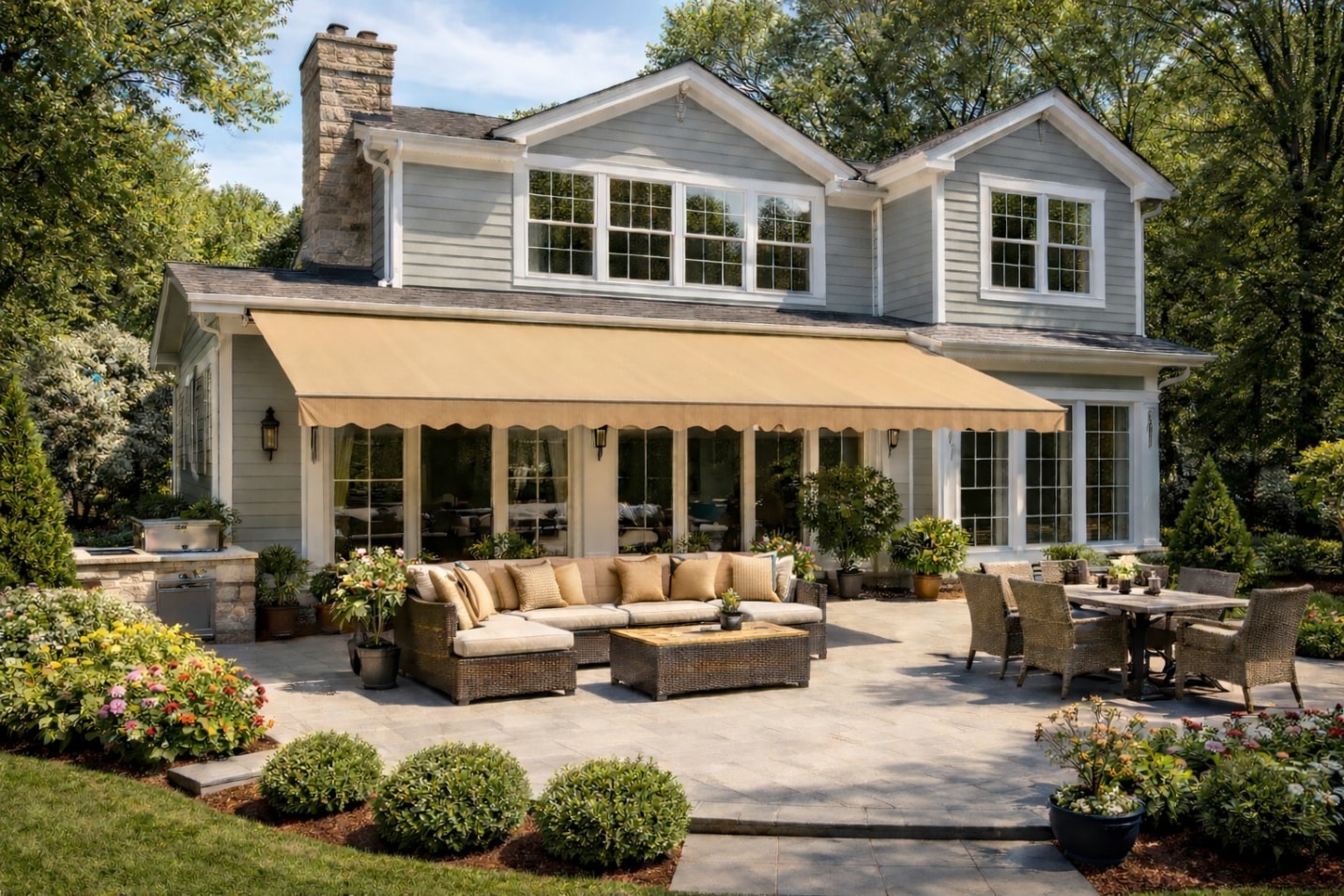
Matching White Paint to Your Room
Not every white color works in every space. The right shade depends on your lighting, room size, and the furniture or finishes already in the room.
Best Whites for Low-Light Rooms
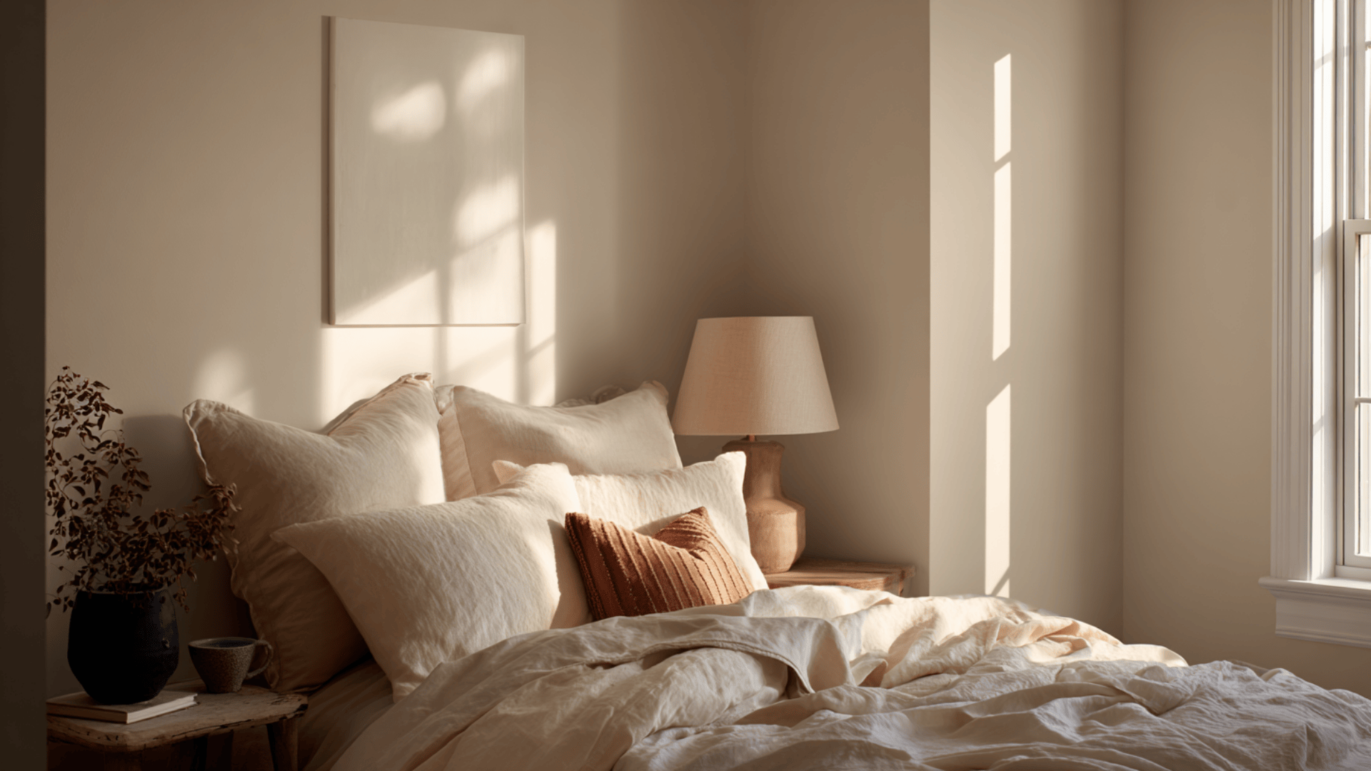
Rooms that don’t get much sunlight can make white paint look flat or gray. That’s where warm whites come in; they reflect more light and bring in a soft, cozy feel.
White Dove (OC-17) is a go-to choice. It adds warmth without leaning too yellow.
Alabaster (SW 7008) is another favorite. Creamy and comforting, perfect for low-light rooms.
Simply White (OC-117) has a gentle warmth but stays bright enough to lighten up a shadowy space.
Whites That Work with Natural Wood
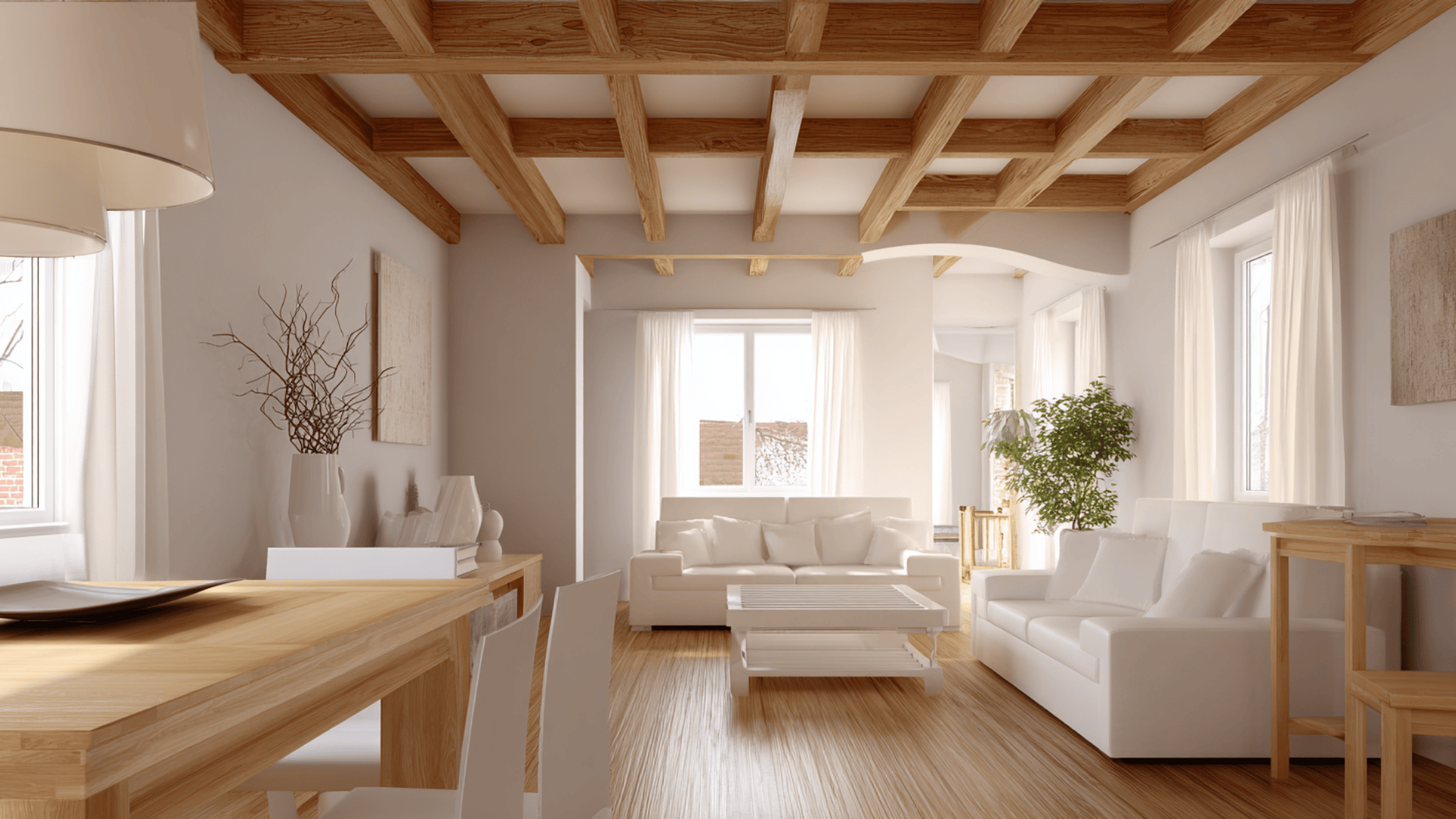
If your home has wood floors, cabinets, or trim, you’ll want a white that plays well with those warm, earthy tones.
Chantilly Lace (OC-65) is a crisp, neutral white that won’t overpower the wood grain.
White Dove (OC-17) brings subtle depth, helping natural textures pop.
Pure White (SW 7005) gives a soft contrast, just enough to warm up bold wood tones without making the space feel heavy.
Whites for Bedrooms, Kitchens, Bathrooms, Trim, and Ceilings
Each room has its own lighting and purpose, so choosing the right white makes a big difference.
In bedrooms, go with warm or neutral whites for a cozy, restful feel. White Dove and Alabaster both work beautifully here.
For kitchens, you’ll want a crisp white that doesn’t yellow over time. Pure White or Extra White are great picks.
In bathrooms, where light reflects off mirrors and tile, cooler whites like Chantilly Lace or Extra White help keep things clean and sharp.
For trim and ceilings, true whites are the way to go. They give a clean contrast to wall color or keep an all-white space looking fresh. Chantilly Lace and All White are reliable choices that hold up well in any lighting.
Matching the right white to the right room helps everything feel more balanced and pulled together. And always test your samples on the actual wall before painting the whole space.
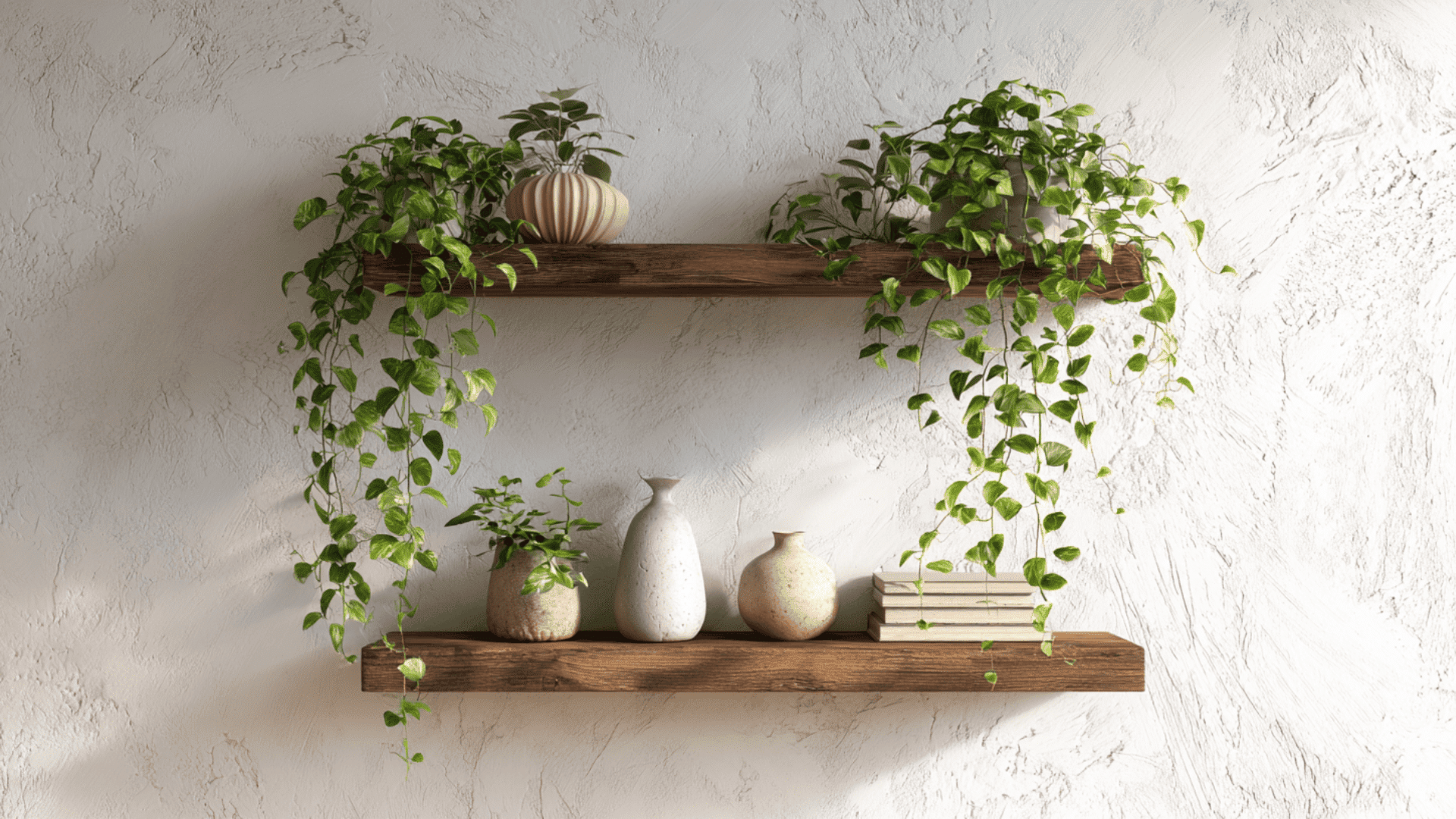
How White Walls Pair with Indoor Plants
If you’re decorating a room with white paint, indoor plants are a perfect match. They bring in life, texture, and contrast, especially when the walls are clean and bright.
White walls bounce light around, which helps many houseplants thrive, even in lower-light areas. They also work like a blank canvas, letting the colors and shapes of your greenery stand out.
If your style leans modern, cozy, or natural, adding plants is one of the easiest ways to warm up a space and connect it to nature.
Here are a few indoor plants that look especially good against white walls, along with simple ways to style them:
1. Pothos (Epipremnum aureum)
Pothos is a low-maintenance trailing vine with rich green leaves. It grows well in almost any light and works with both cool and warm white tones.
How to style it:
Set a pothos on open floating shelves or tall plant stands so the vines can trail down naturally. Hanging it in a woven planter near a sunny window also works well. Its draping shape adds gentle movement and softness against bright white walls.
2. Fiddle Leaf Fig (Ficus lyrata)
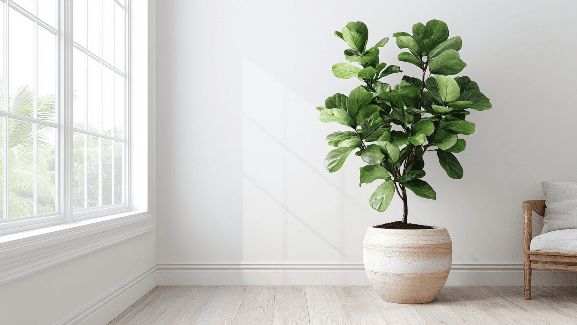
With its big, bold leaves, the fiddle leaf fig is a favorite in modern interiors. Its deep green color looks striking against clean white walls.
How to style it:
Place it in a large ceramic or clay pot and set it in a bright corner near a window. Keep the space around it simple; this lets the plant stand out as a natural focal point.
3. Snake Plant (Sansevieria trifasciata)
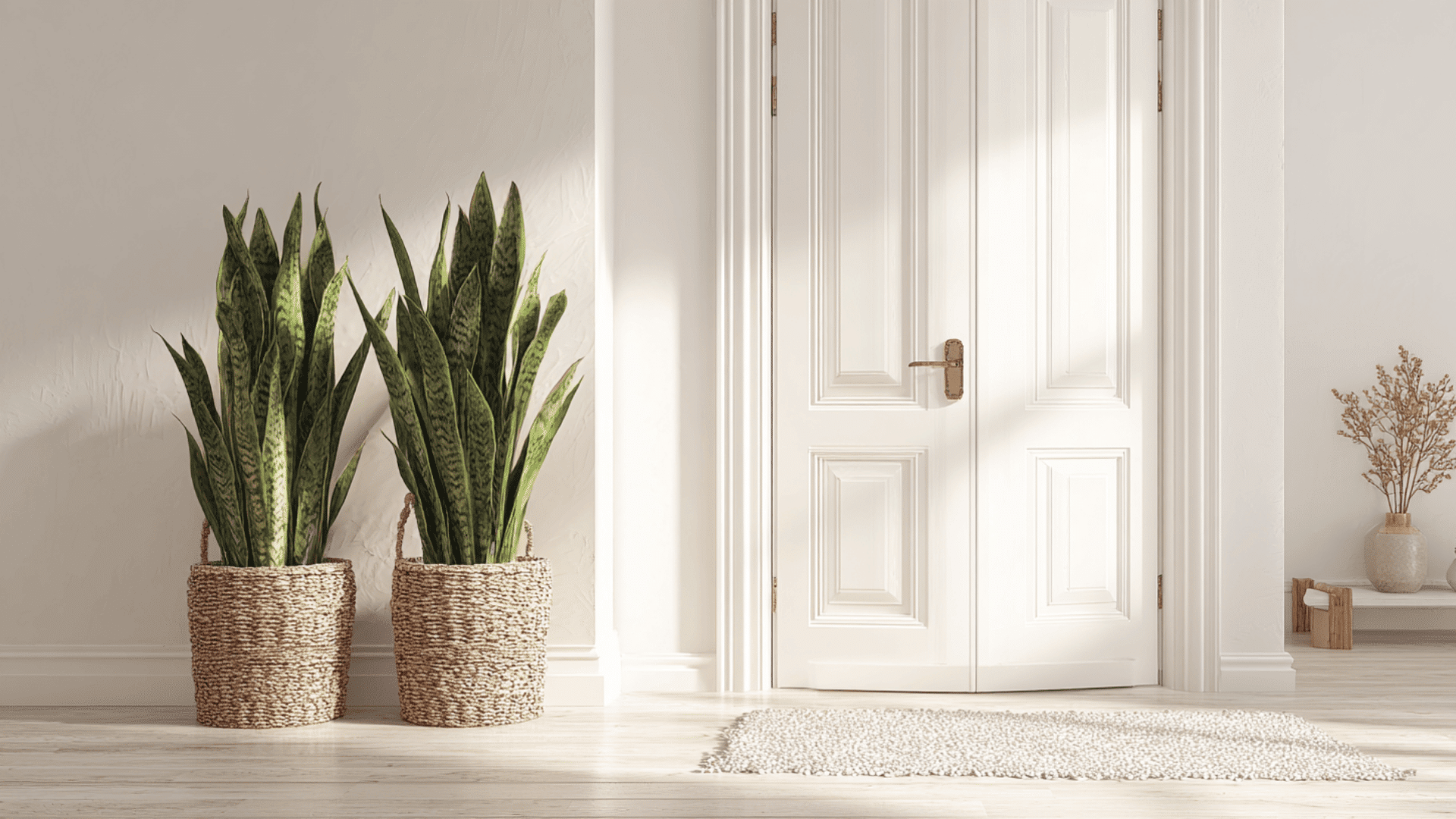
Snake plants have a tall, upright shape that fits well in minimalist or modern spaces. Their deep green leaves with yellow edges stand out against any white backdrop.
How to style it:
Place a pair of snake plants on either side of a doorway or dresser to create balance. Use simple black or white pots for a clean, modern look, or soften things up with a woven basket for added warmth.
4. Monstera (Monstera deliciosa)
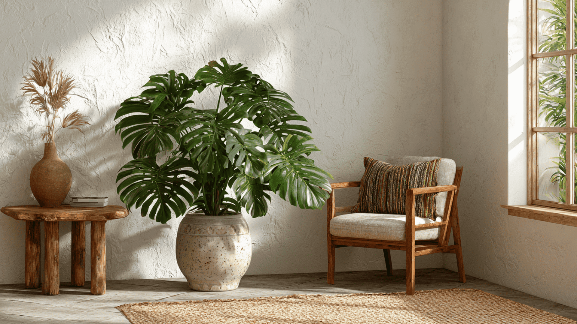
Known for its dramatic split leaves, the monstera adds a tropical theme to any indoor space. It thrives in warm, bright spots with plenty of natural light.
How to style it:
Set your monstera in a medium or large pot near a window with indirect sunlight. You can lift it slightly with a plant stand or place it beside a reading chair to create a cozy, garden-inspired corner.
Sheen & Finish Guide
The finish of your white paint is just as important as the color itself. It changes how light bounces off the walls and plays a big role in how durable and easy to clean the surface will be.
Flat vs. Satin vs. Semi-Gloss vs. High Gloss
Paint sheens go from flat to glossy, and each one works best depending on how much wear a room gets and how much light you want to reflect.
Flat or matte finishes have no shine. They’re great at hiding wall flaws and give a soft, smooth look. Best for low-traffic areas like bedrooms or ceilings.
Eggshell and satin finishes offer a soft, velvety glow. They’re more durable than flat paint and easier to wipe clean, perfect for living rooms, dining areas, and hallways.
Semi-gloss finishes have more shine and stand up well to moisture and stains. They’re ideal for bathrooms, kitchens, and trim.
High-gloss finishes are the shiniest and toughest. They give a bold, sleek look and work well on doors, cabinets, and furniture.
Finish Recommendations for Each Room
Use flat or matte finishes in bedrooms or on ceilings, places where cleaning isn’t a big concern.
Go with eggshell or satin for walls in high-traffic areas like living rooms, hallways, or entryways. They’re easier to clean and hold up better.
In kitchens and bathrooms, semi-gloss gives you the moisture resistance you need.
Trim and baseboards look best with semi-gloss or high-gloss since they take more wear and need to stand up to regular cleaning.
How Finish Impacts Perceived Color
The same white paint can look completely different depending on the finish. Glossy sheens reflect more light, so the color may appear brighter and cooler.
Matte finishes absorb light, which can make the white look softer or a bit darker.
Always test both the color and the finish on your wall before you decide; it makes a big difference.
Application and Testing Tips
White paint can look completely different on your walls than it does under store lights. Testing it first and applying it the right way helps you avoid any surprises later on.
Always Test with Paint Samples
Before you commit to gallons of paint, grab a few sample pots. Paint large swatches on different walls in the room. Check them in daylight, evening light, and under your regular indoor lighting.
You’ll likely see warm whites look yellow in some corners and just right in others. Cool whites might lean too blue under soft bulbs. A quick test up front can save you time, money, and second-guessing later.
How Lighting Affects White Paint Appearance
Lighting plays a big role in how white paint looks in your home. Here’s what to watch for:
Morning Light (Cool): White paint may appear crisper or slightly bluish in early light.
Afternoon Light (Warm): Warmer tones in sunlight can make white paint look creamier or yellow.
North-Facing Rooms (Low Light): These rooms feel cooler and dimmer, warm white paint helps balance that cold tone.
South-Facing Rooms (Bright & Warm): Too much warm light can make warm whites look overly yellow. Consider a neutral or cool white here.
Artificial Light Bulbs:
- LEDs may enhance brightness but shift undertones.
- Warm white bulbs deepen yellow tones.
- Daylight bulbs can make cool whites feel sharp or sterile.
Tip: Always test white paint under the actual lighting in your room at different times of day and night for the most accurate read.
Mistakes to Avoid When Choosing White Paint
Choosing the wrong white paint happens more easily than you’d think. Here are a few mistakes to watch out for:
- Skipping Paint Samples: Don’t guess, test. Even subtle undertones can look totally different once they’re on your wall.
- Ignoring Undertones in the Room: If your floors or trim are warm-toned, a cool white will clash. It’ll look off, even if the paint is pretty on its own.
- Relying on Store Lighting: Retail lighting is much brighter than what you have at home. That white that looked perfect in the store might turn dull or chilly on your walls.
- Choosing “One White Fits All”: What works in your kitchen might feel too cold in a bedroom. Every room has its own lighting and needs.
Picking the right white takes more than liking a swatch. A little testing and planning upfront helps you avoid do-overs and gets you a result you’ll actually love.
Budget vs. Premium White Paint Options
Not all white paint costs the same. Here’s a quick guide to help you choose between affordable and high-end picks.
| Budget Picks (Under $30) | Premium Picks |
|---|---|
| Glidden Premium White – Good for walls on a budget. | Benjamin Moore Simply White (OC-117) – Smooth, low-VOC, rich finish. |
| BEHR Whisper White (HDC-MD-08) – Soft warm tone, solid coverage. | Farrow & Ball All White (No. 2005) – High pigment, designer look. |
| Valspar 4000 Flat White – Basic option for ceilings or guest rooms. | Sherwin-Williams Pure White (SW 7005) – Durable, washable, great for full homes. |
| Zinsser Perma-White – Budget mold-resistant paint for bathrooms. | Backdrop Premium Interior Paint – Modern finish, eco-friendly, easy to apply. |
Tip: Go budget for quick updates or low-traffic rooms. Choose premium for long-term quality, better coverage, and a flawless finish.
Final Thoughts
Choosing the best white paint for your interior walls isn’t as simple as grabbing any white off the shelf. It’s about finding a shade that works with your lighting, style, and space.
From designer go-tos to budget-friendly options, you’ve now got a full guide to help you make the right choice.
If you’re after a warm, soft vibe or a crisp, modern feel, knowing your undertones, finishes, and how the room functions makes all the difference.
Looking to bring more life into your home? Check out my gardening blogs for easy plant tips, garden pairings, and ideas to complement your indoor spaces with greenery that feels natural and inviting.