Some colors just feel right together, like they’ve been friends forever.
I’ve spent hours standing in front of swatches, wondering if this wall and trim color combination will make a room feel warm, relaxed, or off. Picking colors shouldn’t be this hard, but it often is.
That’s why this blog exists: to make things simple.
You’ll get real answers about which wall and trim color combinations work best for different types of rooms, lighting, and moods. Just solid, easy-to-understand advice that helps you see what works.
By the time you’re done reading, you’ll have clear color ideas you can use right away. If you’ve been unsure about what fits your space, this blog will clear things up and maybe even give you ideas you haven’t thought of yet.
Why Wall and Trim Colors Matter More Than You Think
When you walk into a room, your eyes don’t just see the wall color. They also see the trim: the baseboards, door frames, window frames, and crown molding.
Trim might seem like a small part of the room, but it plays a big role in how everything looks and feels.
Trim shapes how we see the walls. It gives the room lines, breaks, and outlines that guide the eye.
A bright white trim can make a colored wall look deeper. A soft beige trim can warm up a cool-toned room. Even a slight change in trim shade can shift the whole feel.
Wall and trim colors shouldn’t be picked alone. They should be seen as a team. Choosing them together can make your space feel put together, clean, and balanced.
But ignoring trim? That’s when things can feel a little off. Let’s look at why this small detail changes so much.
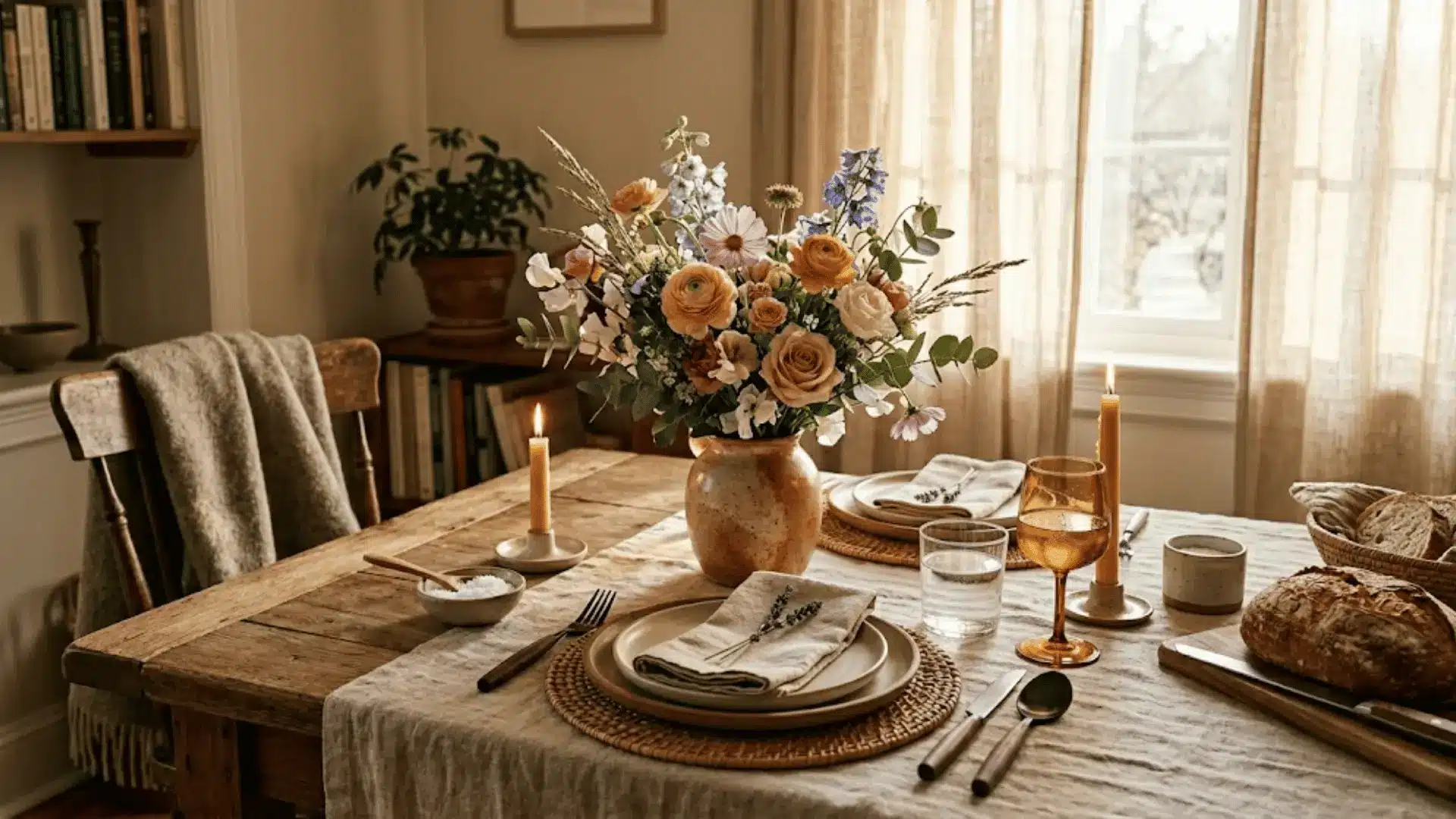
Wall and Trim Color Combinations That Work in Real Homes
When it comes to wall and trim color combinations, not every choice has to be bold or risky. In fact, most combinations fall into a few simple groups.
Once you see the patterns, it gets way easier to choose what works for your space.
Some combos are safe and simple. Others use soft contrast to feel calm and blended. And then there are the bold ones, the kind that grab attention fast.
But here’s the thing: Don’t just copy what you see online. Instead of following trends, look for the pattern behind the choice. Think about how the wall and trim work together in a real room.
Pay attention to the light, the size of the space, and what feeling it gives off. That’s the secret to getting it right for your own home.
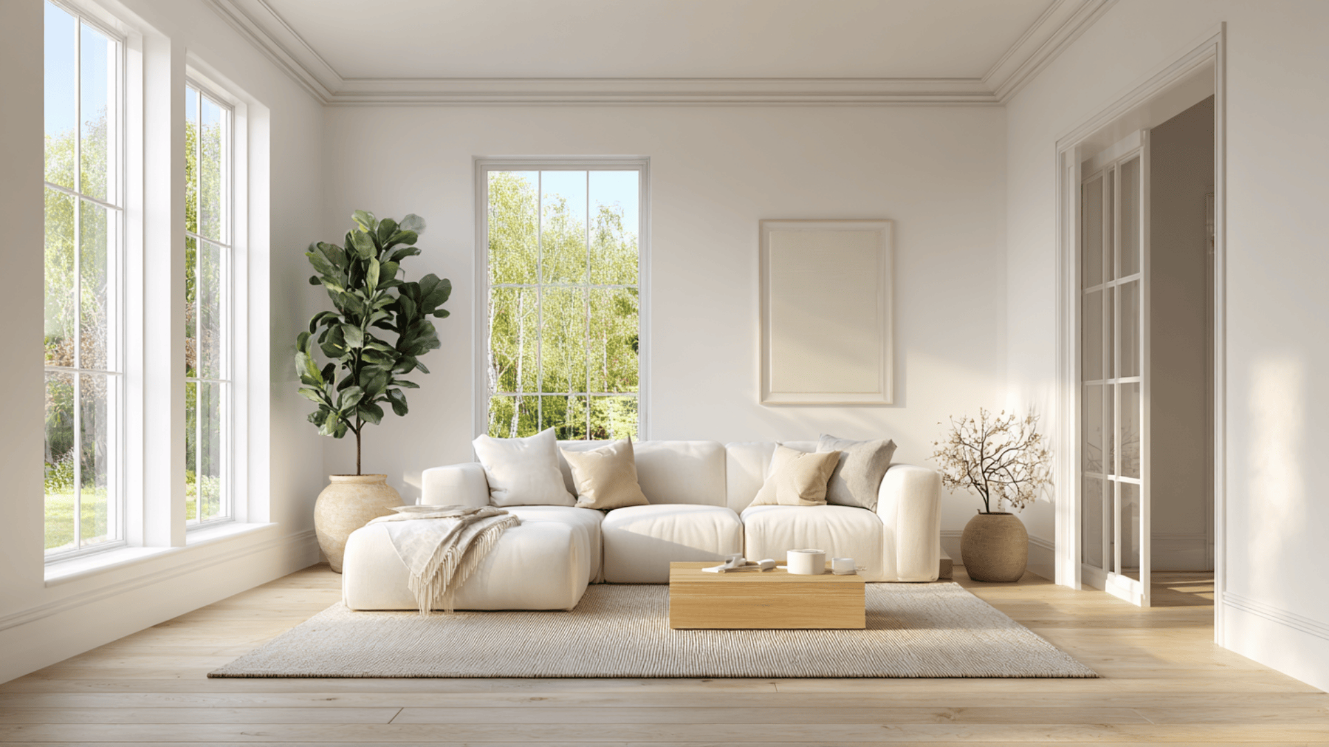
Classic Pairings That Always Feel Safe
Neutral walls with light trim are a go-to for many people and for good reason. These combos are easy on the eyes.
They work in almost any kind of room. Think soft beige or light gray walls with bright white trim. Or warm tan walls with creamy trim.
These combinations feel fresh and simple. They don’t distract you. That’s why they stay popular year after year.
Why people keep choosing them:
- They make a space feel clean and open
- They match with almost any furniture style
- They work in homes of all ages and sizes
Best rooms to try them in:
- Living rooms where you want a relaxed feel
- Hallways and entryways that need to feel open
- Bedrooms if you want calm, light walls
If you’re unsure what to pick, this combo is a safe start. It’s hard to mess up, and it leaves room for fun things like art, rugs, or furniture to shine.
Soft Contrast Combinations for a Calm Look
Sometimes the best wall and trim color combinations are the ones that barely look different. These are soft contrast combos.
Maybe your wall is a soft gray and your trim is a light off-white. Or your wall is a creamy white and the trim is a warm white.
The change is small, but it matters. It gives just enough difference to feel styled, but not so much that it feels loud.
Why blending works:
- It makes the room feel calm and peaceful
- It gives the space a smooth, soft look
- It works great in small rooms or places with low light
How it affects space and light: When the wall and trim colors are close in shade, it tricks the eye. It makes the room feel bigger.
It also helps bounce more light around the space. That’s great for bedrooms, reading corners, or any room you want to feel quiet and cozy.
This combo works well in homes that lean modern or simple. It keeps things clean without feeling too plain.
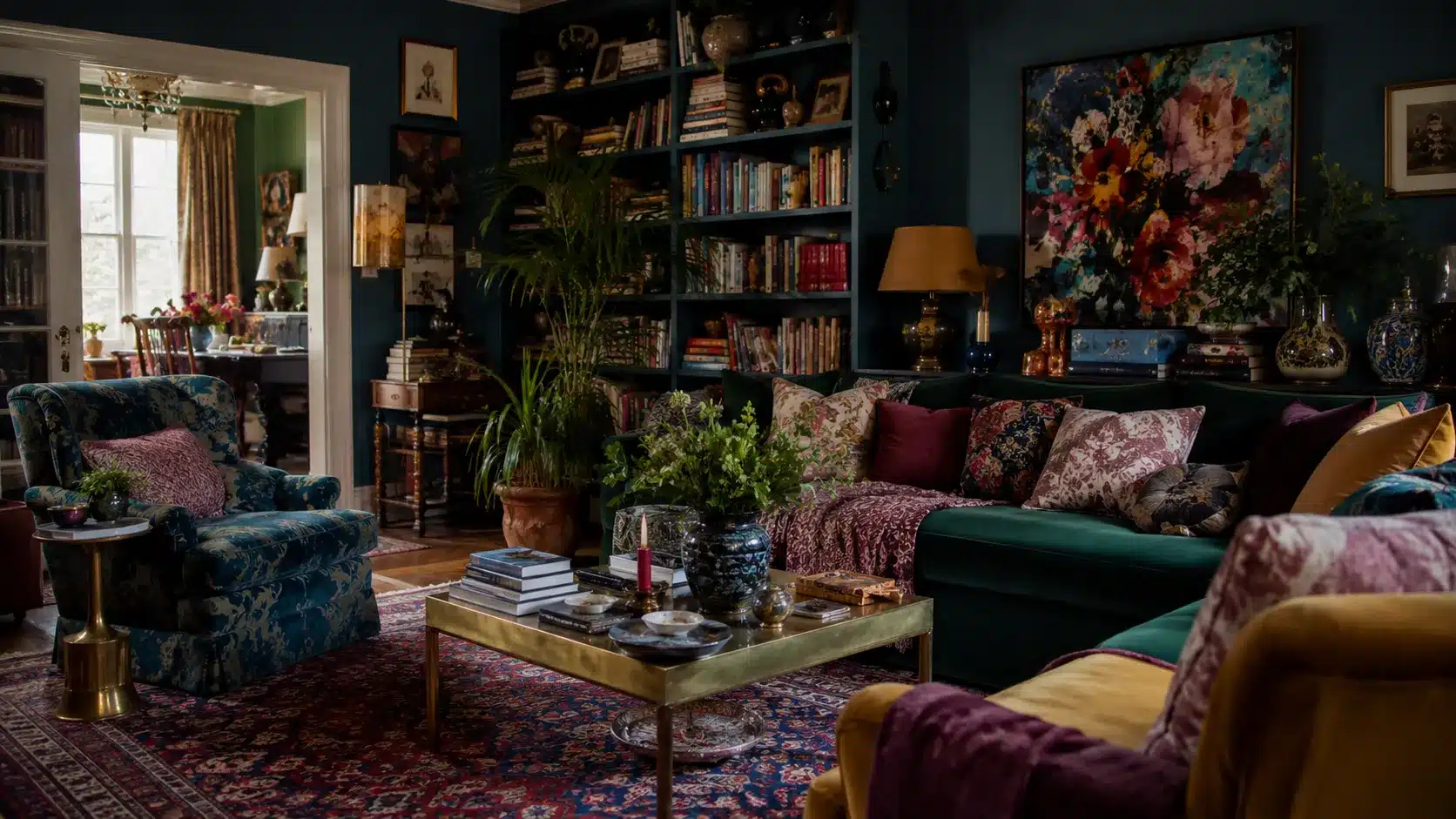
Bold Contrast Combinations That Make a Statement
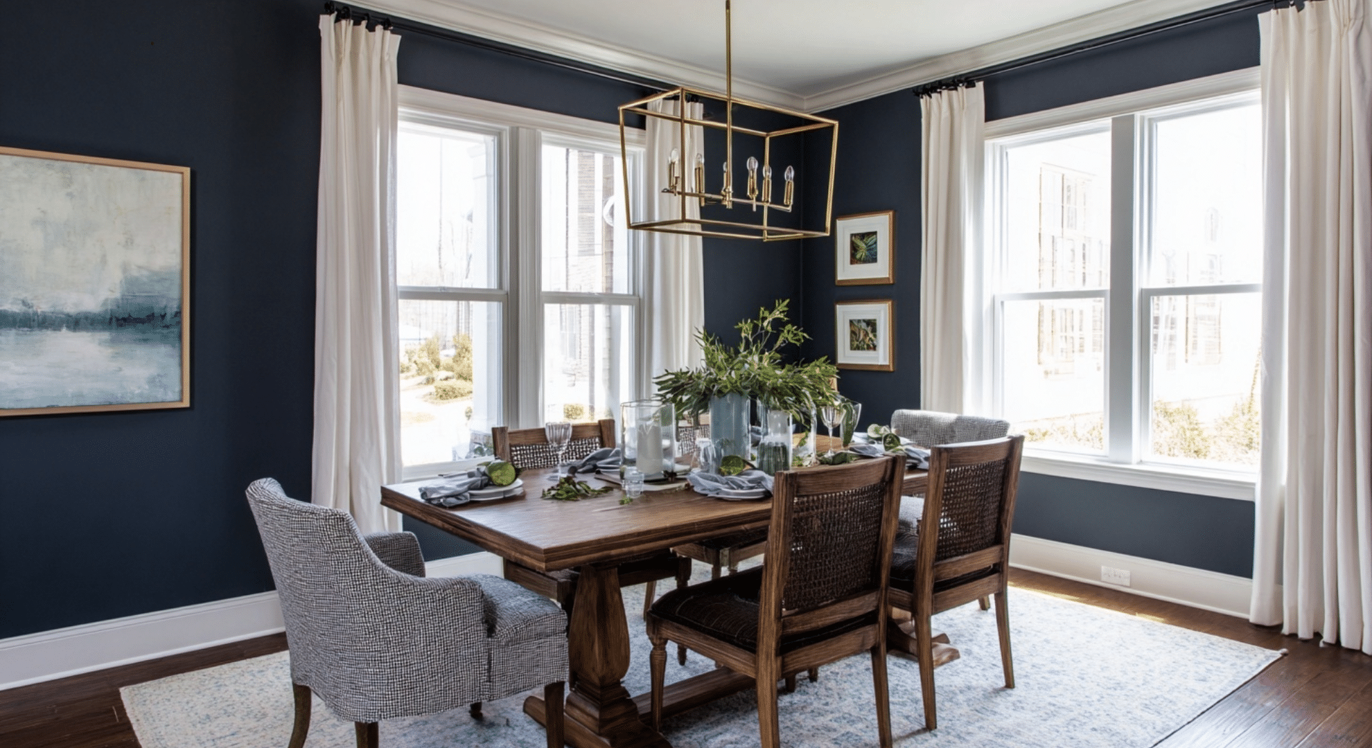
Want to do something braver? Try bold contrast, dark walls with light trim. This combo pops.
Think navy walls and white trim. Or even charcoal walls with soft beige trim. The light trim outlines the walls and makes the space feel strong and clear.
When high contrast works well:
- You want a space to feel dramatic or rich
- You have high ceilings or lots of natural light
- You want the trim to stand out as a feature
Where bold trim stands out best:
- Dining rooms where you want mood and focus
- Powder rooms ,because small spaces can handle big style
- Home offices or studies with deep, moody colors
This style adds personality fast. But it needs balance. You want to make sure the room doesn’t feel too dark. Pair bold combos with good lighting, lighter furniture, or bright rugs to keep the room from feeling heavy.
Each of these wall and trim color combinations brings something different to the table.
No matter if you want safe, calm, or bold, the key is to match your choice to how you want the room to feel, not just what looks good in someone else’s house.
How to Choose the Right Combination for Your Space
Most people just pick a wall color they like and throw in a white trim without much thought.
But when wall and trim colors are chosen together with care, they can completely change how a room feels.
So how do you make the right choice? Think beyond just what looks good in someone else’s photo. Start with what works for you, in your home.
Start With the Feeling You Want
Before looking at paint samples, ask yourself a simple question: How do I want this room to feel?
Do you want calm? Then stick to soft colors with low contrast. Pale walls with slightly lighter or slightly darker trim can make the room feel peaceful and open.
Want drama? Try deep walls with crisp, bright trim. This contrast makes the space feel more bold and strong.
Cozy rooms, like a reading nook or bedroom, often do better with warmer tones: soft taupes, creams, or warm grays. These make a room feel wrapped and snug.
If you like clean and sharp, go for cooler whites and light grays. These colors make a space feel crisp and fresh.
They also lean modern, while warmer tones often feel more traditional.
There’s no one-size-fits-all here. The best combo is the one that matches the mood you want to feel every time you walk in.
Use Natural Light as Your Guide
The light in your room changes everything.
North-facing rooms tend to get cooler, more shadowy light. Colors here look more muted or even a bit dull. In these rooms, warm colors (like soft creams or warm grays) can help the space feel balanced.
South-facing rooms get warmer, brighter light most of the day. In those rooms, cooler tones like icy gray or pale blue can help calm things down. But even soft colors will look brighter in south-facing spaces.
Here’s something a lot of people miss: light changes trim too. What looks like a clean white on the sample card might turn yellowish in warm light or gray in cool light. That’s why testing is so important.
Test spots really matter. Don’t just paint one square on the wall. Paint the wall and the trim next to each other. Watch how they change during the day. Morning light, evening light, and even shadows will shift what you see.
This step is easy to skip, but it saves you from big mistakes.
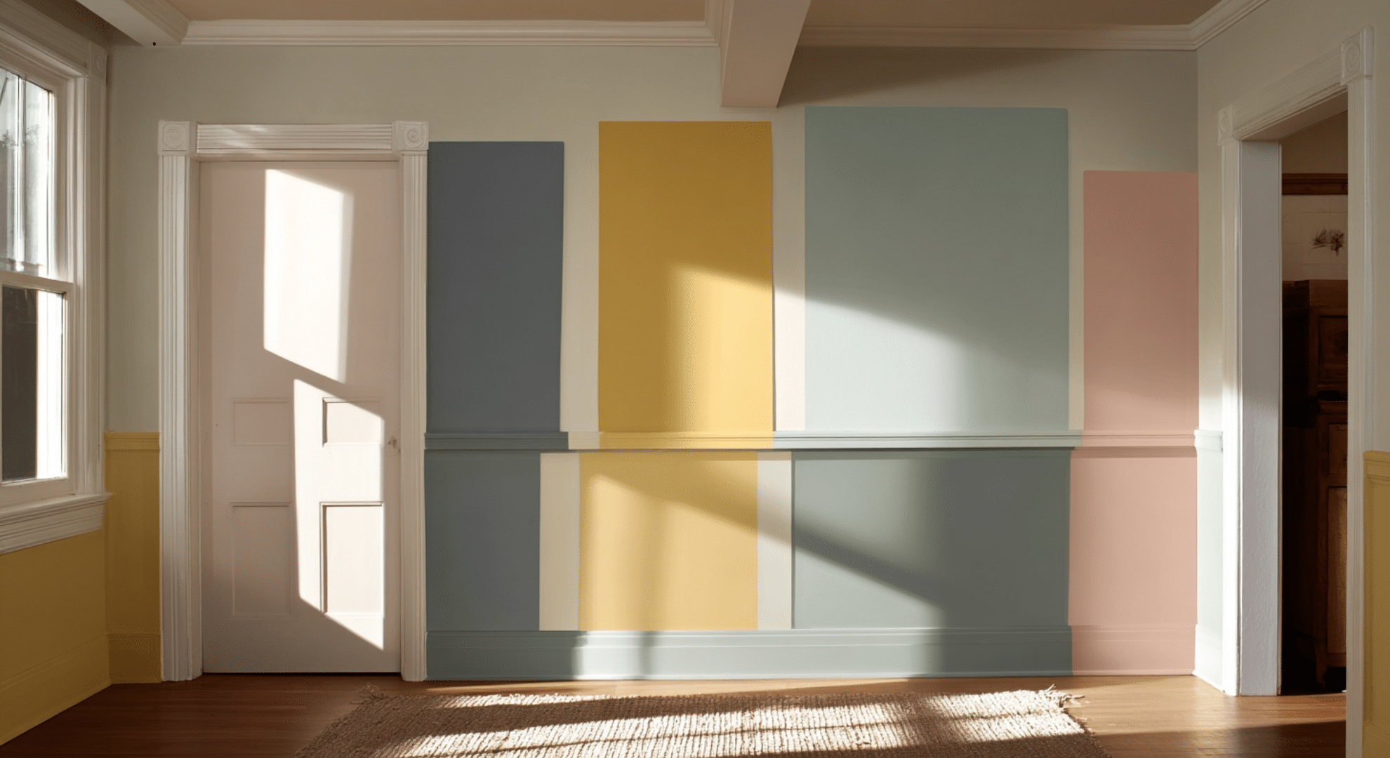
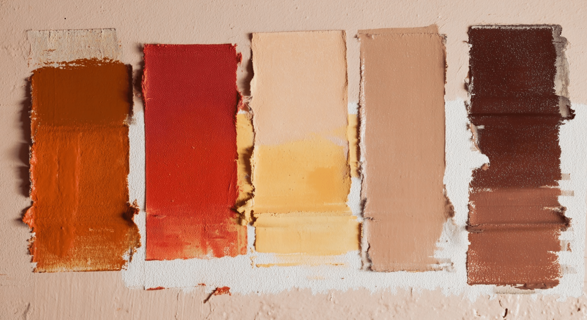
Match Undertones So Colors Don’t Clash
One of the biggest reasons a room looks “off” is that the undertones don’t match.
Let’s break it down simply.
Warm undertones include yellow, red, peach, or golden tones. These feel cozy and soft.
Cool undertones include blue, green, or gray tones. These feel fresh and crisp.
If your wall has warm undertones and your trim is a cool white, the trim might suddenly look a little gray or even blue. If your wall has cool undertones and the trim is a creamy white, the trim might look yellowish. Not good.
Matching undertones keeps the space feeling even. You don’t need exact matches, but they should lean the same way.
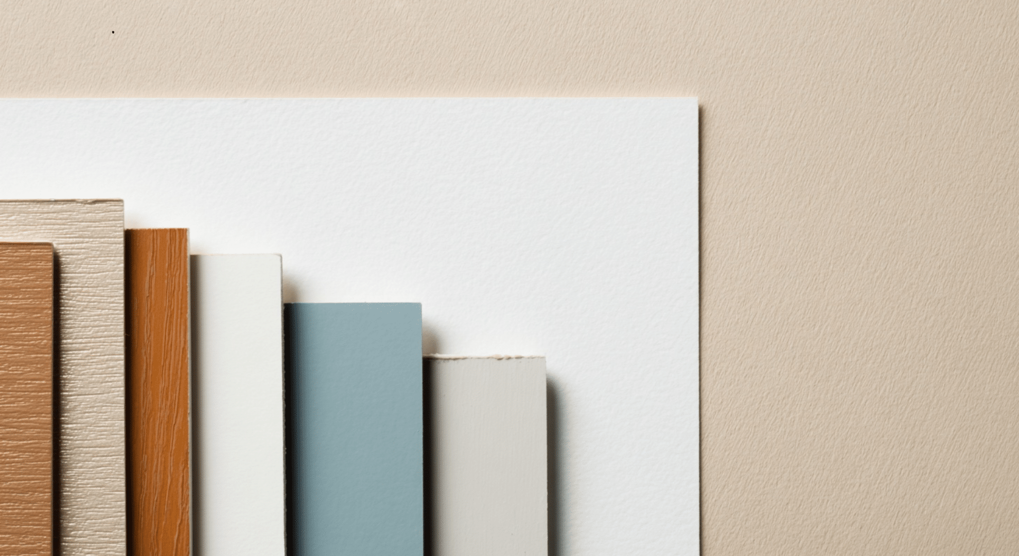
To avoid clashing:
- Put your wall and trim samples side by side
- Look at them in your room’s light
- Stick to either all warm or all cool tones
If you’re not sure, use a plain sheet of white paper next to the paint swatches. It’ll help you spot the undertones better by comparison.
Choosing the right wall and trim combo isn’t just about colors, it’s about how those colors feel, react to light, and work together. When you slow down and think about these things, your space ends up not just looking nice, but feeling just right.
White Walls With White Trim: When It Works and When It Doesn’t
White walls with white trim is one of the most common combos in homes. It’s clean, simple, and feels easy to live with. That’s why a lot of people choose it. But here’s the thing, it can look amazing, or it can fall flat.
This combo works best when you create some kind of difference between the wall and the trim. If everything is the same exact white, the room can feel flat or even unfinished. You don’t want it to look like someone forgot to paint the trim.
To make it work, use different finishes. Try matte or eggshell on the walls, and semi-gloss on the trim. This makes the trim stand out just enough, even if the color is almost the same.
You can also pick slightly different shades of white, like a soft white for walls and a brighter one for trim. Small changes make a big difference.
Using a Dark Trim Color Scheme Without Overdoing It
The dark trim color scheme is becoming more popular because it gives rooms a bold, sharp look. Dark trim like black, deep gray, or navy can frame a space and add strong contrast, even when the walls stay light. It’s a smart way to add style without going overboard.
To make it work, pair dark trim with light wall colors.
Soft whites, creams, or pale grays help the trim stand out without making the room feel heavy. This combo works well in dining rooms, offices, and entryways places where you want the trim to add focus and structure.
But dark trim doesn’t work everywhere. In small or dark rooms, it can make the space feel even smaller.
If the walls are also dark, the whole room can start to feel closed in. Always test paint colors in your space first. Lighting changes everything.
Used the right way, dark trim adds depth and personality. It’s bold but with balance, it feels smart and well-planned.
Wall and Trim Ideas by Room
Sometimes the best way to figure out what works is to see how wall and trim color choices change from room to room.
Each space in your home has its own purpose, mood, and lighting, so the best wall and trim combo for a bedroom may not be the right one for a kitchen.
Here’s how to think about it, room by room:
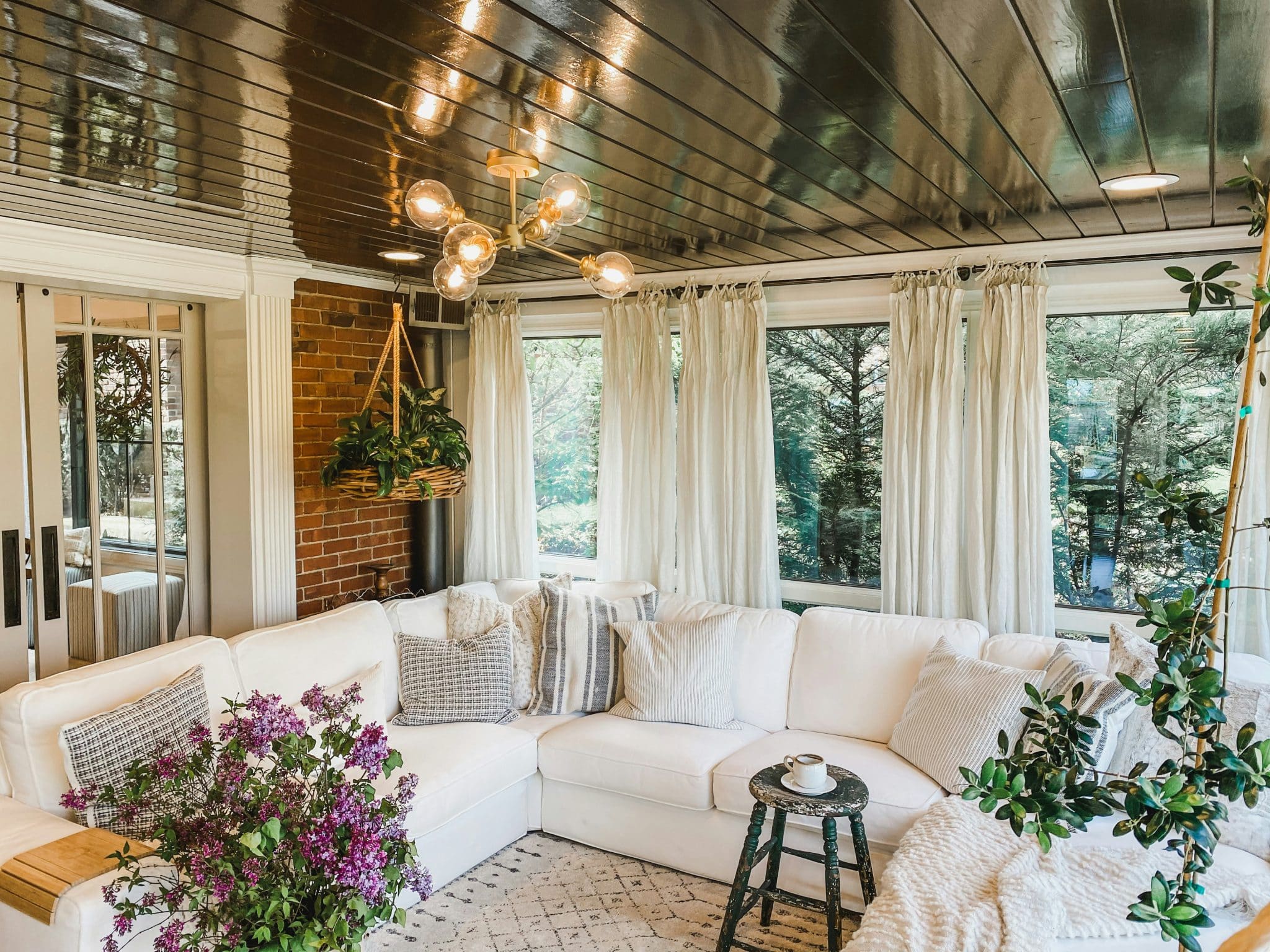
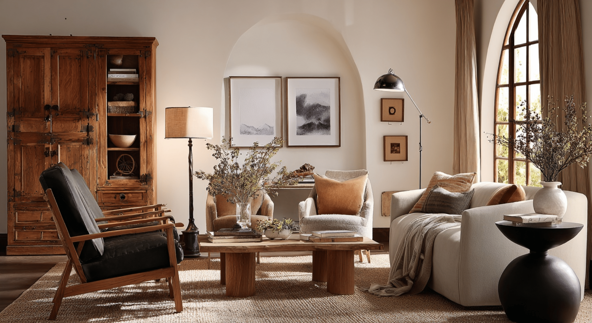
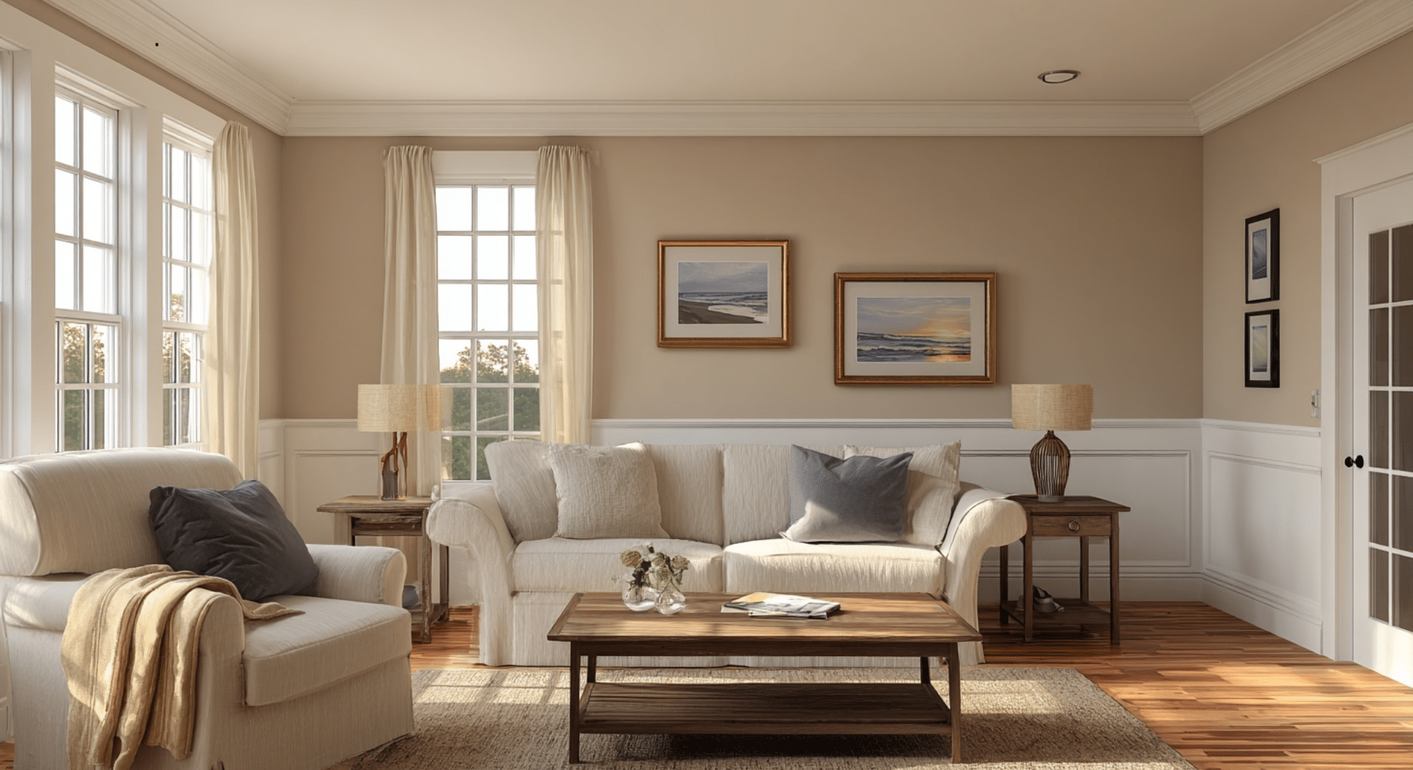
Living Rooms
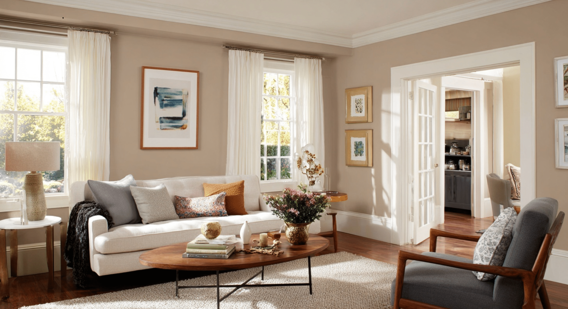
In living rooms, balance is everything. You want the space to feel warm and inviting, but not dull.
A light neutral wall (like soft beige or warm gray) with crisp white trim is a safe starting point. It creates just enough contrast without being too loud.
For more personality, try a medium-toned wall (like sage green or soft navy) with a warm white trim. This adds style while staying comfortable.
Use the trim to frame windows and doors clearly, this helps anchor the room without needing a lot of bold decor.
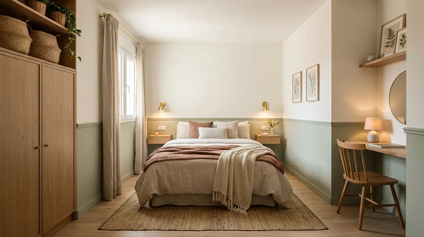
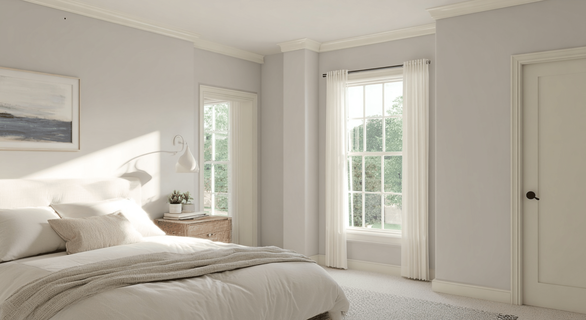
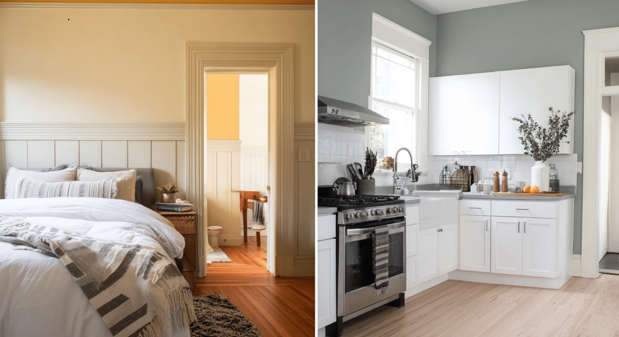
Bedrooms
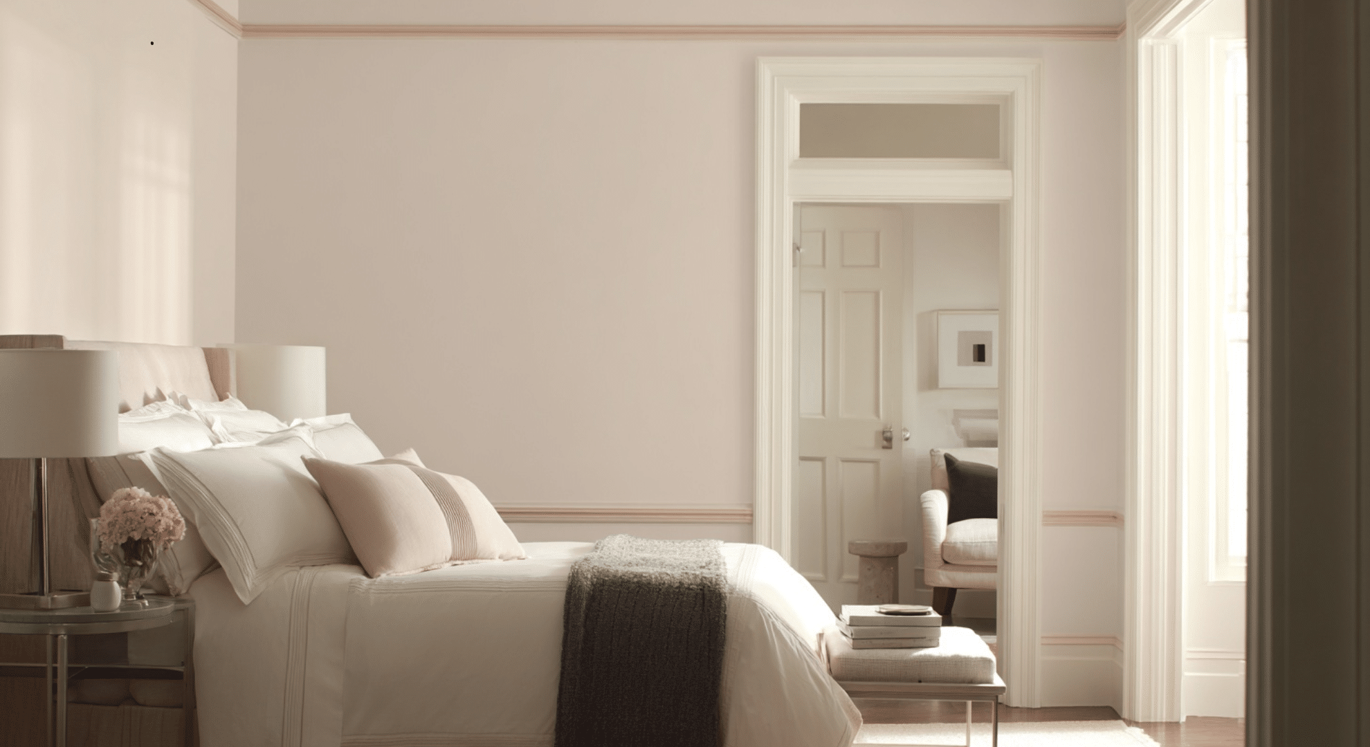
Bedrooms are meant to feel calm, so the wall and trim pairing should reflect that.
Go for low-contrast combos, like creamy walls with slightly brighter off-white trim. This helps the space feel soft and smooth.
If you like cooler colors, pale gray or light blue walls with cool white trim can also work well.
These choices don’t jump out: they relax the eye. For a cozier feel, try warmer undertones in both wall and trim colors. The goal is rest, not drama.
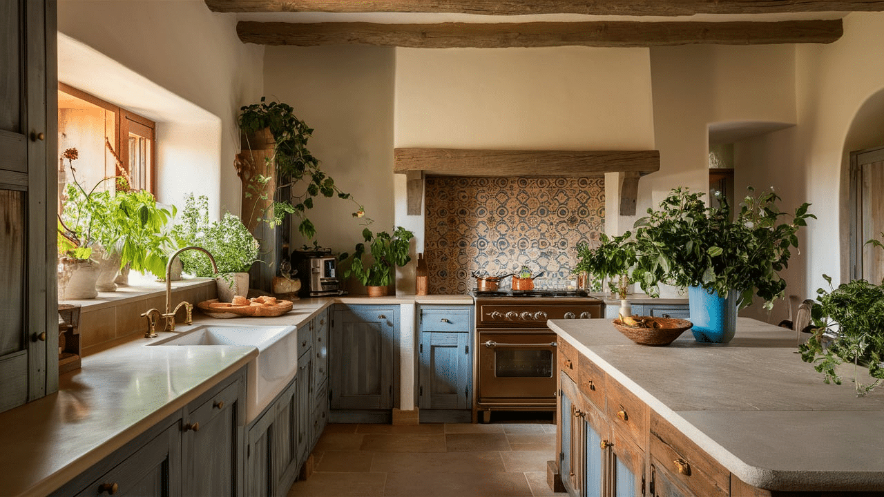
Kitchens
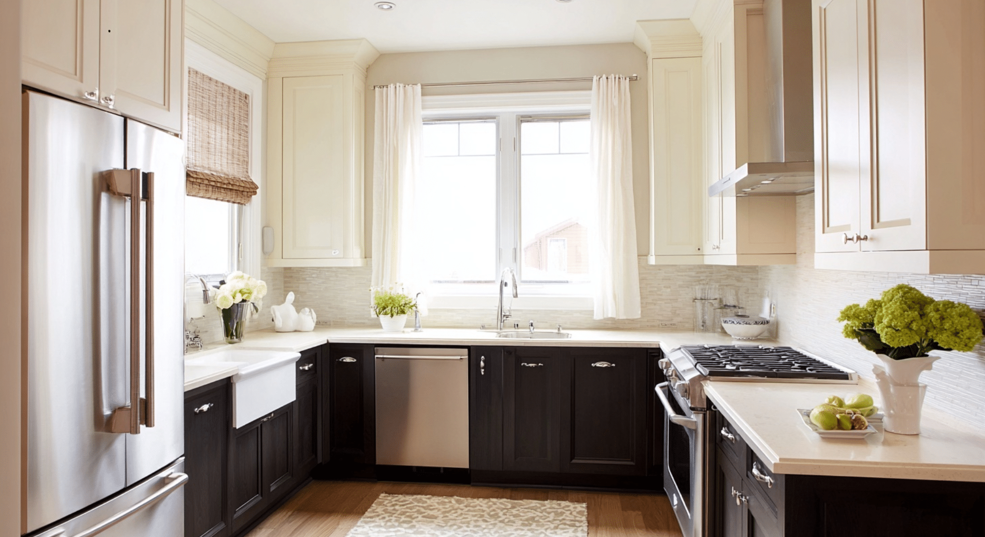
Kitchens need structure. That’s why clean, high-contrast combos often work best here.
White or light-colored walls with bold or clearly defined trim give the room an organized look. Plus, kitchens usually have a lot of cabinets, so trim and cabinet color should work together.
For example, white cabinets with light gray trim can feel modern and sharp. Or try navy lower cabinets, white uppers, and a matching white trim to keep the space tied together. Trim in kitchens helps create edges and visual order; don’t skip it.
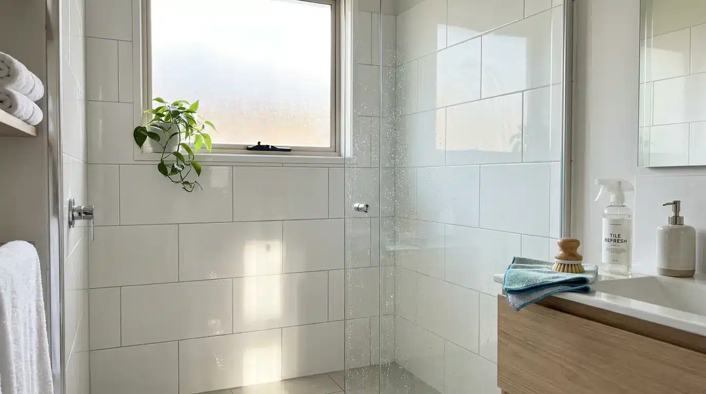
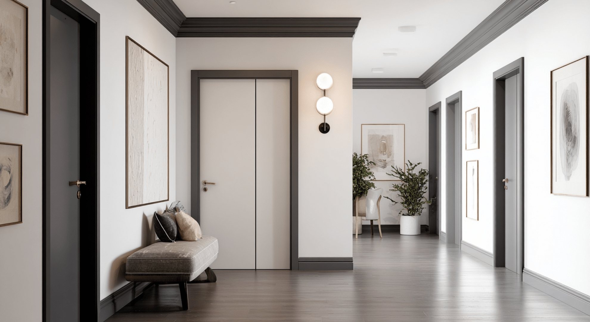
Bathrooms and Hallways
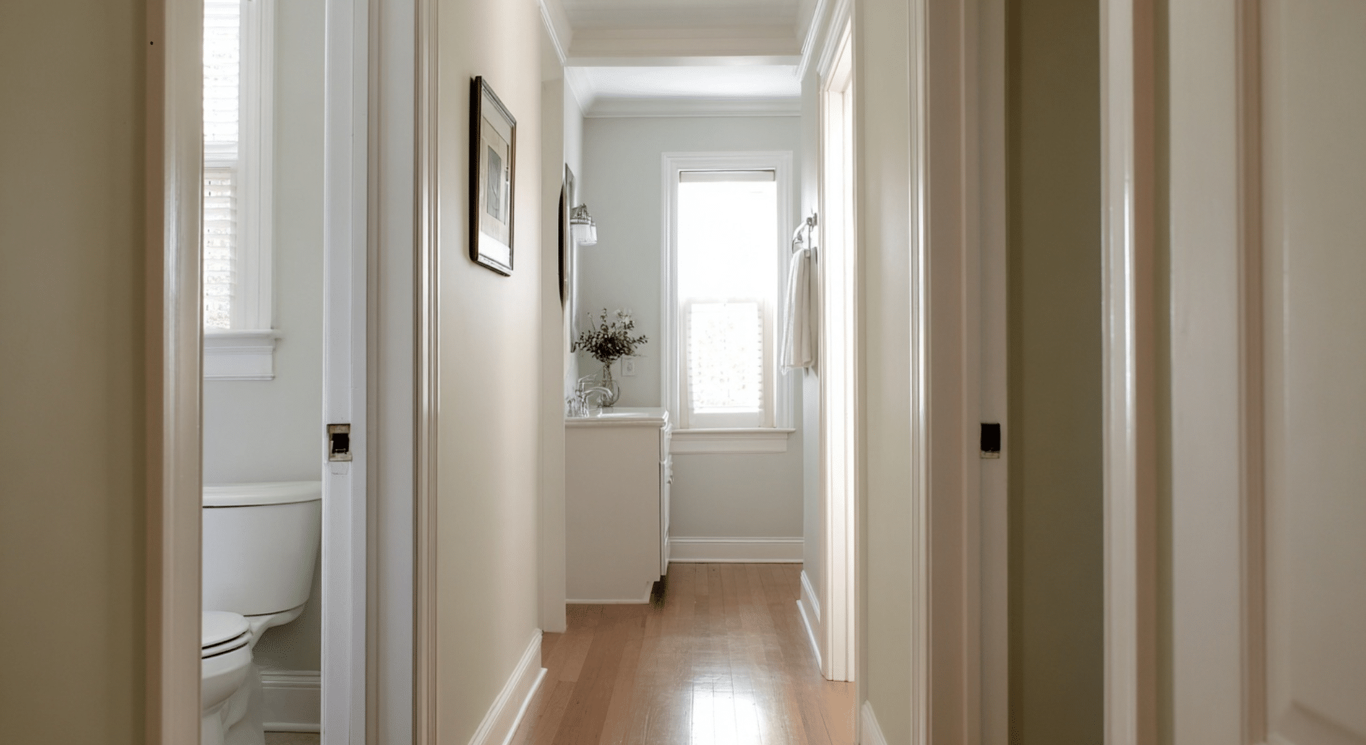
These spaces are often small and short on natural light.
That’s why you’ll want to pick light-boosting color combos. Think soft white or very pale wall colors with bright or slightly glossy trim to reflect light.
Bathrooms and hallways usually have more trim per square foot , baseboards, doors, window frames, and moldings, so your trim color really shows here.
Stick with whites or near-whites to keep things fresh.
In bathrooms, you can use a satin or semi-gloss finish on trim to handle moisture better. In narrow hallways, low-contrast wall and trim colors can open things up and make them feel less cramped.
Choosing wall and trim colors by room helps you match the feel and function of each space.
Start with how you use the room, then shape the look around that. Simple shifts, like a warmer white here or a deeper trim there, can make a huge difference.
Common Wall and Trim Color Mistakes to Avoid
Choosing wall and trim colors seems simple until the room doesn’t feel right.
Many people make the same small mistakes, and those mistakes can throw off the whole space. Here are a few to watch out for before you paint:
Choosing Trim Last: A lot of people pick a wall color first, then just slap on a white trim afterward. But trim isn’t just an extra; it’s part of the full look.
It frames your space. If you choose it last, you might miss out on better combinations. Pick wall and trim colors together to make sure they work well side by side.
Using One White Everywhere: Not all whites are the same. Some are warm, others cool.
Using the same white in every room (or on every surface) can make trim look off, too yellow in one space, too cold in another. Instead, test whites in each room’s light and choose the right one for that space.
Ignoring Lighting: Natural and indoor light change how paint looks. A white trim in a north-facing room might turn gray.
In a south-facing room, it might look yellow. Always test wall and trim colors in different parts of the room and at different times of day.
Picking Contrast Without Considering Scale: High contrast can look great, but not in every room.
A small space with dark walls and light trim might feel boxed in. In a large, open room, soft contrast might feel too flat. Always match the level of contrast to the size and light in the space.
Fixing these common mistakes isn’t hard. It just means slowing down and testing before you commit. That extra time can save you from a room that just feels “off”—and help you build a space that feels just right.
How to Test Wall and Trim Colors Before You Commit
Testing wall and trim colors before painting the whole room can save you time, money, and frustration. What looks good on a sample card often looks very different once it’s on the wall or next to your trim.
Paint your test areas on more than one wall. Choose spots that get different kinds of light near windows, in corners, and near doors or trim.
Always test wall and trim colors side by side so you can see how they work together. Don’t forget to try samples near furniture or flooring too, since those can change how colors look.
Leave your samples up for at least 2–3 days. Watch how the colors change throughout the day. One coat isn’t enough; apply two coats so the sample looks close to the final result.
In daylight, check how natural light makes the colors shift. Do they feel too bright? Too dull?
In the evening, turn on your room lights and look again. Some whites may look yellow under warm bulbs, while cooler colors may seem gray or flat.
Watch how the trim color reacts next to the wall. Does it stand out in a good way, or does it clash? Small changes in undertones are easier to spot at night.
Testing like this helps you avoid surprises. It gives you time to see how colors truly live in your space before you commit to covering every wall.
Conclusion
Choosing the right wall and trim color combinations can really change how a room feels.
I shared what’s worked for me and what can help you pick colors that match your space, lighting, and style. Now you’ve got solid, easy ideas you can try without feeling stuck.
As you plan your next room update, take a moment to think about what feeling you want in that space.
A calm vibe? Something bright? You know more now and you can trust yourself to make a good call. Keep noticing the colors around you. They can surprise you.
If you found this helpful, I’ve written other blogs that dig into more home color tips. Check them out and keep learning. You’re just getting started.